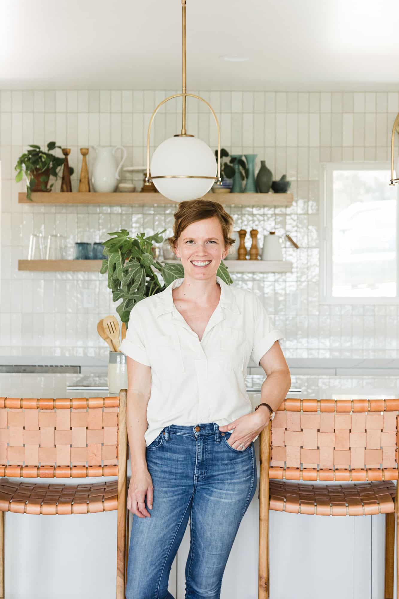
 Hi, Elise here and I am so excited to share my kitchen before and after with you today!
In December 2018, my family bought a new house in our same neighborhood in San Diego. My daughter had started kindergarten a few months before and as soon as she began settling into her new school, my husband and I realized we wanted to live in this area for a long time. We started looking for houses that were on a quieter street and had a little more space.
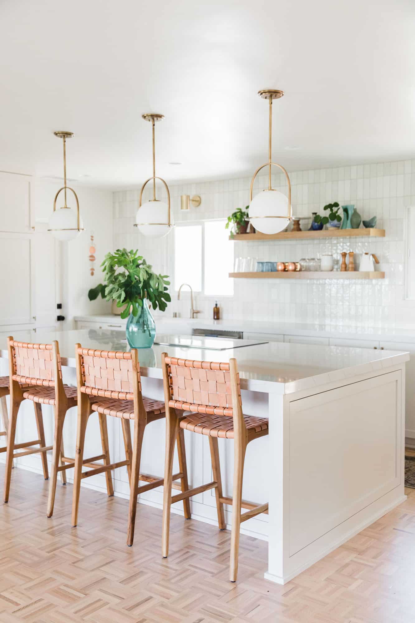
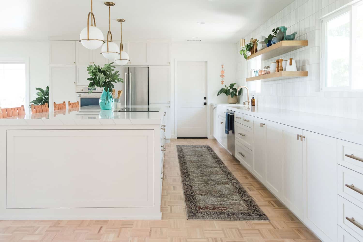 When we were first house hunting, I saw photos of this house and wrote it off because the kitchen was too small. The next time I looked at photos, we decided to add it to our tour list anyway (there wasn’t a lot in the area that fit our needs). On the first walkthrough, I said, “Maybe if we take out this fireplace and open up the kitchen?” Our realtor laughed, but I couldn’t stop thinking about it! That night I found a local contractor team on Yelp and I got someone from there to meet me at the house again and go over logistics. Could we take out that fireplace and open up the kitchen? Would it make sense? How much would it cost? She was able to give us an estimated remodel budget and based on that, we put in an offer right away.
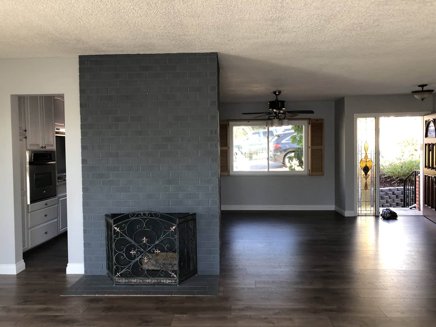
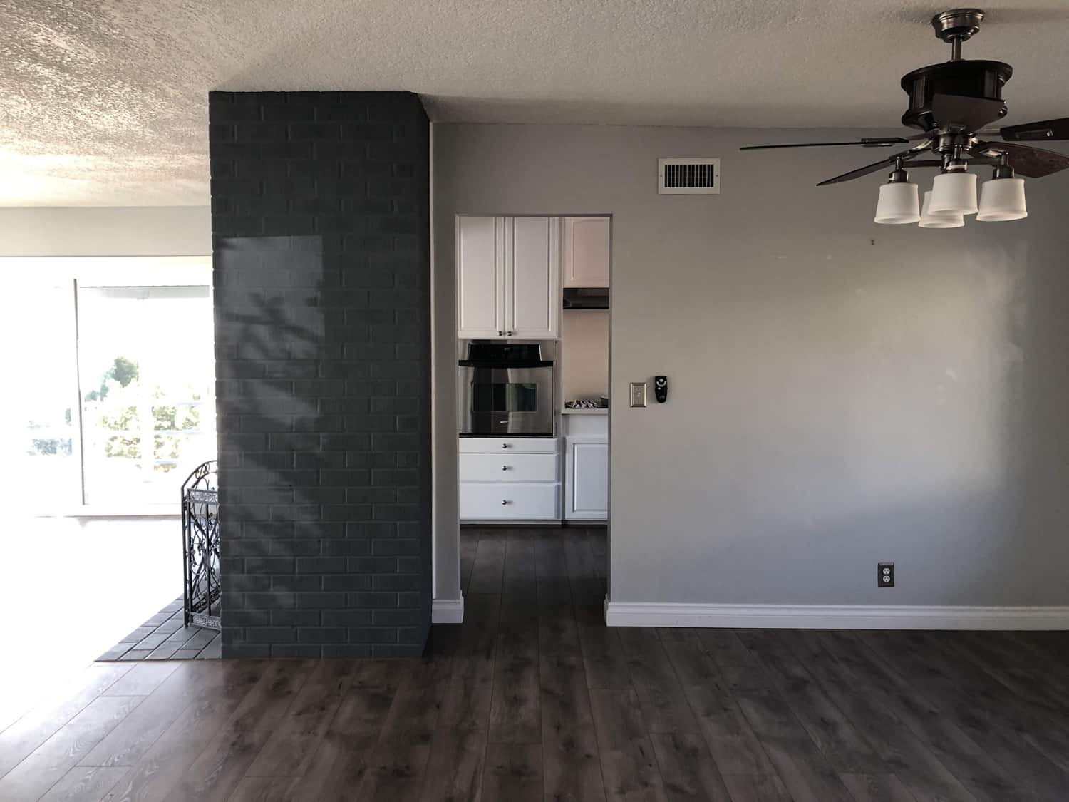 In early January, we had the laminate flooring and carpet pulled up throughout the upstairs, because we planned to have new flooring put in before we moved in with our furniture. It turned out there was wood parquet flooring hiding under most of it! Pulling up the parquet to lay our new floor would have been expensive and removed the charm, so we decided to keep it and had it refinished to a lighter white oak color.
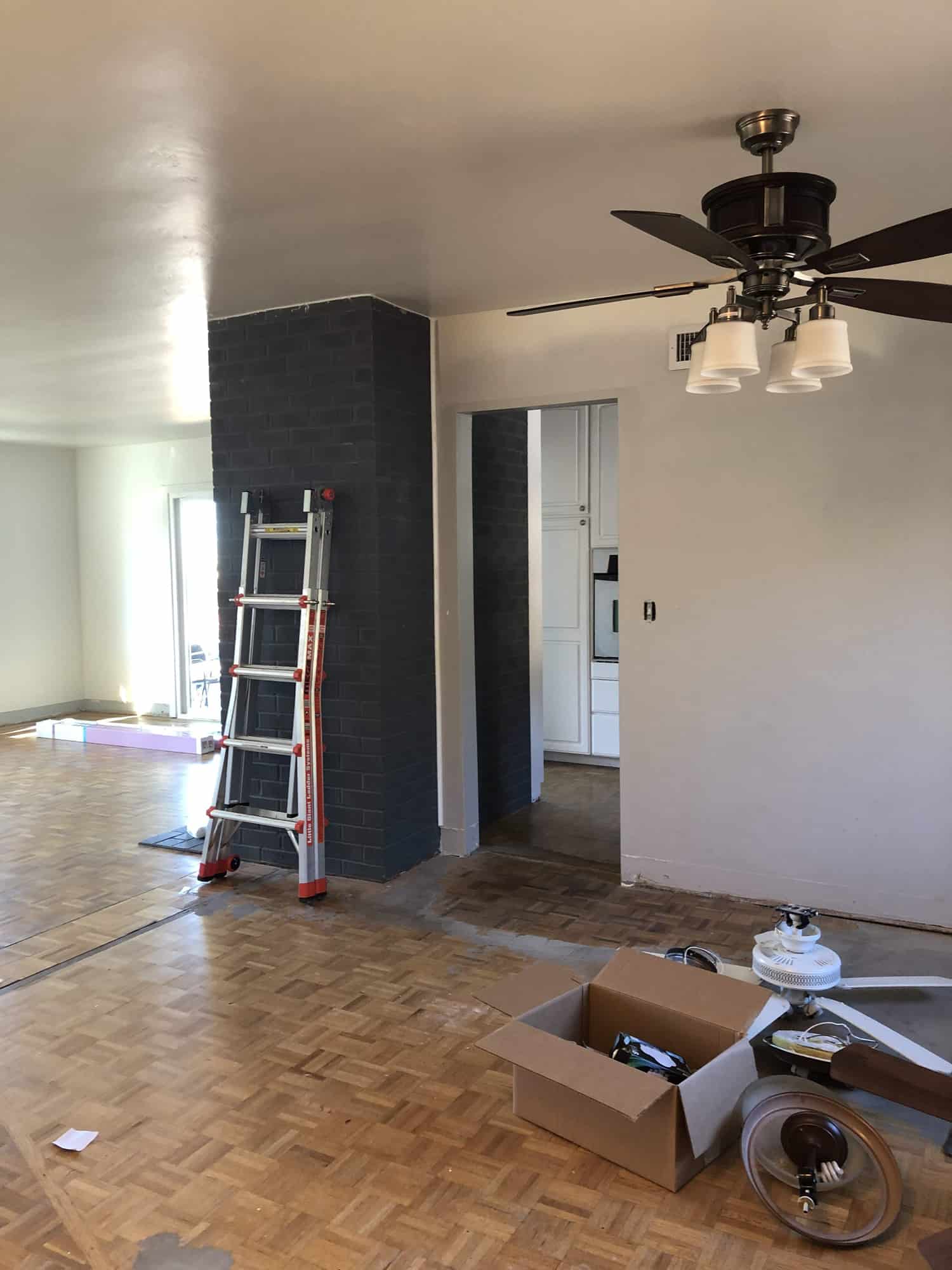 Because the parquet flooring was in what we planned to be the living and dining room, we realized we would want to carry it into the kitchen as well. Parquet is pretty different and more interesting than what we had planned to install, so we toned down some of other decisions for the kitchen (originally we thought maybe we would do a bolder color on the cabinets and maybe a more statement countertop). This worked great for us. I think it helps to have one set choice for a room (cabinet color, statement, dresser, whatever) and then you can build around that instead of trying to design completely from scratch.
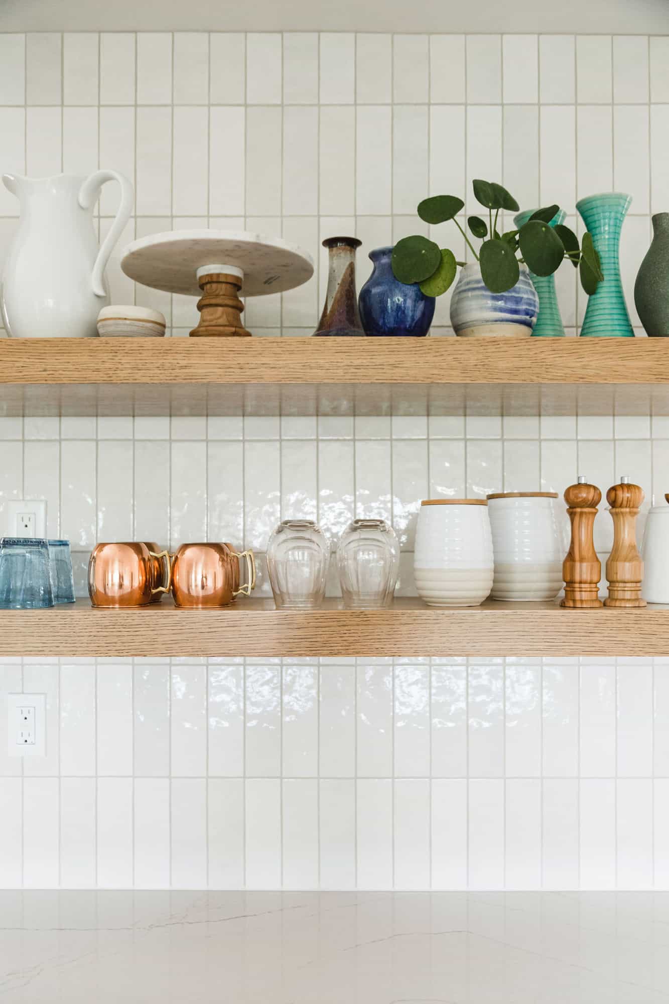
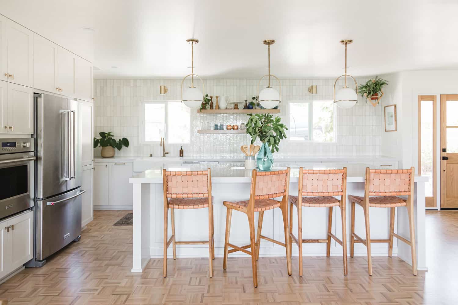 When we took out the wall between the kitchen and what the previous owners had used as a dining room, we had so much space! We choose to fill it with a giant island and a long countertop. There is a decent amount of storage in the lower cabinets and in the pantry wall, so we skipped upper cabinets. (We keep plates and bowls in a big drawer right next to the dishwasher.) No upper cabinets meant we got to do something fun with that window wall and I chose to fill it with vertically stacked Cloe tile from Bedrosians.
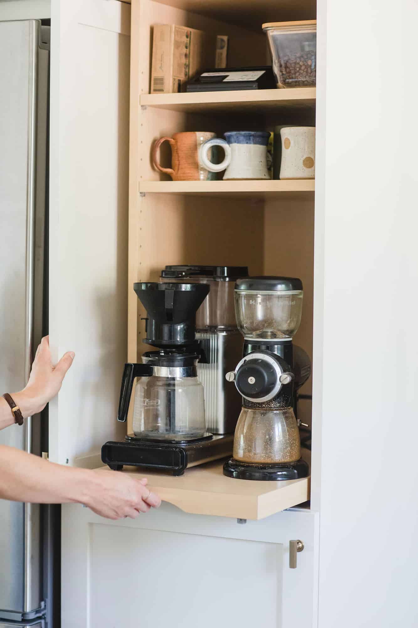
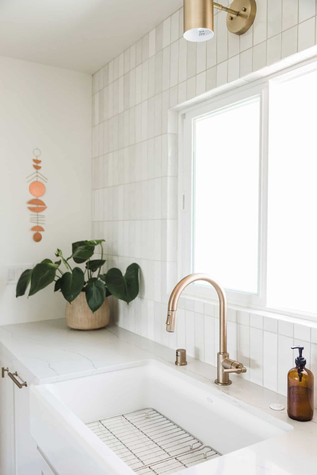 My main goal for the new kitchen was “nothing on the countertops!” and so we tucked the microwave behind the cabinet above the oven and the coffee maker in the cabinet next to the fridge. There are plugs behind them to make this work.
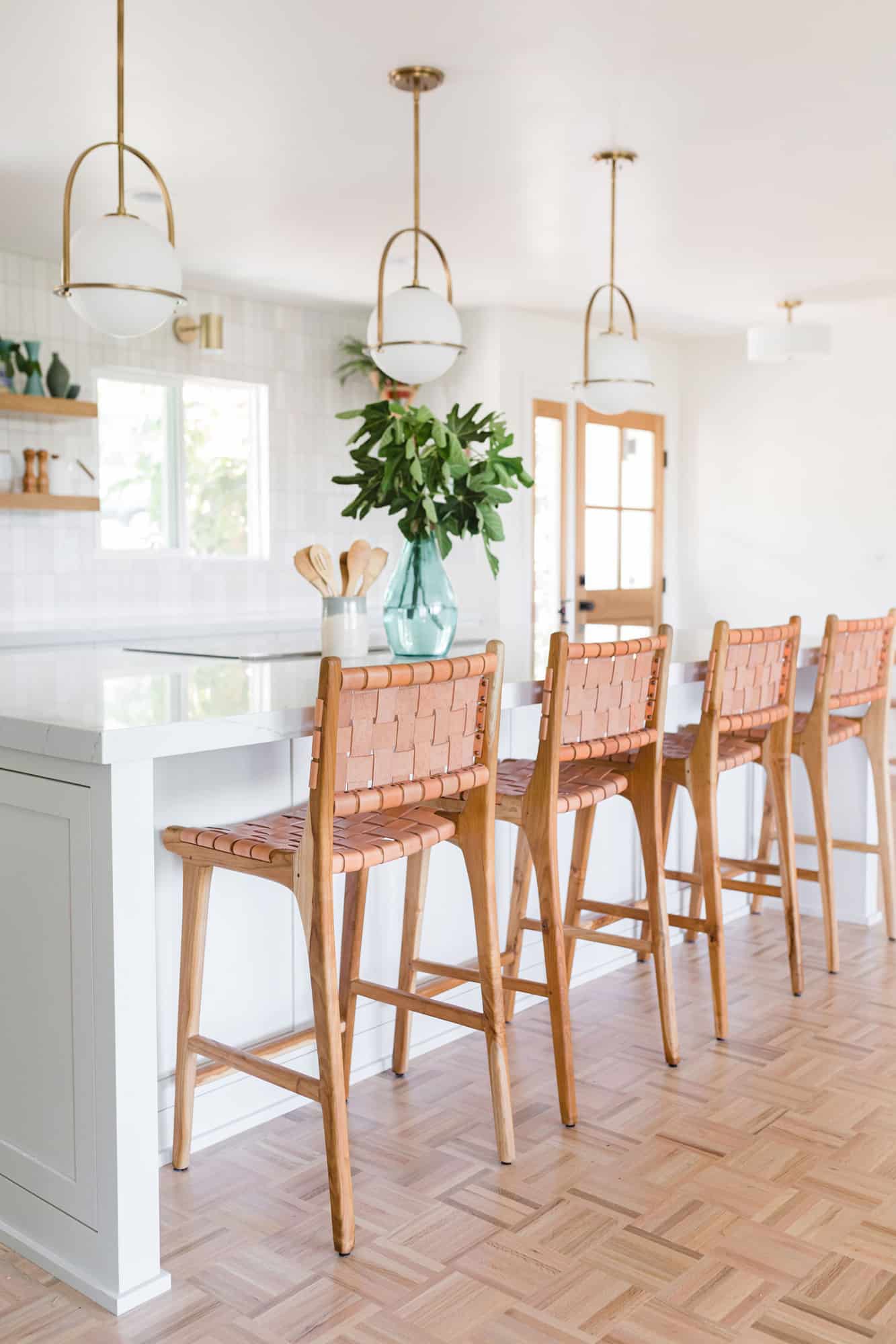
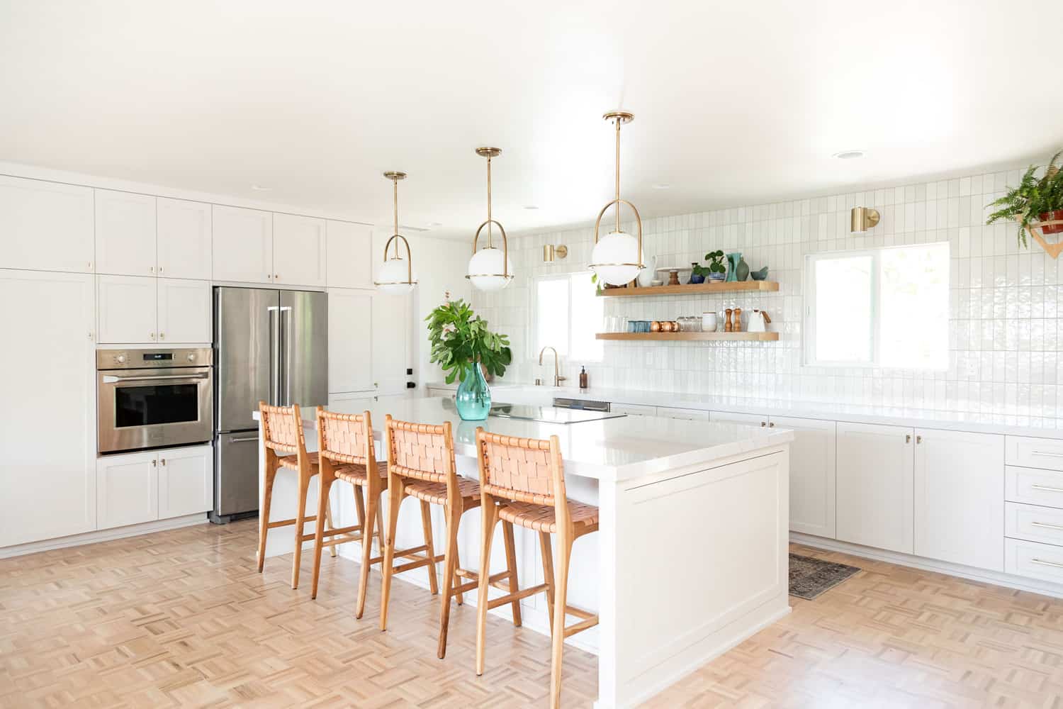
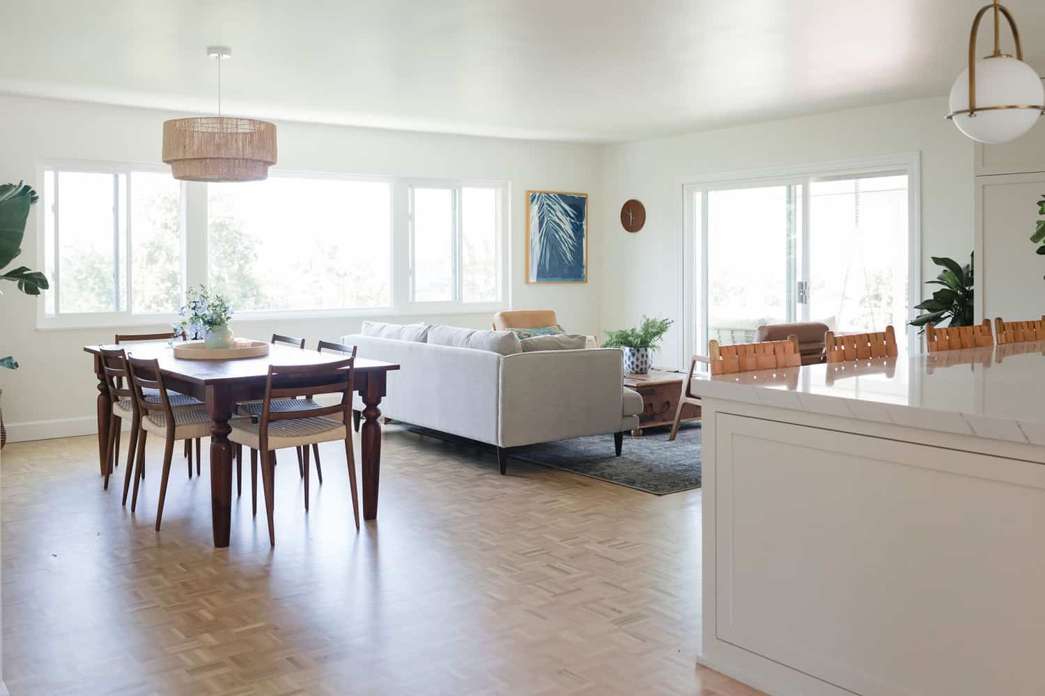
We were in the house for about 100 days during the remodel, which felt fairly fast all things considered and are so happy with how the space has transformed! Thank you for letting me share with you. I have linked the sources below.
Chairs: Häti-Häti Home
Pendant Lights: Hinkley Lighting
Wall paint color: Benjamin Moore Cloud White
Cabinet paint color: Benjamin Moore Olympic Mountains
Countertops: Cambria
Front door: Simpson Door Co.
Door hardware: Emtek
Cabinet and drawer pulls: Emtek
Kitchen towels: Olive and Linen
Brass wall hanging: Electric Sun Creatives
Wall tile: Bedrosians
Floor: Armstrong Flooring
Who is Elise? Glad you asked—Elise Blaha Cripe is a longtime friend of A Beautiful Mess. She shares on IG @elisejoy, has a planner business called Get To Work Book and her new book about goal-setting, Big Dreams, Daily Joys comes out Oct. 8! You can pre-order here. We’ve already pre-ordered our copies!




18 Comments
Such a beautiful kitchen! I have a thing for kitchen islands – Elise’s has done such a good job with hers! 🙂
Charmaine Ng | Architecture & Lifestyle Blog
http://charmainenyw.com
Very similar to YoungHouseLove’s kitchen!
Loving the light fixtures but couldn’t find a source—where are they from?
Where are those chairs from????
Same! Love the chairs! Would love the source
Here’s the link! https://www.hatihome.com/
Beautiful! I so love parquet floors…we had them in the entry in my childhood home and I was so dismayed when my parents tore it out to put in boring tile. They are lovely!
Stunning! I love the flooring and having nothing on the countertops gives it such a clean look! Putting plugs in cabinets where you want to have plugged-in things is genius!
Beautiful kitchen. Can you share the source for the floating shelves?
It’s so beautiful and I think of you every time I see a home with parquet now! xx
I am a “nothing on the countertops” person too, so I love the hidden microwave and coffee maker. I also love that you didn’t do much shelving on the top and kept it simple.
So beautiful! Love the kitchen, Elise and ABM! What a good combo!!!
Where are the gorgeous light fixtures above the island from?
Gorgeous kitchen transformation, wow. I’m slowly redoing mine – currently saving up to replace the countertops, and bookmarking this post as inspiration!
I’m curious about how you painted the cabinets. Did you sand them first or just paint on top of the existing color? Thanks in advance!
It’s so beautiful, Elise! You always have such a vision.
Carrie
http://www.carriecolbert.com
Beautiful! I noticed you have no range hood – how does that work for you? I hate the look of them and rarely use mine.
oh my god those pendant lights are absolutely amazing – I’m saving those for future house remodels!