 I’m so, so excited to explain the inspiration for our 1965 home remodel. It’s taken me a minute to fully get my head around it!
We love the new home and over the past few months have really begun to bond with it (this is a thing!!). There are a few really amazing original features, including the front elevation (hello, Brady Bunch windows) and a stone fireplace. Beyond that, most of the home has been remodeled through the years and the kitchens and all bathrooms have ’90s and 2000s remodels that are the definition of “meh” (but they are CLEAN and not gross, so I’m happy for now!)
Over time, we plan to add some 1960s inspiration back into each room of the home. We’re also planning an addition that will add quite a few rooms, rework the kitchen completely, change the outdoor living spaces and overall improve the entire home … but we haven’t gotten far down that road yet. So for today, I am mainly going to focus on phase 1-2 (what we are doing before the addition) because it’s stuff we are doing this year … and a lot of it we’ve already started.
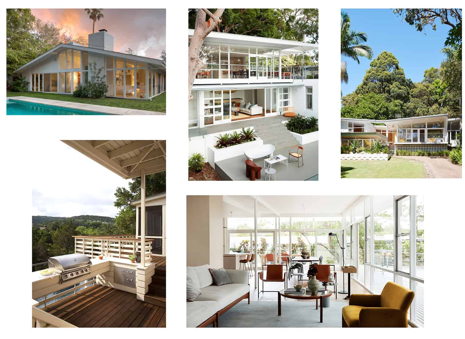
First up! Above, I have some of my exterior inspiration gathered up. One of the main things I want to splurge on are windows. The front of our home has the most amazing 1960s windows, but the rest of it has traditional windows and moldings, so we’d like to transition to matching them all to the original ’60s windows.
I like black window frames (in other people’s homes), but for our 1965 home, I always knew I wanted to do white metal windows. And these inspiration photos really seal the deal for me. I love how they look from the outside and the inside.
Sources above: one, two, three, four, five.
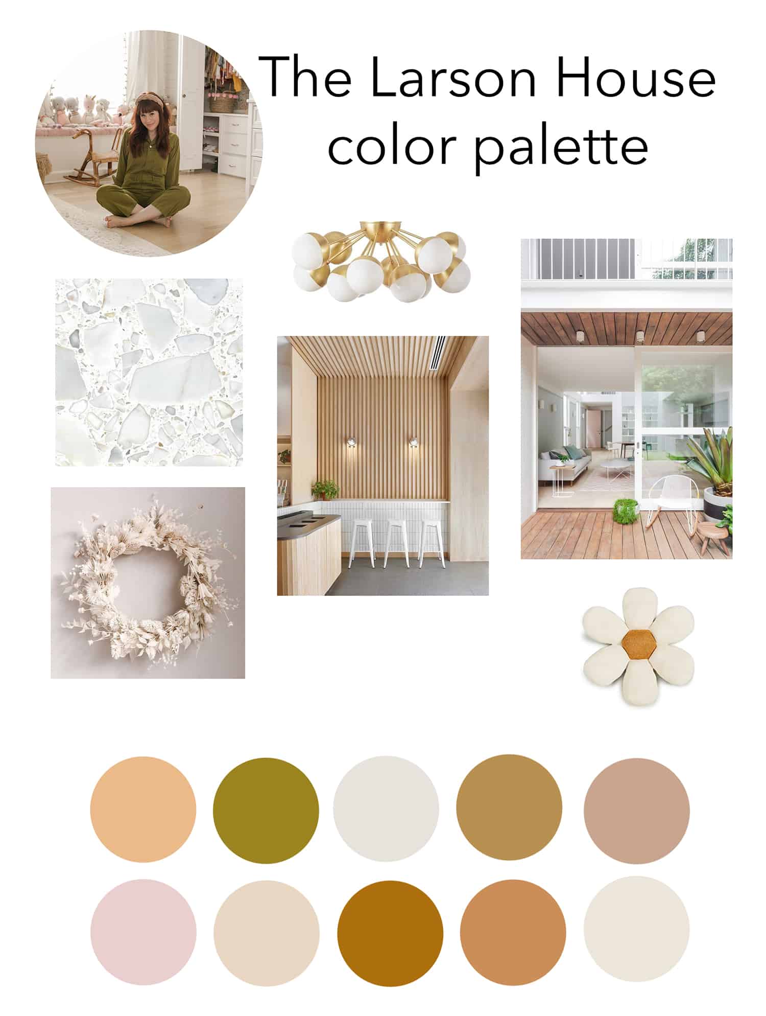 Color was an area where I may have overthought it, but I’m glad I did because after probably 10 different mood boards I finally feel so confident in my choices and ready to add some color to our home. Our color scheme will be a base of whites, creams, light wood and neutrals with some warm tones mixed in—and a tiny bit of pickle green and mustard yellow. This palette feels like magic to me!
I waited to make any purchases or do anything with color until I had this mood board complete. If you’re interested in learning how to make a mood board, listen to this podcast episode.
I am planning to make a very white, on white … and neutral home. But I like color too! One of my favorite things in the universe is seasonal decor. So I plan to go crazy for my favorite holidays—Halloween and Christmas, as well as adding a lot of extra yellow in spring. VERY excited about that seasonal color—it makes me incredibly happy!
One more thing … let’s talk about pink.
So, I assumed years of people calling pink “millennial pink” would ruin it for me a bit. One of my least favorite nicknames ever—no *thank* you to whoever coined the term. But honestly, I still love pink. I even did a couple of my bnb makeovers using zero pink just to stretch outside my comfort zone … but I’m not over it.
Now, being on the other side of the big pink “trend” and still just loving pink, made me realize that I truly love it—no matter if it’s in style or out of style. So, while I will probably use it in small doses, it is definitely here to stay. You know, I almost had a pink wedding dress—damn! Maybe I should have!
Sources above: terrazzo, chandelier, wreath, indoor room, outdoor room, flower pillow.
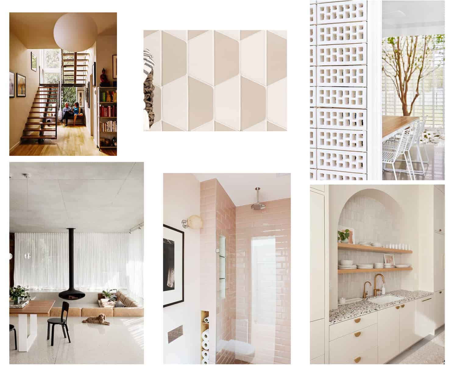 Interior inspiration was the toughest one for me to make into a collage because there’s really nothing on my pin board that looks THAT much like how I’m imagining these rooms. I pride myself in doing something unique in each room, so I would never be able to use an inspiration photo too literally. But still, this is the general vibe we are going for.
That first stairway image is a HUGE inspiration. Jeremy is obsessed with this image and it’s a photo we reference over and over when we’ve been planning the flow for our addition. It’s probably the most formative inspiration photo we’ve found.
I’m loving the tone-on-tone tile with a shape that nods to the ’60s! I’m into the idea of incorporating breeze block into our outdoor, and maybe even indoor spaces. I’m VERY smitten with the idea of a sunken living room … if it’s logistically possible we will absolutely be doing this. Fingers crossed.
Sources above: one, two, three, four, five, six.
At the moment, we are so excited to move in and begin slowly decorating and making choices! I hope this post gives you a good feel for the inspiration of what we are trying to create, but it will take TIME. A lot of time. 🙂 Our last renovation took about three years and I can see this one taking that long or even a bit more.
Thank you for coming along with me on the process! I am excited to share more as we go. XX- Elsie
P.S. You can see our 2020 project list here (I’m still feeling good about completing everything on that list!) and if you have any questions (like, “why are you even moving?”) I probably answered them here. xx- Elsie




22 Comments
Love the colour palette! I want to adopt it for my wedding, haha! Thanks for sharing! 🙂
Charmaine Ng | Architecture & Lifestyle Blog
http://charmainenyw.com
Love this board! Can you create a blog post about mixing different types of wood or different color wood? I think that’s what I struggle most with when it comes to home decor. I have a mix of very light wood, yellowish wood, and reddish shades of wood, and I often wonder if I should re-stain it all one or two tones.
I try to stay with 2-3 different wood tones (mainly 2) but it’s ok to make exceptions- sometimes it works! 🙂
How do you feel about mixing gold and silver tones? If I switched out all the drawer/cabinet pulls to gold do I need to also switch out all the faucets and shower heads?
Yes to the breezeblock!
SOOOO excited!
I love it! It’s so clean and calming, but not boring at all! I can’t wait to see it all come to life!
Thanks so much!!!
I can’t wait to see her home come together!
Paige
http://thehappyflammily.com
I loved your old house, and am so excited to follow along as you make the new one your forever-ish home!! Love the color scheme, and am hoping you’ll be able to do the sunken living room!
Thank you Meredith…. fingers crossed!
These color combinations are simply beautiful! I feel so inspired after reading this.
Kate,
https://runawayfiancee.blogspot.com
Thank you!!! 🙂
I love the windows mood board and your colors,
I am so ready for a refresh
thank you for the inspiration. I am curious about your beautiful subtle color palette how close you can match products?
Or are they all paint swatches ? Thank you !
Hi! Those are just colors I made in photoshop for reference. I think of it as a general color scheme- I don’t worry about exact matches, just try not to clash! :))
I almost had a pink wedding dress too! I wanted to look like a walking peony 😉 Thank you for sharing this. There is nothing more satisfying than seeing someone else’s creative process!
Elsie did you see Dakota Johnson’s Architectural Digest Home tour? I think you would be inspired by that! It seems like a similar vibe.
Thank for such a thorough post, I loved reading it, visiting all the websites linked, and of course, always love your style. Well, as we say in France: I’ll go too bed less of an idiot tonight 🙂
Wow, beautiful!! I love your boards, the pink bathroom tile is so dreamy!!!!
For another drool worthy sunken living room inspiration moment, look into the Miller House in Columbus, Indiana!! It’s featured (along with many other gorgeous MC structures) in a film I worked on called Columbus.
Can’t wait to learn about/from your reno + dream about my own future living rooms!!
I work at a window company and wow it was fun to read how excited you are to splurge on them! They’re so often overlooked but make SUCH an impact. Excited to see what you choose!
Hello! Do you have a suggestion for a good mood board app that helps you plan colour schemes?
Hi! I use photoshop or just make a folder via Pinterest or on my phone or desktop… nothing fancy! :))