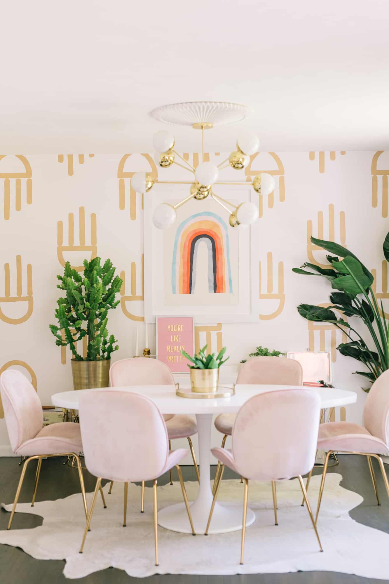
 I spend a lot of time in my dining area. No, it’s not because I am constantly eating meals (although I am a big snacker for sure), but it’s basically my office during the day since it has enough space for me to work on larger projects, good light for photographs, and a table to work on. Since I spend so much of the week in this room, I kept thinking of different ideas I wanted to do change up the vibe a bit from when we moved in almost four years ago. While I loved the pink walls that we’ve had in this space up until now, I thought it would be fun to totally change up the vibe with some tweaks and a new color palette and the results are a bit of a departure from what’s been my “normal” style for a while, but that’s why I love it!
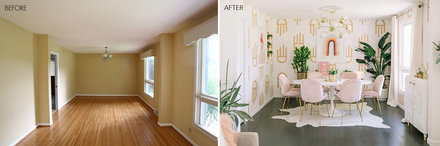 I’ve definitely tried to give the space more contrast and personality from our blank slate when we moved in four years ago. It always takes a while to customize a house but it’s worth it!
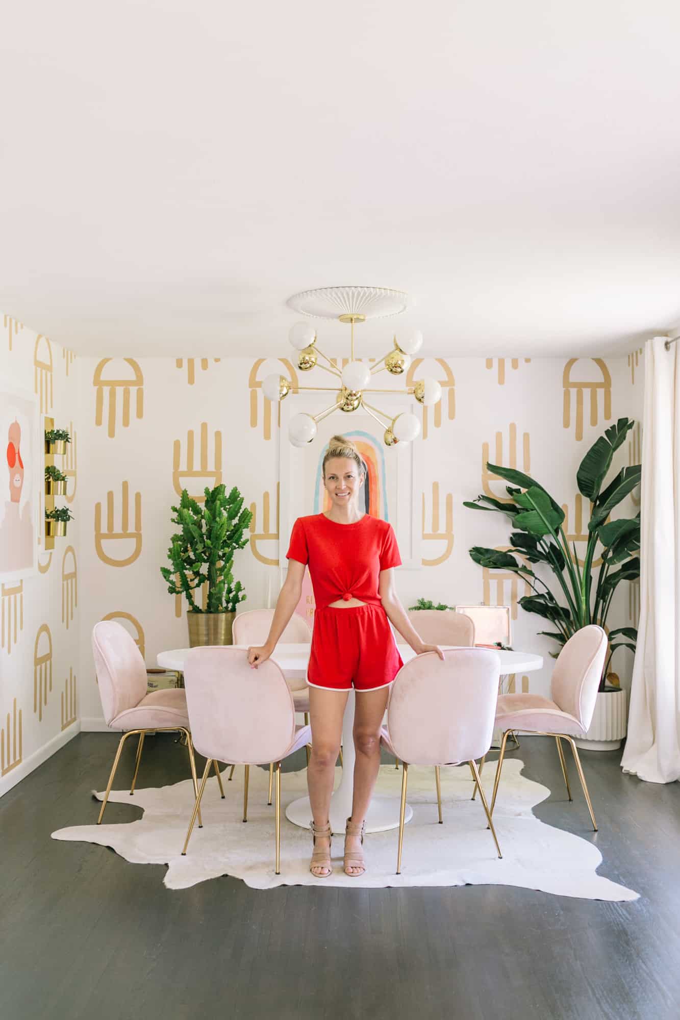
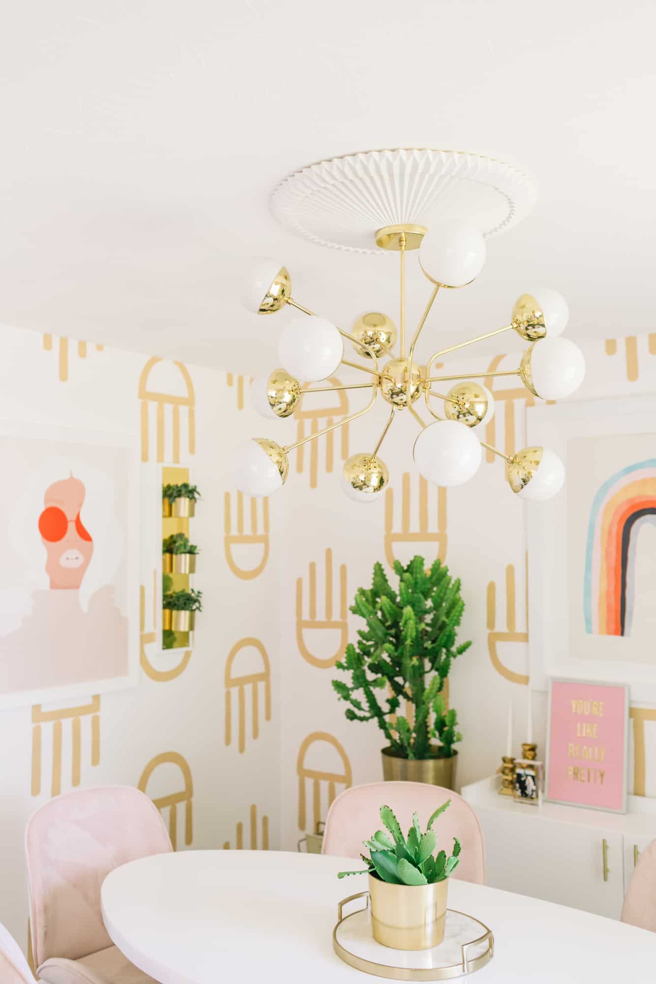 One of my favorite new things in the space is this amazing parlor chandelier—it feels like just the right amount of mid-century awesomeness with a little bit of fancy to make the area feel special (and that ceiling medallion really puts it over the top, if you ask me).
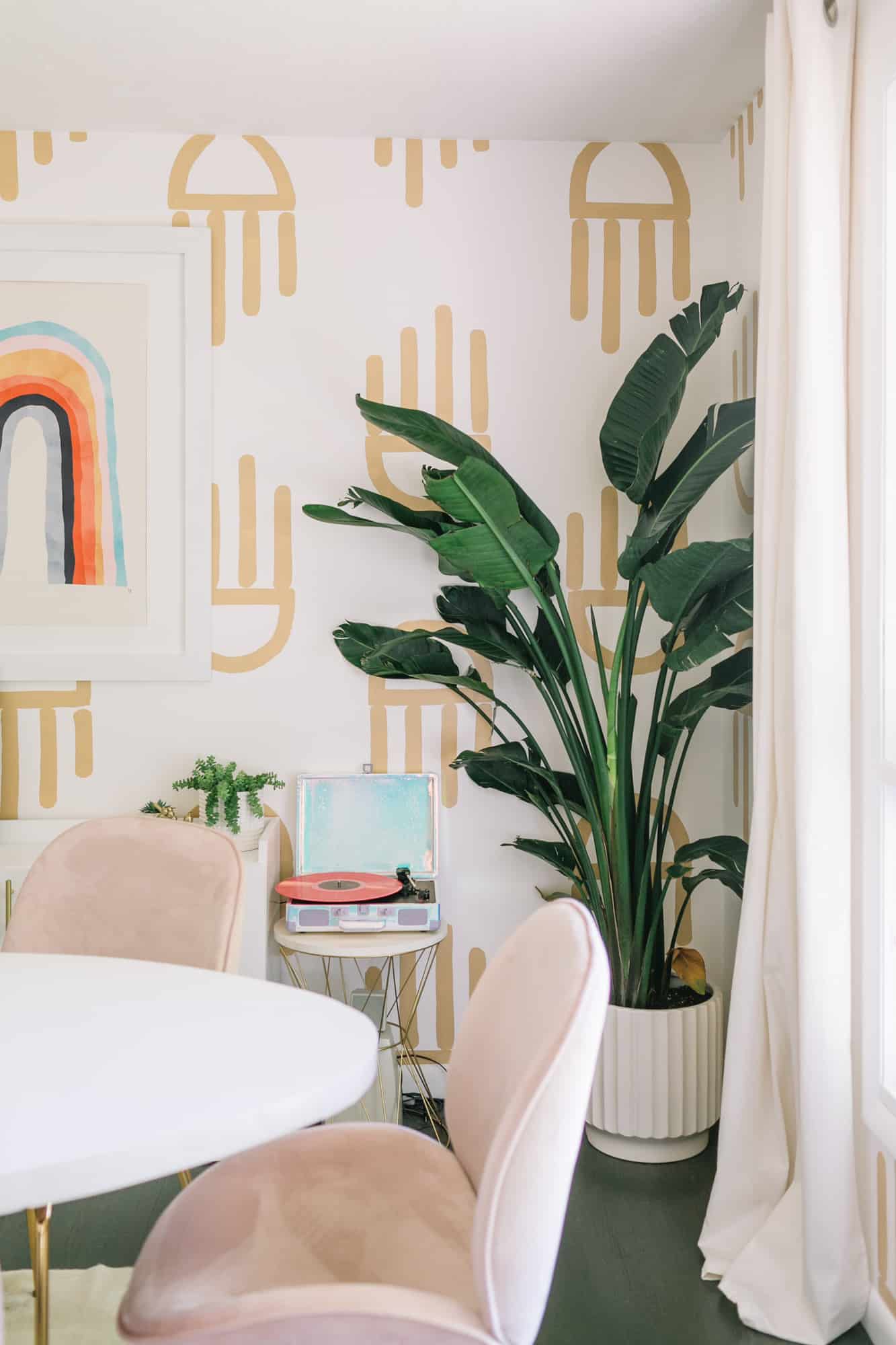
I tend to do mostly white and gold planters so I love when I can find white ones with pattern or texture like this to make it feel a little more interesting without being overwhelming.
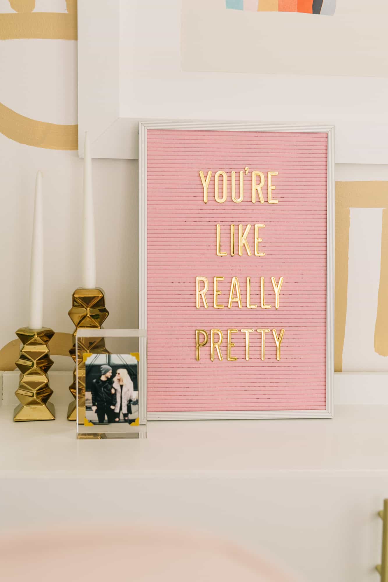
Love a Mean Girls quote anywhere at anytime … especially on a pink letter board with gold letters! That lucite photo frame is still one of my favorite photo DIYs and it’s sooo easy to make.


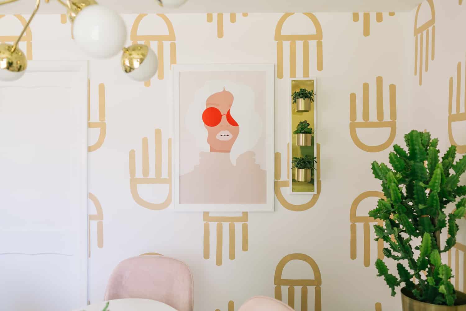
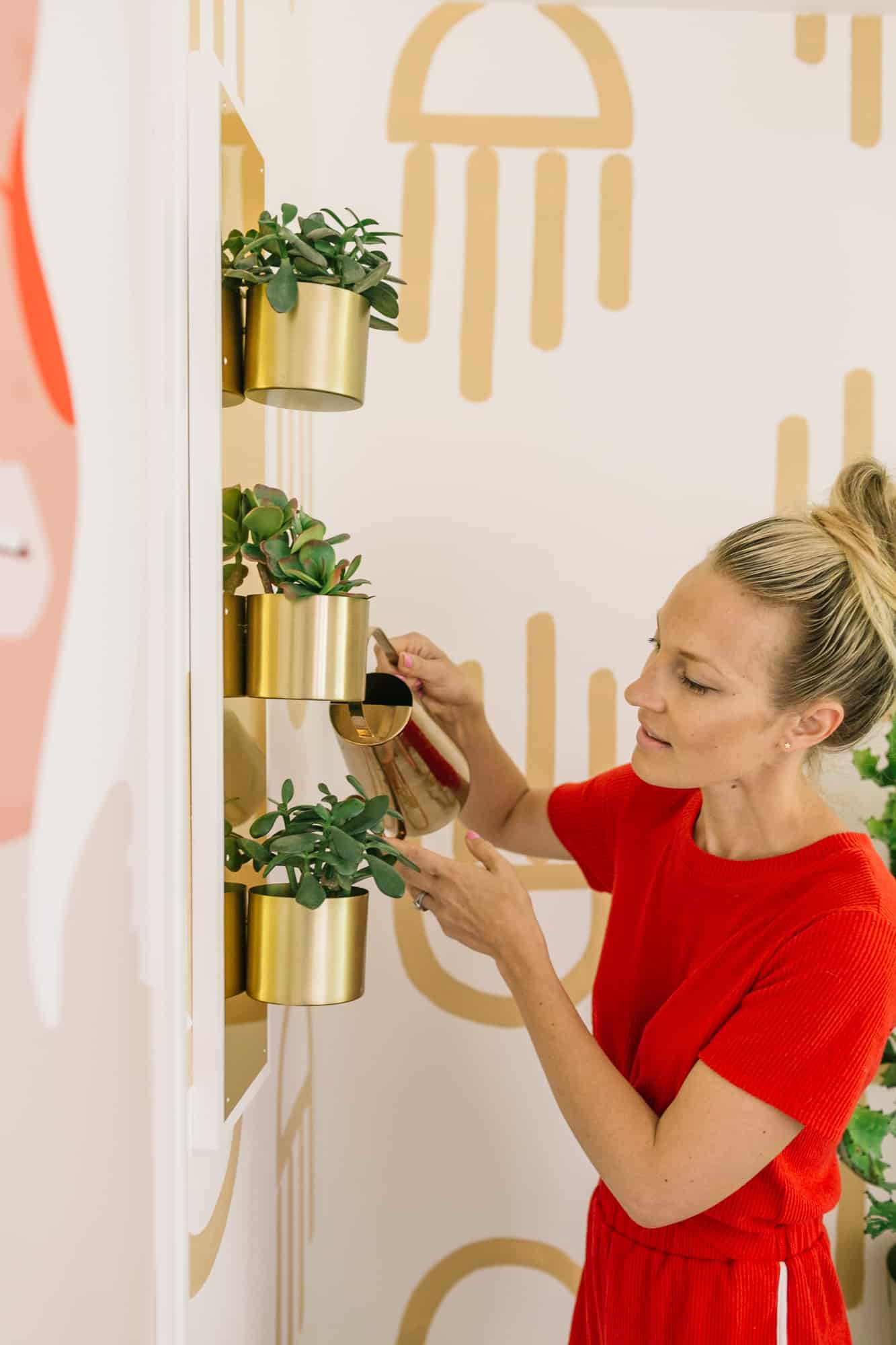
Would you believe that brass wall planter is made from a door kick plate? I always wanted to make something with one of those and I love love love how it turned out! I love that illustrative print by this artist so much—I basically want to build my whole house around her vibe! It looks like that particular print isn’t available anymore, so I’m so glad I snagged it when I did.
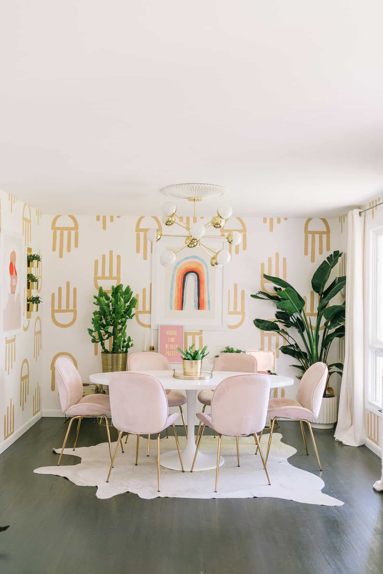
The oval dining table is actually my old rectangle table DIY that I turned into a mid-century IKEA hack! I think that tabletop has been with us for almost six years now, so it’s definitely one of my longest running DIYs around the house.
I love the color palette in that rainbow print and I still use this oversized custom frame DIY for a lot of larger prints in my house.
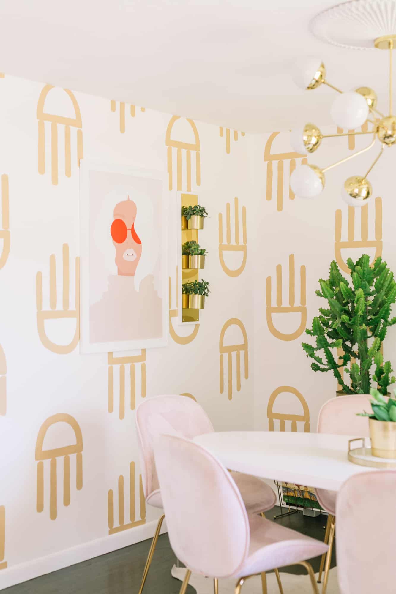
I really wanted to do some wallpaper in this room, but I’m a bit of a commitment-phobe when it comes to actually wallpapering a room, so I opted for a handpainted wallpaper instead! The shape is supposed to be a little like an abstract hand, but some days I just see shapes and other days I see jellyfish, so I guess it can be whatever I want it to be! Either way, I love how it turned out and it was fun to push myself and do something a little more bold with the room design (and since it’s a neutral color I can change the colors in the room as I please).
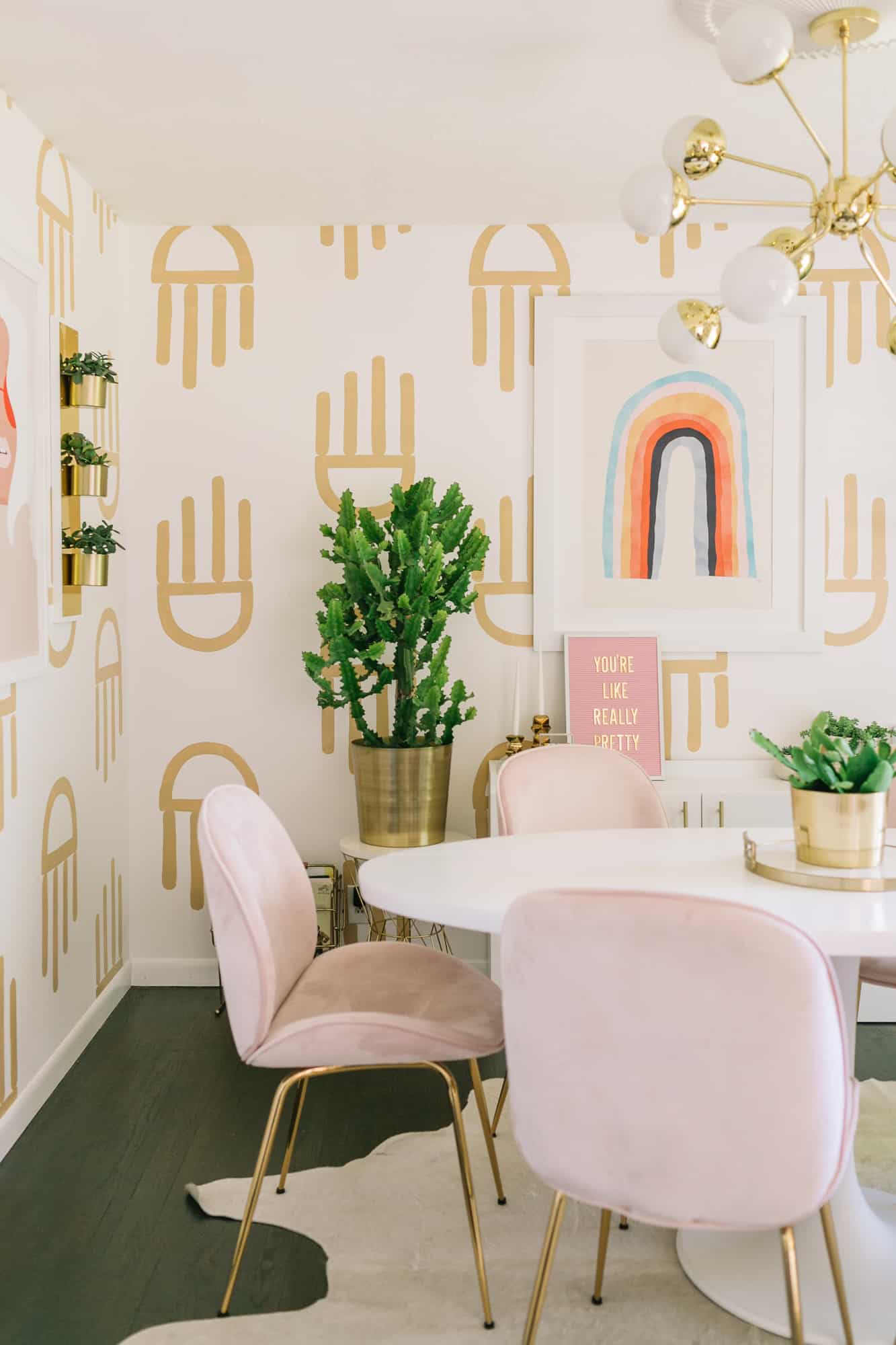 When thinking of my new dining space, I really wanted to get some pink chairs and these blush velvet chairs were perfect for the new vibe of the room (and they are actually really comfortable too!). As soon as we unboxed them, they’ve also become the favorite napping spot for both of our cats, so I do have to vacuum them every so often. But I love the look, so it’s worth a little extra effort. I also love using a cowhide rug under a dining table as they are almost impossible to stain/ruin with food and they vacuum up really easily as well.
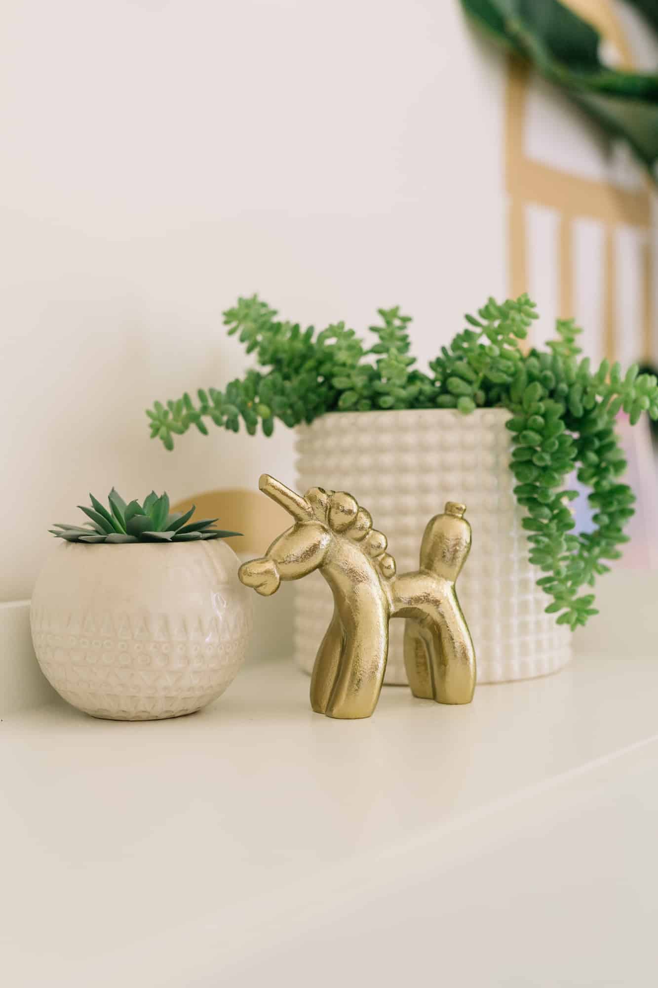
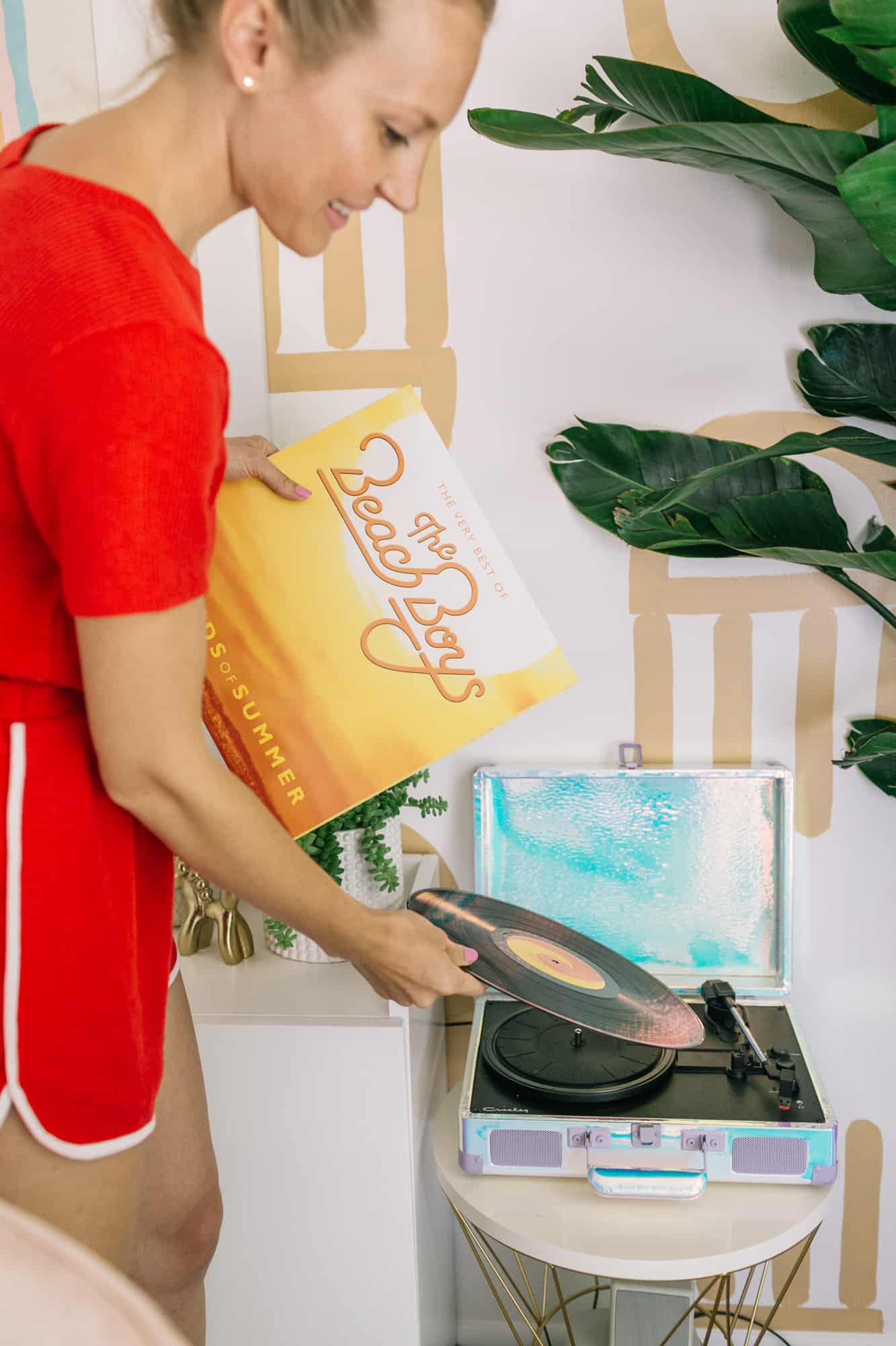
I love having a little record player in the dining area so I can listen to albums while I work and sometimes we’ll do “theme nights” with dinner where we play Pavarotti while eating Italian food, etc., and that makes mealtimes more fun/educational as well for Lola.
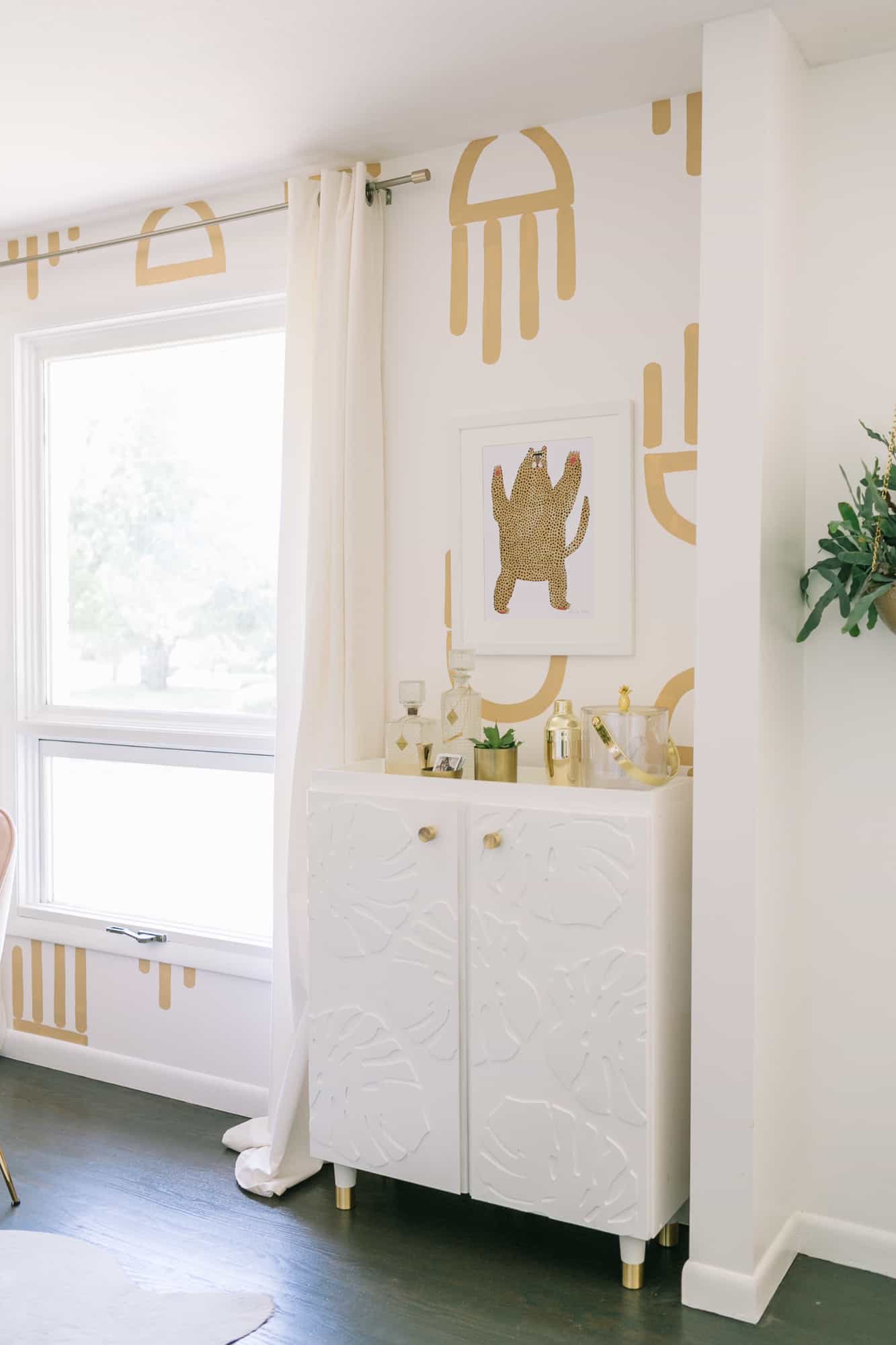
I created this IKEA cabinet hack to help keep all our bar cart items away from Lola (we had an open bar cart in our other dining room design) and while I loved the multi-tone green paint in the original version, it competed too much with the wallpaper. So I made it all white instead to give it a more subtle leaf pattern that isn’t too loud but still has a custom feel to it. That leopard print is also one of my favorite things in the room.
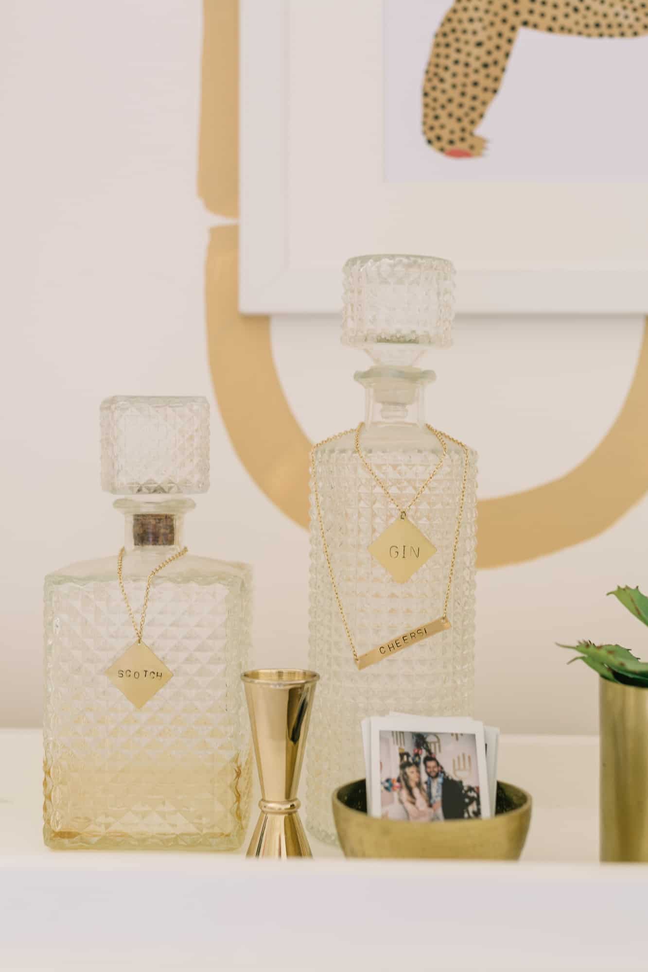
 Overall, I feel like the room has a playful-with-a-vintage-throwback vibe and that’s still something that’s my favorite thing to create, even if it’s in a new color palette for me. Overall, I always feel like it’s fun to take some risks and do something a little more bold, so I encourage you to make a few decisions that scare you a bit too in your space (especially if they can be redone relatively easily)! Thanks for stopping by! xo. Laura




14 Comments
I love the funky wallpaper, it works so well with the decor of the room! The dining chairs are so cute as well. 🙂
Charmaine Ng | Architecture & Lifestyle Blog
http://charmainenyw.com
You have me rethinking should I do a dining room, but I can hear my fiance screaming no round tables. This is definitely fresh and vibrant.
I love that you have a style that’s so distinctly yours! It must be so inspirational to look around while you’re working and to see a lot of the ideas that bounce around in your brain throughout the day come to fruition.
a.) You have inspired me to have a theme dinner night
b.) You have also inspired me to buy that Beach Boys album
c.) Hate to be this person, but can you please share where you got your romper (think it’s a romper)? It’s a vintage dream and I want to wear it while watching Now & Then.
Thanks for sharing, Laura!
Hi! So glad it’s been inspirational! It’s a romper from target last year, sorry it’s not still around!
Laura
The link to the rainbow print just takes you to the Society6 page but not the specific artist itself. Could you share the artist? Thanks!
Here you go! https://society6.com/product/shelter865753_print?sku=s6-7892778p4a1v45
Thank you, Jacki!!!
Where is the gold unicorn from?? ????
I can’t remember! Sorry!
Laura 🙂
I like the transformation from ordinary to a unique and particular room, very welcoming and bright! Bello!
It would be fun to also show a before refresh compared to the after pictures. This would give the reader a better perspective of the current changes in the room. Though I do appreciate a link to the previous room update. As always I enjoy these posts!
That wallpaper is so fun, I just love it! I would love to redo my dining space, it’s the first thing I decorated 10 years ago and it’s just boring! Great inspiration here
xo Jessica
My Style Vita
Love the hand painted wallpaper!
Oh my goodness this space is too cute! I cannot get over the print on the walls! In love with it
– Grace | The Keen Kind