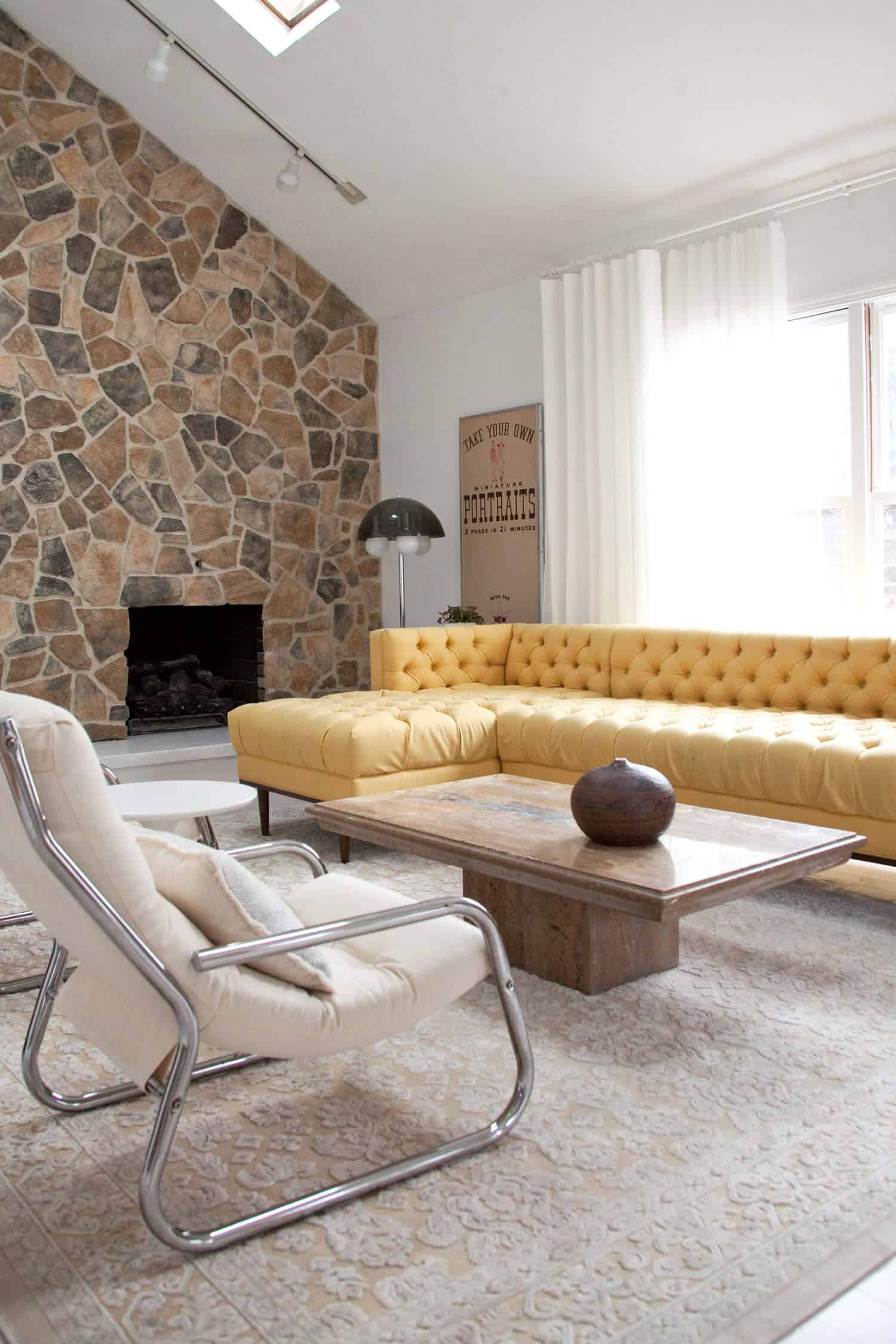
 It was only a few short months ago that I posted a tour of this home and announced we were placing an offer. I had a couple of friends say they were surprised. It didn’t seem like a good fit. Not much character. Kind of weird in ways. But here we are, and I’m excited to finally share the outcome of my vision for this living room space! And I feel like it might make a lot more sense now.
We had missed out on a home with a sunken conversation pit in front of a lava rock fireplace, so every home I viewed after that one could never measure up. I realized I needed to get really creative about what could be done to a space, instead of trying to find another house with something as awesome as a conversation pit. (That one was probably a once-in-a-lifetime find for my budget!) Though our current home was built in the ’80s, I wanted to bring some mid-century flair to the living room (which is technically sunken, since you take a step down into the space), but not so much that it felt at odds with the rest of the home, or the home’s character. I was able to achieve the loungey vibe that I love about a conversation pit by transforming the brick fireplace into a tall stone feature element, and building out the hearth to extend the entire length of the wall.
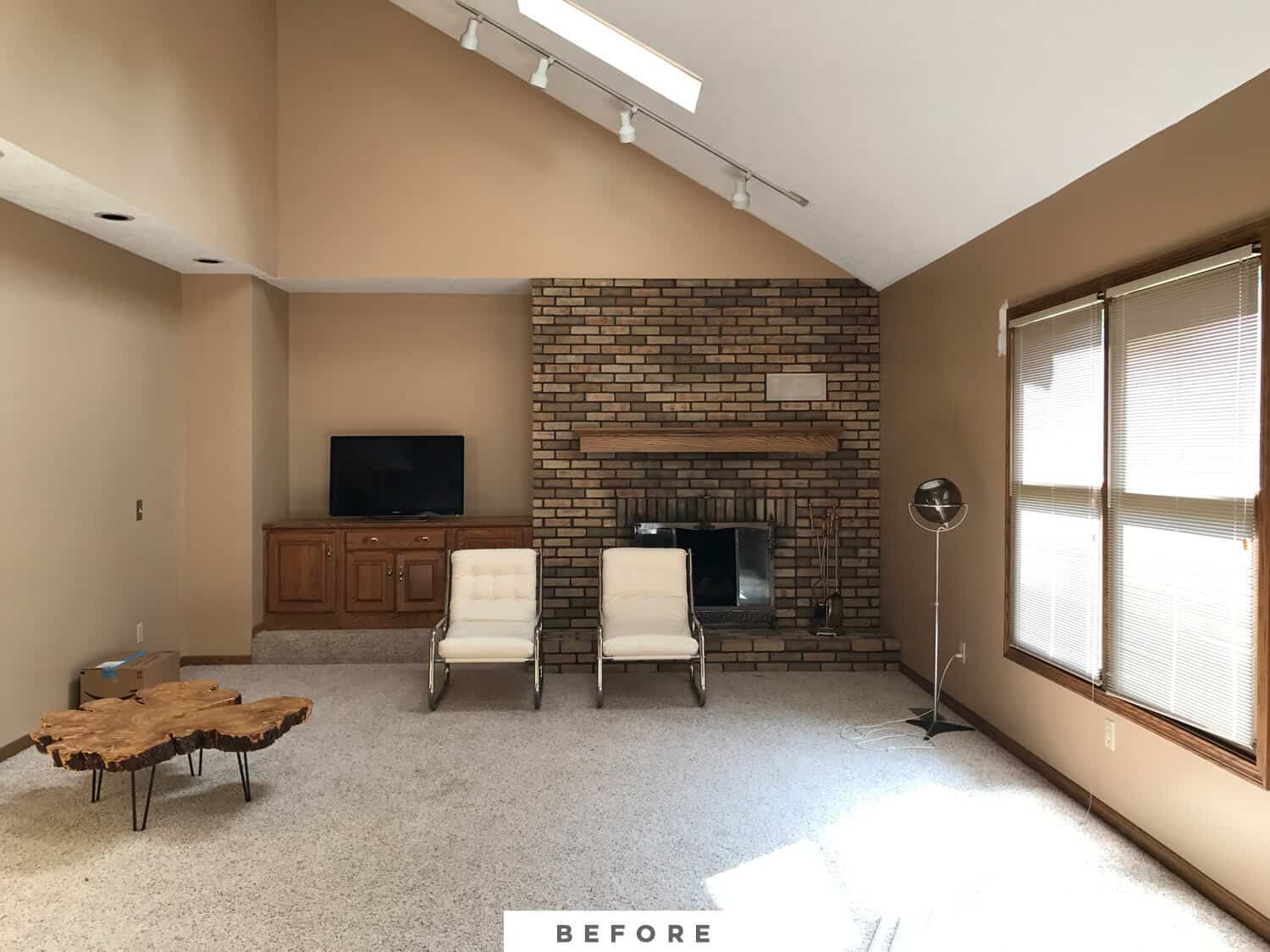
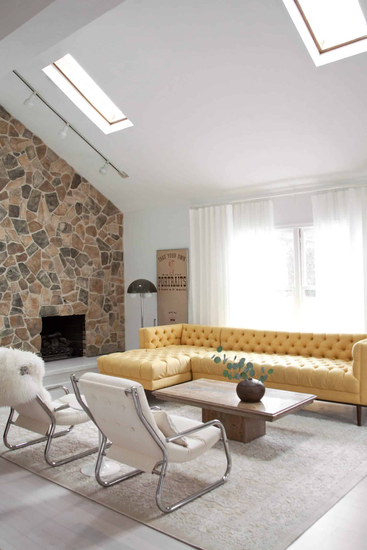
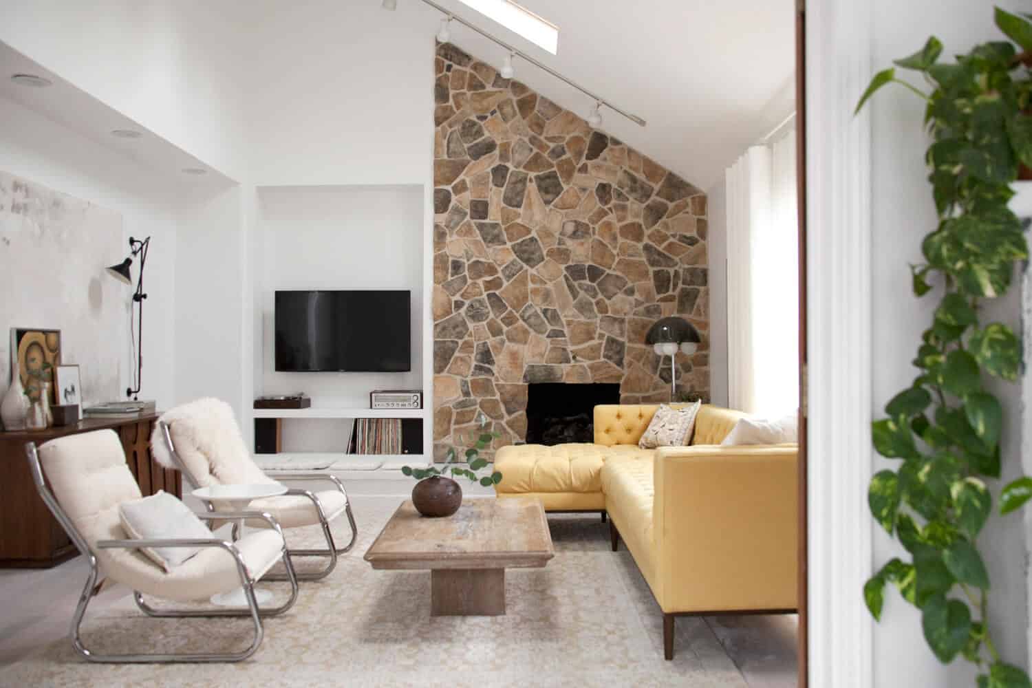 You can read all about the process of making over the fireplace wall on my post from earlier this week, but I’ll sum it up for you here too. I actually didn’t do any demo on the fireplace wall (besides removing the mantle and carpet). Instead, I chose to cover up the brick with an affordable manufactured stone veneer product called Cultured Stone by Boral. I wanted a warm neutral stone with some variety in its mix, adding textural interest and even pattern to such a starkly bright white room. So I selected the Old Country Fieldstone in the Summit Peak colorway and hired my friend, mason Jeremy Miller, to install it for me. He installed a moisture barrier over the drywall above the fireplace, mounted metal lath to that, and then covered the whole area with mortar to make an even surface for mounting the cultured stone veneer. I think out of all the changes we’ve made to our home so far, this has been the best decision! Such a big bang for the buck.
On the newly extended hearth, I chose to use Ardex Feather Finish in white, which is a concrete material meant to be applied as a skim coat or floor underlayment. I chose not to use the manufactured stone material on the face of the hearth because it would stick out beyond the upper lip of the hearth, which I would then have to build out to maintain any kind of dimensional overhang, and that just seemed like too much work for something I wasn’t even sure was the best choice. So I decided on the white Ardex because it has a natural material vibe, but it wouldn’t add any visual or physical bulk like stone would. I’m glad I chose to make the hearth bright and white, as it looks streamlined and fades nicely into the floor and walls, allowing the stone wall to be the focal point of the room.
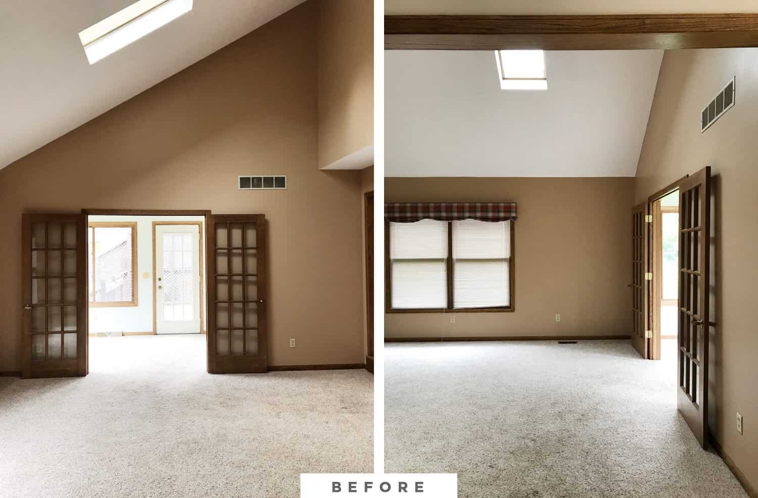 Of course another huge change for this space was the new wall color and flooring materials. Paint is the least expensive way to change a space, and while I do love a cozy darker color in the right application, I just wasn’t feeling it for in here. Because of the angles of the ceiling and soffits in here, choosing a color that contrasted with the ceiling was making the space feel angular and tense. Painting the walls with Benjamin Moore’s Super White now makes the ceiling feel like its soaring, and blurs the line between where the wall ends and the ceiling begins.
I do plan on using some moodier colors in other rooms of our house, like our entryway and study, but I definitely feel like our living room was made for white walls.
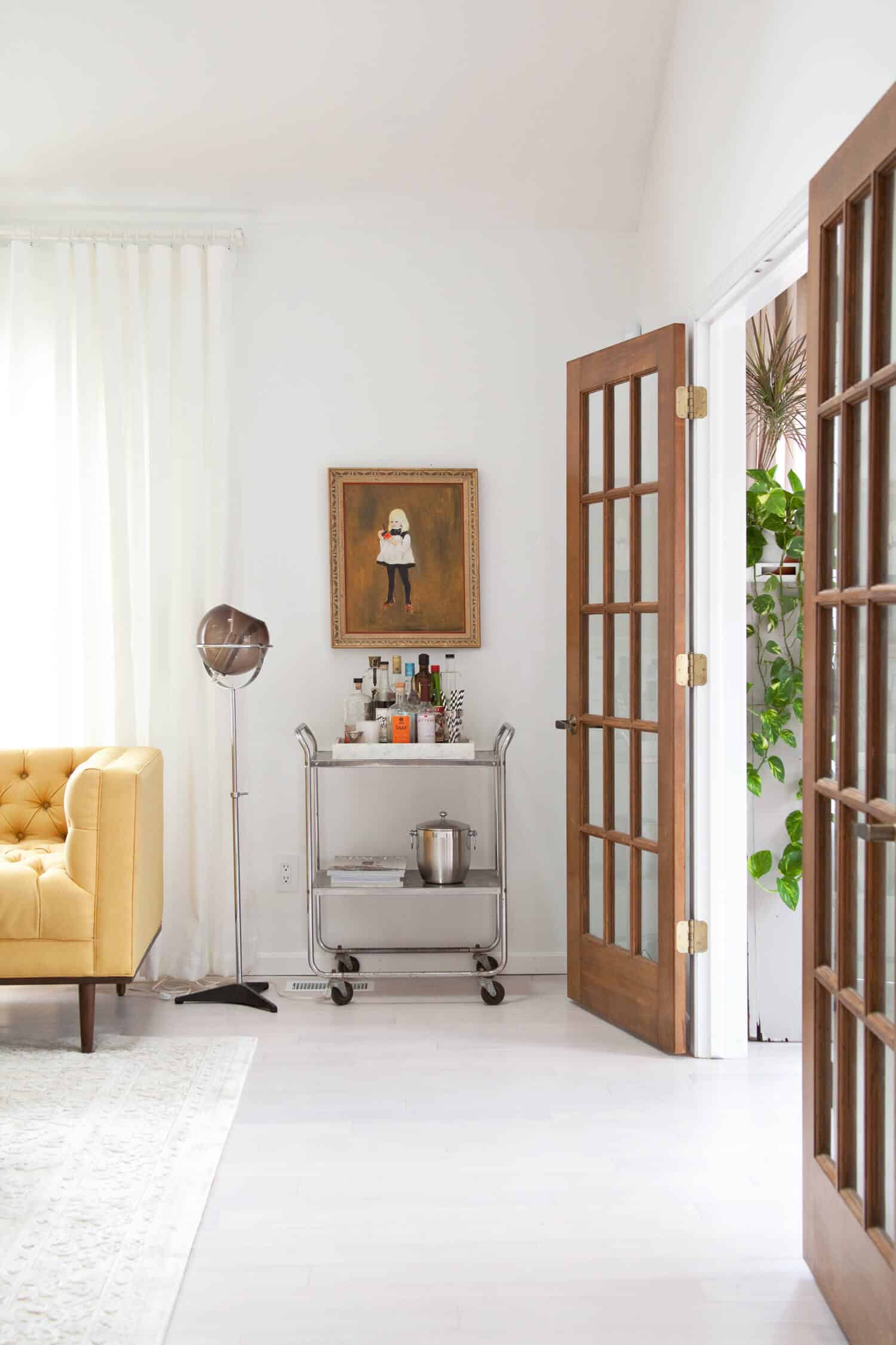
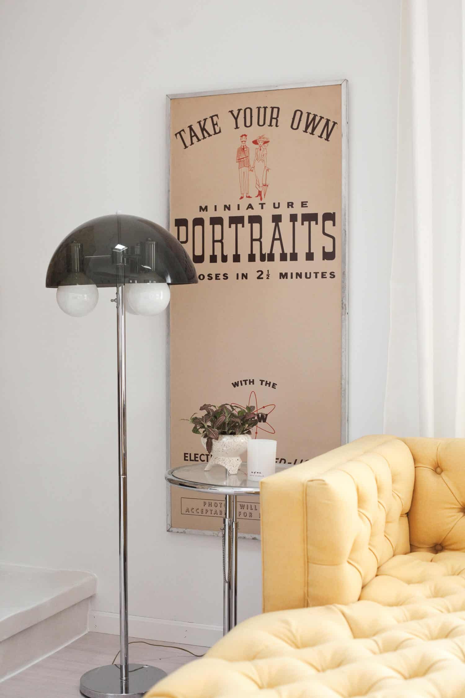
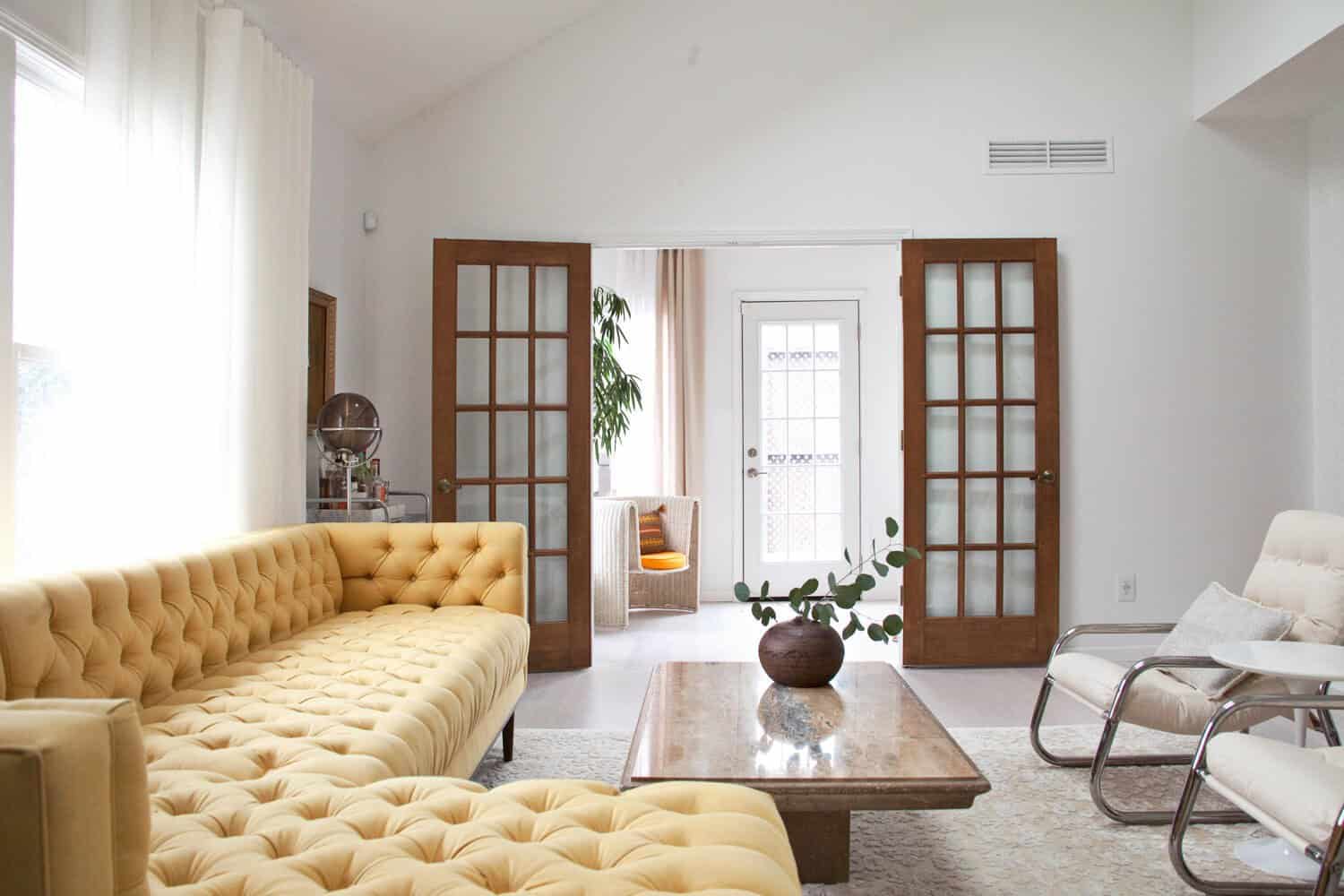 The bright space of the living room is enhanced by natural light coming from two skylights and a window I’ve visually enlarged with four stack-back curtain panels, but it also benefits from a lot of light pouring in from the adjacent sunroom. The sunroom is one of two ways we can access our back deck, but that door hasn’t gotten any play since we’ve moved into the house. Maybe one day it’ll see more action when we add a dog to our family, in which case I’ll probably add a large rug to the sunroom as well.
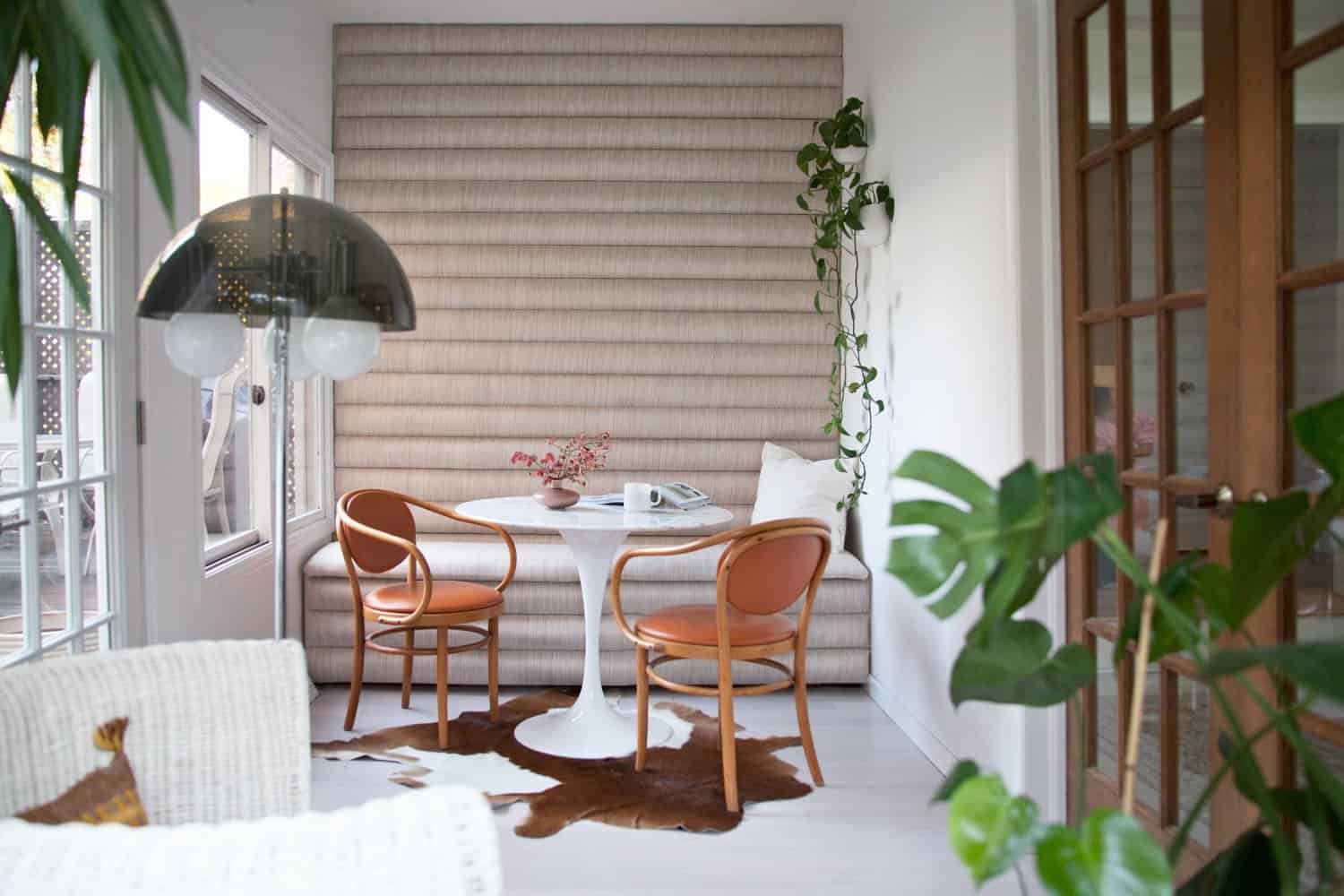 You can check out more of the sunroom details over at my blog, and see how I built the channel-tufted storage banquette on this post here at A Beautiful Mess. It’s a bright little space where my houseplants are really happy, and I love that the view into the sunroom contributes a touch of greenery to our living room. I’m considering moving my big ficus into the living room this spring, but we’ll see what my heart tells me!
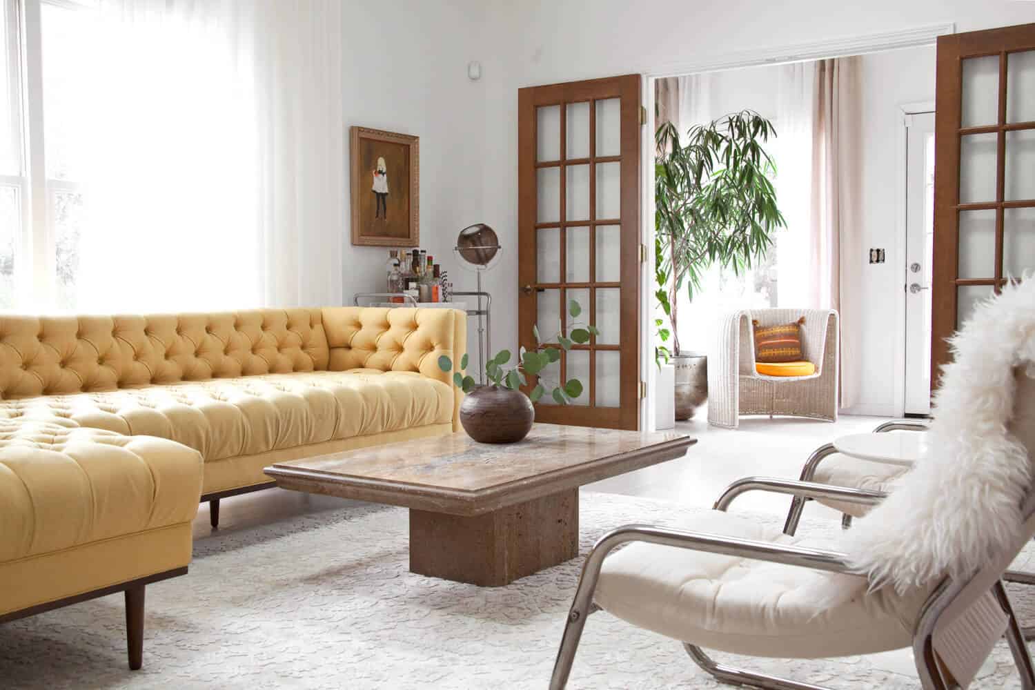
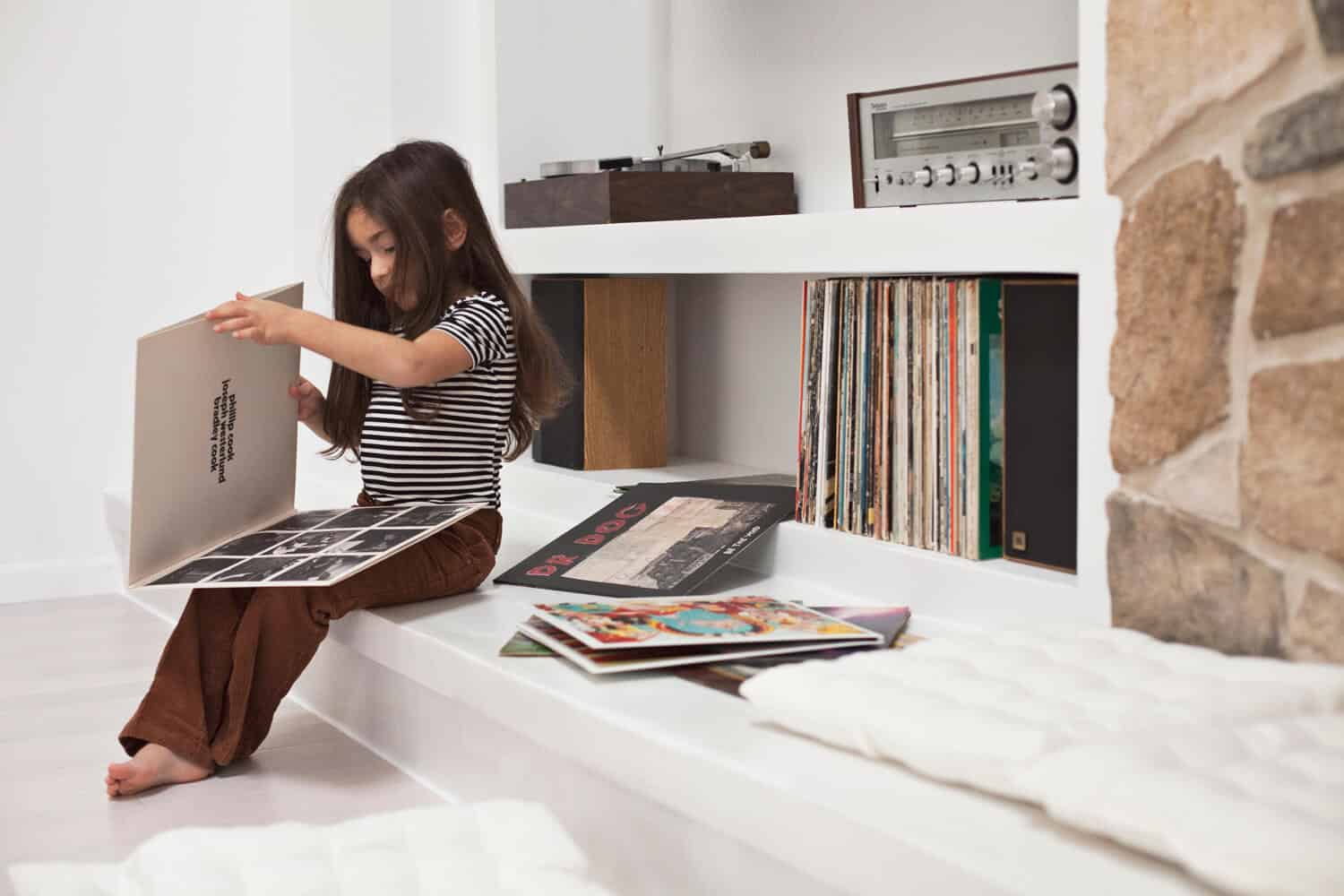
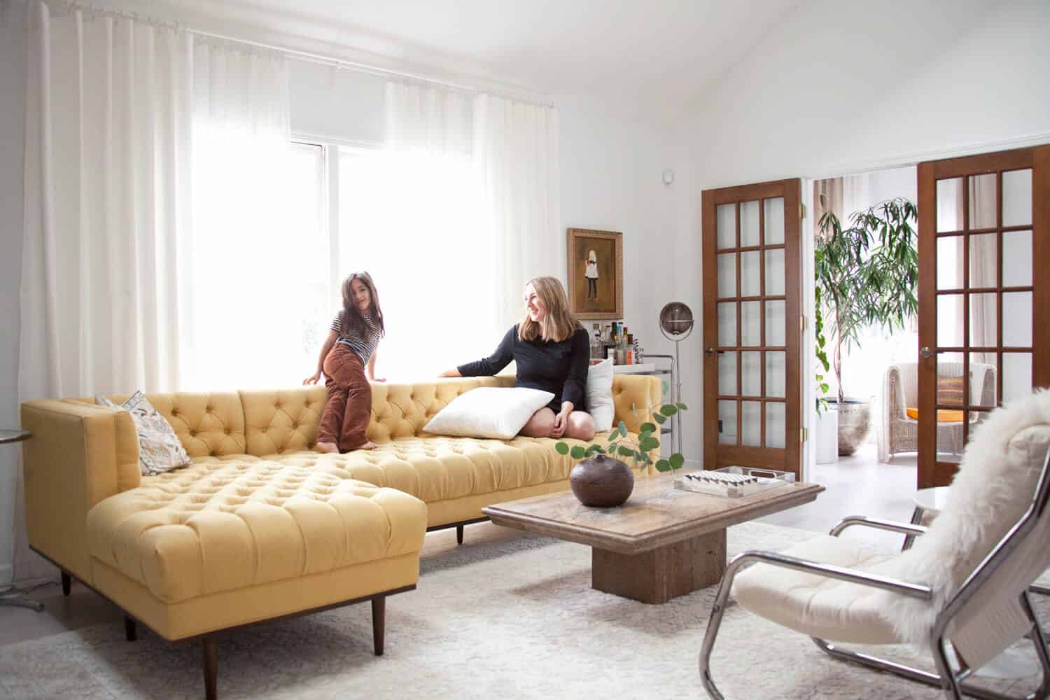
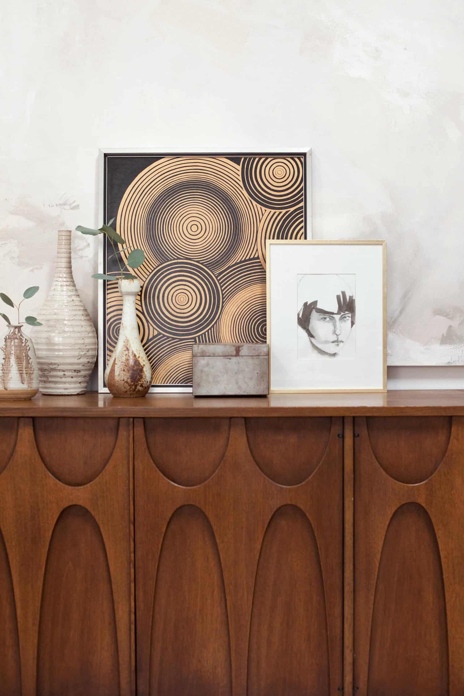 It’s difficult for me to nail down a description of the decor style for our home, but if I could sum it up, I’d probably say our home is a mix of mid-century modern, ’70s boho, and ’80s transitional—with a touch of Bauhaus and Scandinavian influences. I steer towards earthy neutrals with lots of texture and bold style, but I like to add a pop of color where it counts— like with our gorgeous yellow Welles sectional from Joybird.
I’m actually in the process of swapping out this sofa for a larger L-shaped sectional from Joybird, but I’m either sticking with yellow or choosing an adobe orange velvet. We decided on the swap because we wanted more seating in here since we host a lot of parties, book groups, and movie nights in this space.
 I love the mix of old/new and high/low that fills this space. I wanted our new home to feel sophisticated, but also cozy and inviting. Of course, as with any home, this space will always be a work in progress. But it feels good to finally be finished with the big projects in here and to be able to call this space “done” (for now)!
If you have any questions about my design process or about the materials or products, I’ll be checking into the comments below to reply to everyone. I did add a link list at the end of this post to help you track down any products, or to disappoint you in the event the piece you love is vintage! Ah, vintage. Such a heartbreaker, eh?
Thanks for taking a peek into my home! It’s a joy to finally be able to share it with you. – Mandi
 Living Room Materials and Product Sources:
Wall paint: Benjamin Moore’s Super White
Fireplace stone: Boral Cultured Stone Old Country Fieldstone in Summit Peak
Flooring: Lumber Liquidators engineered bamboo
White Ardex: eBay
Large area rug: Lulu & Georgia
Sofa: Welles sectional from Joybird
Glass side table: All Modern
Coffee Table: Chairish
White chairs: 1st Dibs
White side table between chairs: LexMod
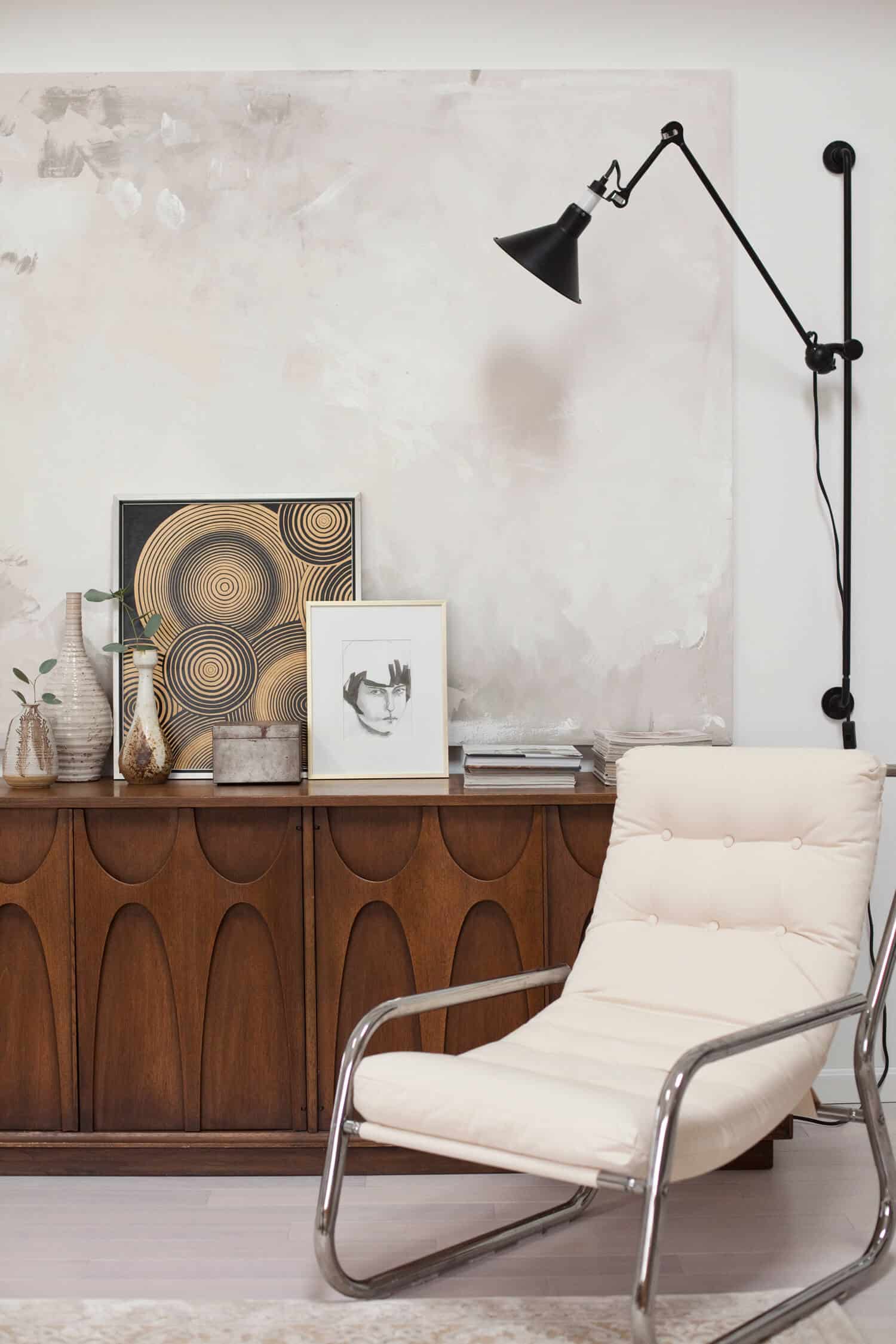
Credenza: vintage Broyhill Brasilia from Main St. Modern in Canton, Ohio
Black swing-arm wall sconce: Hayneedle
Curtain rods: IKEA
Curtains: HomeGoods
Hearth cushions: Deal Genius
Sunroom wicker chair: vintage from Main St. Modern in Canton, Ohio
Sunroom table: Lexmod
Sunroom rug: Amazon
Sunroom wall planters: West Elm
Watercolor Louise Brooks portrait on credenza: original from German artist Galerie Minimal on Etsy
Large neutral art created by my girls
Decorative trays: Home Goods
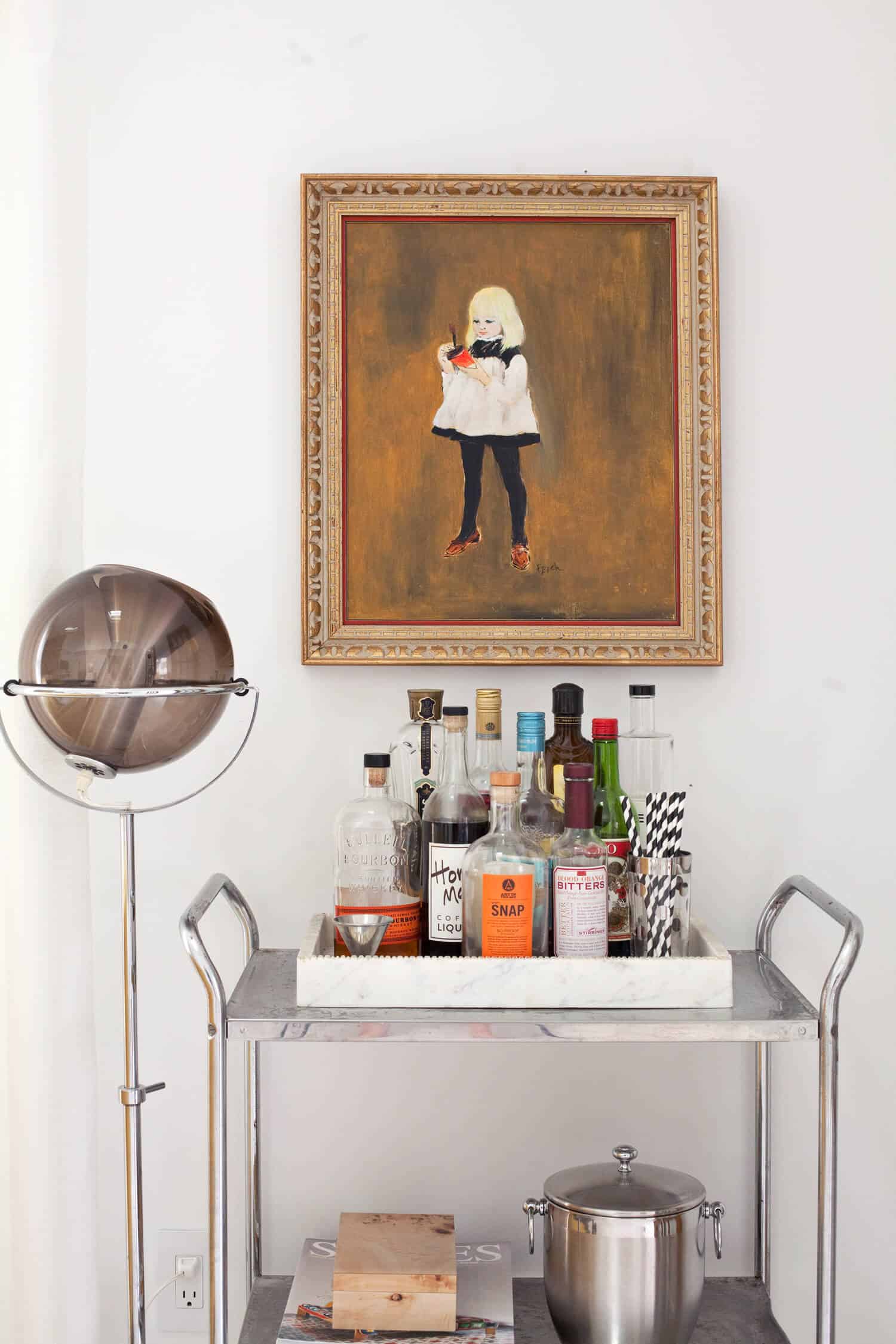
Vases, floor lamps, bar cart, photobooth panel, yellow op art, and little girl portrait are vintage.




28 Comments
I love, love, love the living room, Mandi! 🙂 I’ve pinned a few pictures to my blog because it’s so beautiful. It’s minimal which is nice for a clutter-free look, but it looks so comfortable with the brick wall and wood furnishing. That yellow sofa, though, it just completes everything! ❤️❤️
Charmaine Ng | Architecture & Lifestyle Blog
http://charmainenyw.com
I agree! The yellow sofa makes the space.
That is one stunning flat!
That room is gorgeous, I really like the 70s vibe!
https://www.makeandmess.com/
Love it, Mandi! I adore the abstract painting too! I may need to let my almost 2 year old take a whack at creating too ????
Do it! If you don’t like what they create, you can always paint over the canvas and have them do it again. They’ll have a BLAST, and you get great abstract art! 🙂 (I just recommend waiting for warm weather if you live somewhere cold, so you can do it outside and wash up outside too.)
The one thing that confuses me about this room is how you guys watch TV in it. The TV is so off-centered from where the actual seating space is – does it pull out so you can angle it towards the couch? There’s no way you could watch it from the chairs without turning your neck 45 degrees – yikes!
Yes, the TV is on a heavy-duty bracket that pulls out pretty far from the wall and rotates in every direction. However, we are swapping our Joybird sofa for a full L-shape sectional from Joybird, so we won’t have to pull the TV out any more, unless there are a lot of people watching. Originally we had this sofa facing the TV (see it here: http://makingniceinthemidwest.com/2017/09/19/living-room-progress-halfway/), but we moved furniture out of the way to work on the fireplace, and I decided to just keep the sofa in front of the window since next week we will be putting the new sectional there anyway. It’s super difficult to move that stone coffee table, so I didn’t want to do that again if I didn’t have to. 🙂 As it is now, I move the TV out and angle it every evening, then put it back when we’ve finished.
Wow, I’m not even a fan of 70’s decor, but this is stunning! That couch! Those colors! That bar area! Incredible!
How do you like your new floors and did you install them? I fell in love with them on your media area post and thinking about installing them in my house!
Oh, the floors. Okay, let’s start at the beginning! Ha! I wanted to do light floors, but knew I didn’t want white-washed floors over the whole house. So I figured we could do them in one room and replace then in a few years if it looked too dated, because they were SO CHEAP. I didn’t regret it at all, aesthetics-wise. They look amazing! But they are SO easy to dent and scratch. I was warned by friends that bamboo tends to be that way. So, I guess I could recommend it in a lightly used space, not somewhere where furniture will be dragged around, or heavy objects will be dropped (like a kitchen or laundry type space). They are so affordable, but I would recommend doing a whitewashed wood instead of bamboo. If I could go back in time, I might’ve splurged on an unfinished oak flooring all over our first floor and finished it myself to save money that way. Oh, and yes, we did instal it ourselves and it was super easy! We bought a nail gun from Lumber Liquidators for the job.
Hi! what program do you use to make the floor plan of your home (that I saw in your blog when I clicked the entryway link).
I love interior design and I would want to learn more about how to properly make a simple floor plan like you did. Thanks in advance!
Hi Valeria! I actually have AutoCAD on my computer from my design days. Google SketchUp is a free software I’d recommend checking out. You can even do 3d modeling with it!
I love what you did with this room. Love love the fireplace wall!! I cannot wait to see what other colors you are going to use through the house.
I really like the fireplace. I have always pictured fireplaces as the focal point or the center of a living room, but I really like how the fire place on one side.
Laila from Townhouse Palette
This room looks amazing, and I love the fireplace/media center redesign. I was wondering, how cozy is your couch? It looks super structured, is it overstuffed and soft, and good for snuggling in on, or is it stiffer? I’m in the market for a new sofa, and have been coveting the styles on joybird but haven’t made the jump!
It loosened up and became more comfortable after we began using it, but whenever friends come over they usually say, “Oh, that’s more comfortable than it looks in pictures!” Ha! Which is kind of a funny thing to say, in my opinion, but I get it. Comfort is so subjective… if you’re looking for something you can sink into, they have better options for you. I wouldn’t recommend something with tufting (especially on the seat) if you want something cushy. Also, keep in mind proportions, like back height, if you like to have a cushion behind your neck when you sit. I personally don’t like the style of higher back sofas, but my dad, for instance, would hate having this one be his main sofa because of the lower back. It’s all a matter of personal preference.
Thanks for the insight, that’s super helpful!
This room is amazing! I love how well all of the pieces work together!
Paige
http://thehappyflammily.com
Great eye! Simple fixes that made a huge impact! Love it!
Beautiful room
https://thepinkpineappleblog.blogspot.com/2018/01/my-favorites-cozy-sweaters-for-this.html
Mandi – Love this space! I always enjoy your vision and process. Thanks for sharing! Question about the trim in this room… Did you just paint what you already had with Benjamin Moore Super White?
Yes, I did use the same Super White on the trim, but on the walls I used eggshell, and the trim received semi-gloss.
I cherish, love, love the front room, Mandi! I’ve stuck a couple of pictures to my blog since it’s so excellent. It’s negligible which is pleasant for a messiness free look, yet it looks so alright with the block divider and wood outfitting. That yellow couch, however, it just finishes everything
Gorgeous! I love your design aesthetic. Looks like a great and fun place to relax and hang out with friends!
Hi Mandi!
Thanks for including us in your write up. Your living room looks fantastic!! Just wanted to drop an updated link to the chair cushions for reference if you ever want to update the link. Thanks!
https://www.dealgenius.com/4pk-dream-home-tufted-chair-pad-cushions-linen-look-feel-2.html
Thanks!
Absolutely love what you did with the fireplace!