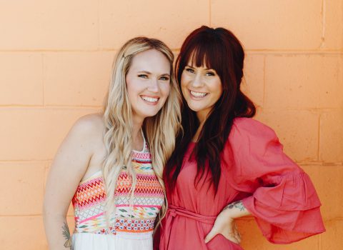
We’ve invited another one of our favorite A Color Story users and all-around BOSS photographer, @ariellevey, to share her secrets on creating her signature photo style.
Hey, guys! It’s Arielle, and I’m back with more tips and tricks on how to elevate your photos using (my fave) A Color Story. Today I’ll be touching on how I edit my photos on a regular basis and how to achieve rich, dramatic tones. I’ve been editing this way since iPhone editing apps came out, but since ACS was born, I’ve had much more flexibility with my options.
As with all photos, great light is key when it comes to your end result. For these particular kinds of edits, I encourage shooting in the early morning or during golden hour for deeper tones. Experiment with different times of day and remember shade is always on your side too!
For a jumping off point, my top three filters lately for deep tones are: Magic Hour from Good Vibes (how appropriate, am I right?!), Deep from Deep, and Patina from Deep. These three are going to automatically give off darker shadows and a natural contrast while maintaining true color. As a side note, I always apply my filter(s) first before any adjusting. This will pave the way for you to make it your own with the tools at hand moving forward. Let’s get into it!
I’ll never forget in Photoshop class before editing apps existed, I was instructed to edit in “onsies and twosies”, meaning watch closely and adjust little by little to start. This goes for any change you make: filters, contrast, saturation, curves, etc. For example, with every image I edit, I rarely go 100% intensity on any given filter. I think this gives off more of a custom look and will allow for more control as you make changes to the photo. For this example, I applied the Magic Hour filter at 10%, and then continued to add contrast, saturation, yellow, and purple tint at 10% over and over. Always feel free to keep reapplying any given tool if you feel like you want more of something. I finished this edit off with the coral color fog at the top of the image.
2. Contrast is key
Shifting contrast slightly at the beginning of any photo is a great adjustment to start with (after your filter) because it’s the main tool for achieving this particular look. Essentially, you’re upping the highlights and darkening the shadows. From there, you can see what the photo needs. Depending on the edit, I’ll go in with contrast as a final step as well just to deepen everything a bit more. The example above only has one filter applied (Candy Girl at 70%), and the contrast was bumped up by 30%.
3. Shifting tones with highlight, midtone, and shadow colors
I am truly obsessed with these tools! One reason being, it’s so customizable to virtually any photo. When it comes to reds, greens, and blues, you get to choose which color you want a little bit less or more of. Here’s an example of shifting midtone and shadow colors with blues and greens. This image has no filter, a tiny bit of contrast, and I bumped up the green midtone and shadow by about 50%. The other image has the same steps applied but using blues instead. This can dramatically change the look of the photo with just a couple quick steps.
Do not fear the saturation tool! I still start off little by little with this as well, but once I discover what colors I’m going for, I’ll add 200% to some images.
It truly depends on the shot itself, but once you start playing around, it can be so much fun to see what it can do. The only thing I would watch out for on this is skin tone. Keep it simple if so! For this photo example, I’m using a darker photo to show you how much color you can pull from using 100% saturation. This image started out with contrast at 50%, then the yellow temperature brought up by 30%, and then saturation at full intensity.
5. Remember: Nothing is off limits!
Digital art is so unique and there’s nothing you can’t do. With the slightest shift of the yellow tint tool, you can warm up the mood of your photo or bump up the red midtones on a blue sky and watch it turn pink. The filters can inspire tones and set the stage for your style of editing. Every tool is there for a reason, so experiment away!
Thanks for taking the time to peek into my ACS techniques! I can’t wait to see what you create. –Arielle
Credits // Author and Photography: Arielle Vey


28 Comments
Love this! Arielle’s photos are always awe-inspiring!
great tips! I’m definitely going to take these into consideration in the future! thanks for sharing 🙂
dorky-and-weird.blogspot.com
Xoxo Jessy
These before-and-afters are amazinggggg! You are seriously a magician when it comes to these edits. Whether it’s the ocean or a cocktail, I’m always in awe of your posts. Thanks for sharing these great tips!
These photos are gorgeous! Thanks for the tips. I have been using different photo editing tools, but I am downloading ACS now 🙂
I’m thinking that the world is changing. We now have all these editing tools that once were the purview of professionals in print magazines such as Vogue and Bon Appetit. As consumers, we never saw the “Before and After” so we rarely questioned the reality of what we bought on the news stand.
Only recently, as technology has democratized, have we started to talk about Photoshop fails and body shaming based on altered images. We realize that these photos could actually damage our self-perceptions.
As I read this article, all of that came to mind. It is fun to alter an image and play with it and make it into an idealized picture. Artists have done this forever – think of Maxfield Parrish. Artists and their viewers knew they were idealizing, though, since it was obviously a painted image.
There may be a sub-plot, though.
Photographs were different. One used to think they held “truth.” But with the ability to rapidly change a so-so image into a magical one, are we heading down a path that leads to dissatisfaction and an inability to accept the real world as it is? Imagine a person sees photos of a pink beach, for example, where the image has been amped up and the beach becomes this glorious PINK tint.
Now, if someone were to book a trip to Indonesia, will they be let down by reality? Will Mother Nature not live up to expectations? And what does that say about our future ability to enjoy life as it is?
I love this post (and your app) so much! Indeed, contrast is your bff! 🙂
http://annescribblesanddoodles.blogspot.com
So, so gorgeous. I LOVE this. <3
All of these images are gorgeous. I honestly thought the app didn’t make my images as sharp as VSCO but I’m in love with that pink filter. Literally the ocean image took my breath away!! Trying it again now?
I think this is a fun topic to explore, Susan. Personally, I already feel so used to the “difference” between edited photography and real life that it doesn’t bother me anymore. Although there was this ONE place where I went one time that was SO much uglier in person that it made me kind of sad. That said, I didn’t feel like it was anyone’s fault and I didn’t feel lied to. I could just see once I was there in person that all the photos of it would have to be heavily edited to be any good.
Also, I personally wouldn’t compare color tinting images to photoshopping a body or body shaming. You really are just tweaking what is already there (just as if you used a colored lens) and not necessarily altering reality in an offensive way. Just my opinion, though! When we created A Color Story we thought about having features like what facetune has but ulitimately we decided that we didn’t want our app to be used in that way.
One last thing- I am so incredibly inspired by Arielle and others on Instagram who are able to edit in this way. I DO consider it art. 100%! I am so grateful that she would come on here and teach us her black magic!!!!
Have a great weekend! Elsie
Thanks for the amazing tips!
http://www.distinguisheddiva.com/2016/08/serena-williams-for-self-magazine.html
I enjoy this app. there is a lot of variety in the filters. one of my new favorites
Such gorgeous edits! I love the first one especially with the pink sky.
Angelina Is|Bloglovin’
I love the process of editing photos. The creative extension and quick capacity of it is so uplifting.
Chelsey | http://www.chelseythornton.com
I love playing around with the colours, shadows and contrasts in my photos. I probably have taken my edits too far once or twice, so I agree about the pulling back and working little by little.
xx Jenelle
http://www.inspiringwit.com/
Thanks for the great post!
This might be a stupid question but does this go for pictures from phone only – or from DSLR?
Great tips, your editing is so on point!! I’ll try some of this tricks! 🙂 x
Ariadna || RAWR BOWS
I’ve only recently begun playing around with editing features on my iphone and have been loving it. Thanks for these tips, I’ll be pinning this to refer back to!
Thanks Arielle, for sharing your tips with us! I’m a big fan of your Instagram feed and of the A Color Story app, so what a perfect combination. I’m always looking to up my editing game, while at the same time developing my own personal editing style. I always appreciate it when photographers are willing to break down step-by-step what it took to create a particular image. 🙂
Arielle’s feed is perfection. These tips are so helpful! Thanks for sharing it with us 🙂
La Luna Vita
So many gorgeous shots!
xx Kelly
Sparkles and Shoes
Gorgeous pictures and some great tips! Sophie x
sophiehmstewart.com
These photos are so amazing! Great tips for beginners too 🙂
Sam from
eclecticelite.com
Oh my god the first picture is incredible – I feel like a total photo editing noob because I had no idea you could completely change the colour of something!
Steph – http://www.nourishmeblog.co.uk
Wow, thanks girls!
Just something I need to ask (dunno if you’ve already answered to some other users reporting the same problem). I’ve been experiencing an issue with A Color Story: as I modify my photo, its texture changes and becomes sort of “grainy” resulting in a kinda low resolution image? Do you guys have some advice? I love your app but I find myself choosing not to use it as I used to because of this issue. Thanks!
Hi Seri! If you could contact us via acolorstory.com/support we would be happy to assist! -Jacki
I really love ACS.. I just discovered it and I downloaded … Thank you very much
This was a fascinating read, thanks for the tips. I often increase the shadows dramatically too and am usually happy with the results
Every photo looks great! Some great tips for upping my photography game!
I could get lost on your website, I love it!! xx