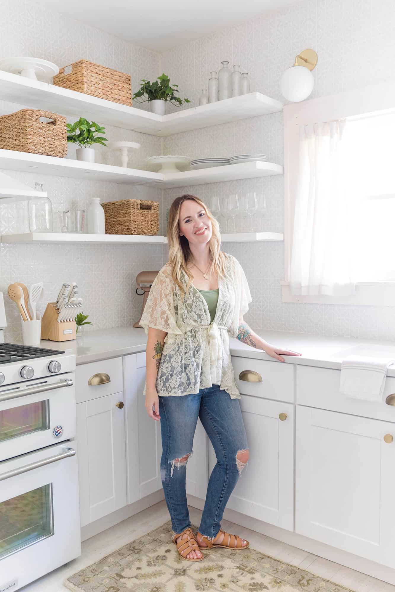
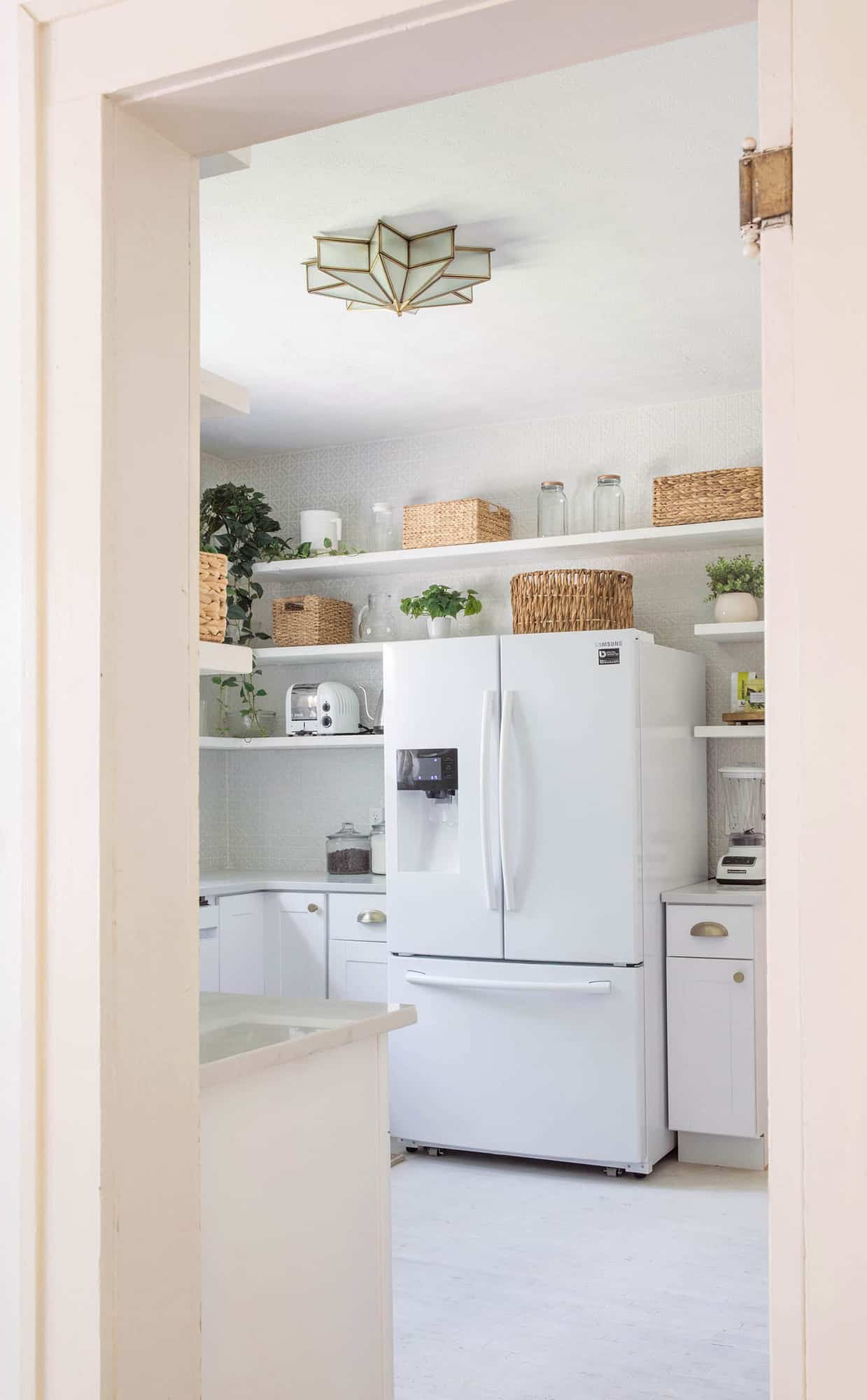
 If you follow us on Instagram, then you know that my big project this season is working on Elsie’s “holiday house” here in our hometown of Springfield, Missouri. This is the home that the Larson family plans to stay at during their frequent visits home, especially around the holidays. And the rest of the year we hope to rent it out as an Airbnb. Today, I’m sharing one of the biggest room transformations in the whole house—the kitchen! We have been working with The Home Depot and basically everything you see in this kitchen is from there. They have SO much great decor and home goods on their website, including everything from light fixtures to glassware. We also used some of its design services, which I had never used before, and I’m excited to tell you a little more about that. To me, the kitchen is one of the most important rooms in a home. So many memories happen in the kitchen, even if you or your family are not big into cooking. I can’t wait to bake cookies with Elsie, Nova, and Marigold this Christmas in this kitchen!
 Like I said, this room has been completely transformed. Many of the spaces in this house are only getting minor changes, but not this kitchen. So, let me remind you what this room looked like when we first purchased the home earlier this year.
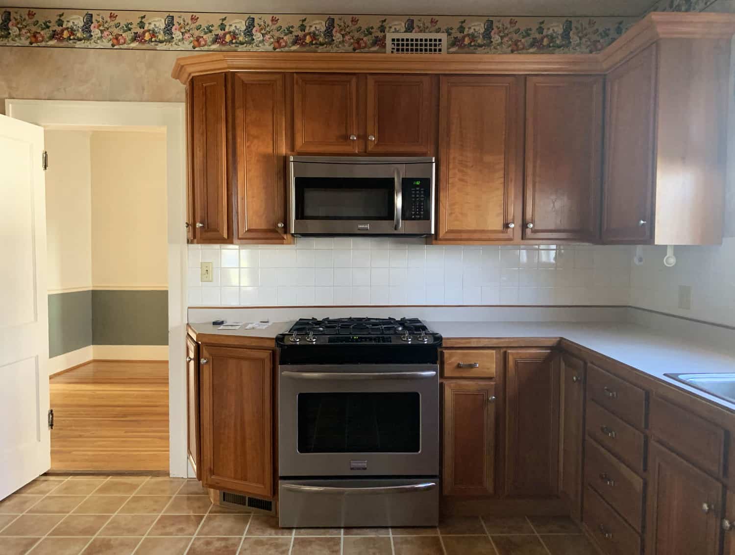
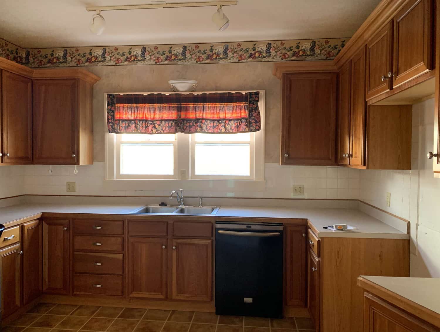
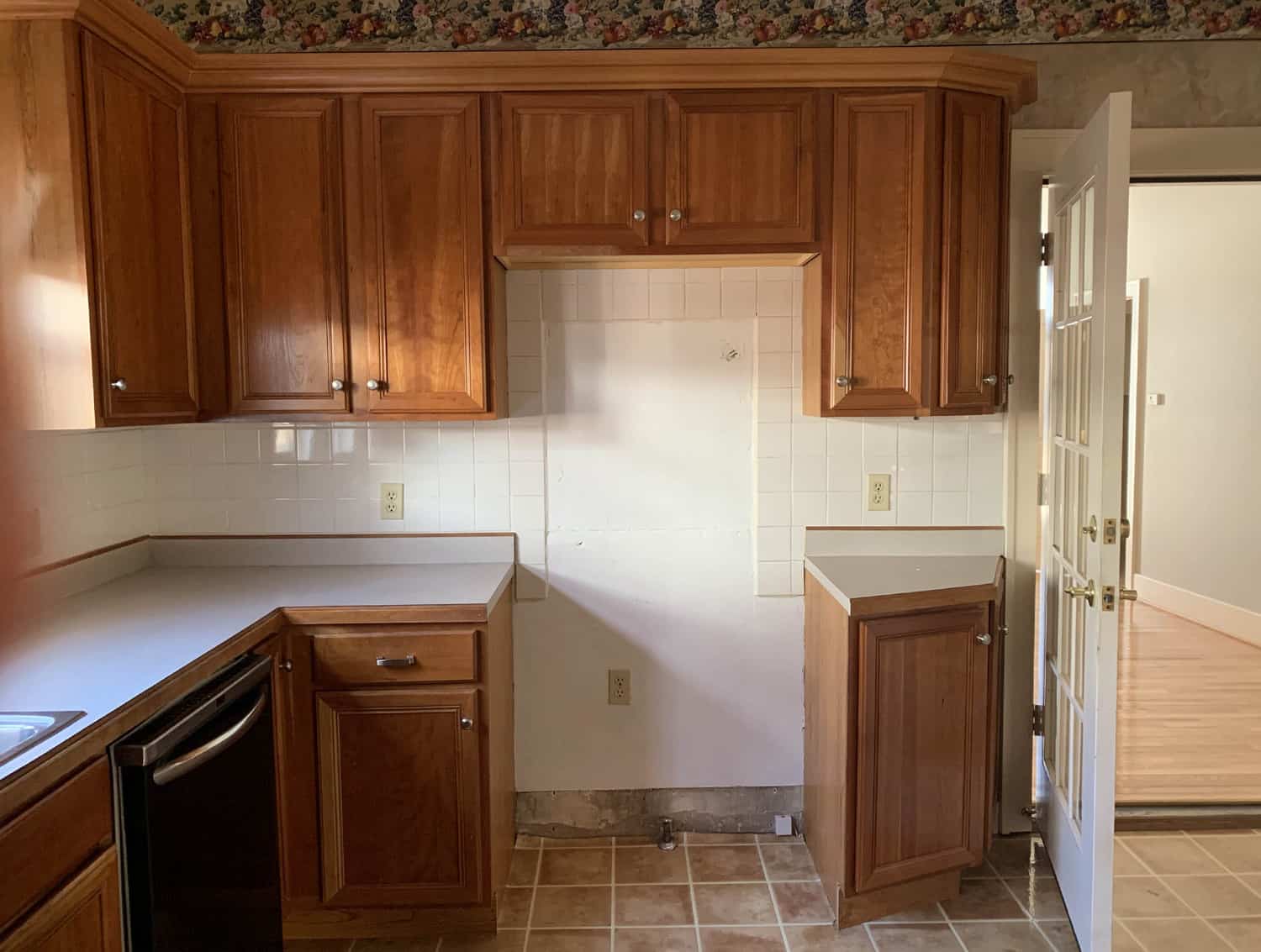 This house is in one of our favorite neighborhoods in Springfield. It’s very close to our downtown, but very much feels like a cozy and friendly neighborhood where neighbors sit on their front porches in good weather and say, “Hi.” It’s truly an adorable area, with many of the homes being very old. This house was built in the 1920s, and one goal Elsie and I have had as we planned the updates we wanted to make was to modernize in a way that also felt appropriate for the age and style of the home. The kitchen didn’t really have much that felt original or even close to the age of the home, so we felt OK changing it up. We also were hoping to remove the linoleum floors and recover the original wood floors (if it was still there, we had no idea until we tried), as the rest of the home still had them. We didn’t plan to change much of the layout of the space, but just update it to be a little more functional and much more the style we were aiming for throughout the house.
Here is what we found after the linoleum was removed:
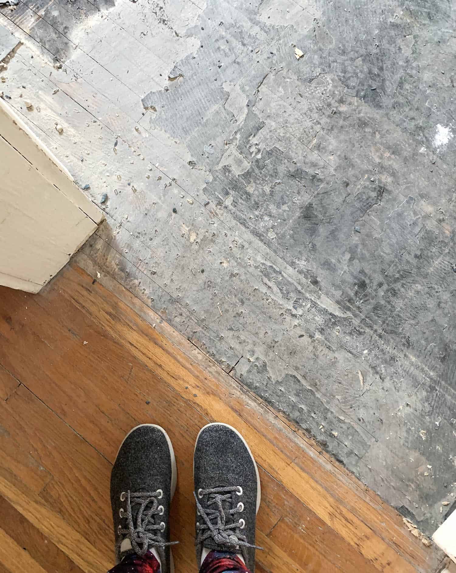 This is the transition between the dining room and the kitchen. The floors were indeed still there! But we had a LOT of scraping to do before they were exposed and could be refinished. There are also a lot of little imperfections, like old staple marks/stains. And we’ve worked to minimize these, but also the ones that are still visible we don’t mind. They only add to the story of this house.
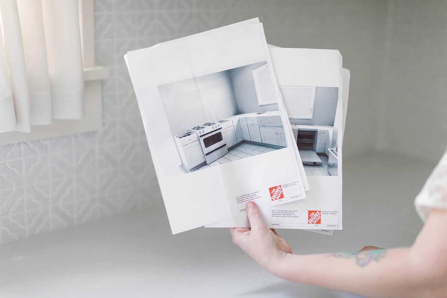
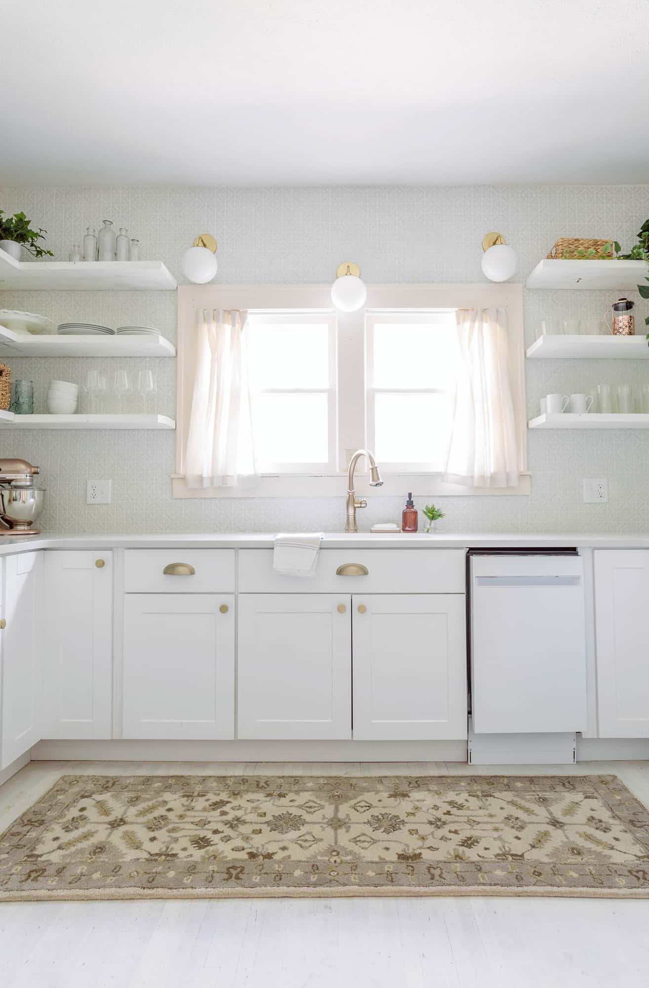
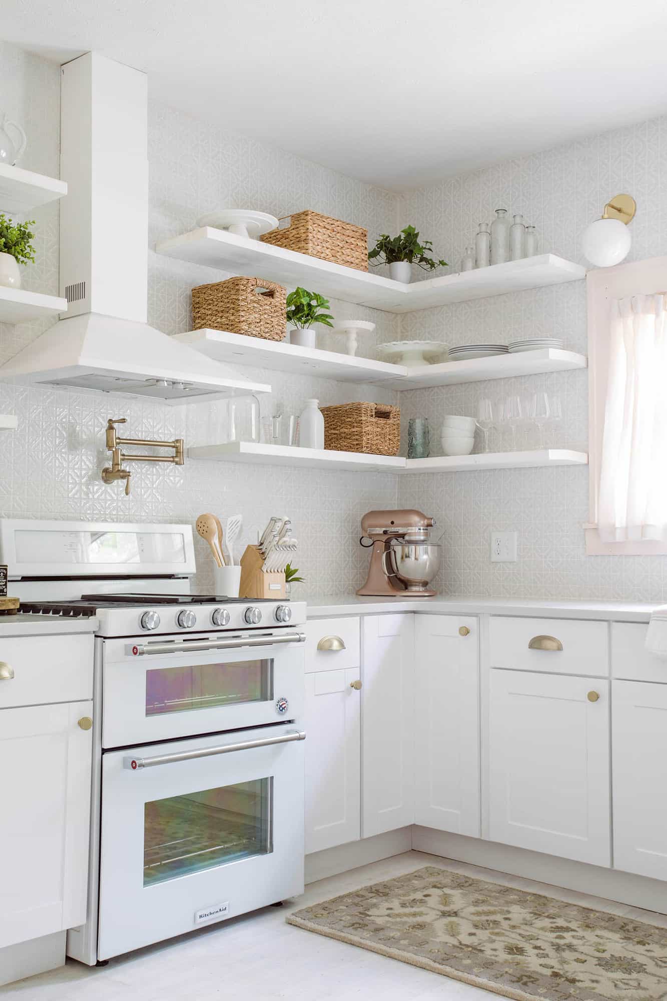 We knew we wanted different cabinets as well as countertops, and so we worked with The Home Depot’s in-store design services to pick out our lower cabinets as well as countertops. I’ve never designed kitchen cabinets from scratch—I’ve mostly just repainted what was there in other homes I’ve lived in or worked on. I was amazed and overwhelmed about how many options there are! Kitchen cabinets can be so much more functional when you get to design them yourself. You can add all sorts of things that might matter to you, like built-in Lazy Susans in the corners so you can reach/use the corner cabinets more (we added these) or other fun things like a built-in wine rack, spice rack, trash cabinet, built-in microwave, and so many other things. It’s crazy how many choices there are! This post is sponsored but here’s my honest opinion: I LOVED working with THD in-store services to design the lower cabinets. The gal at my local store is named Rebecca and she’s the best! She was super knowledgeable and seemed genuinely excited to help me with my project, and she didn’t at all mind working with my timeline or budget. Cabinets and countertops are one thing you really don’t want to get your measurements wrong on, so I also felt much more confident ordering things with her help.
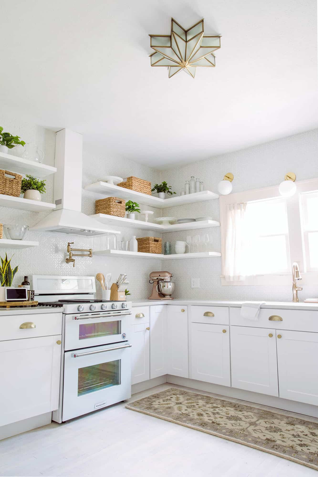
We also had our local contractor team add floating shelves for the upper cabinets. Not only do Elsie and I both love the look of floating shelves, they also do a couple things in this space. First, it really shows off the tile backsplash (!!!!!!!). And second, since this home will be rented out by other families at times (or at least we hope so), this may make it a little easier to find things. 🙂
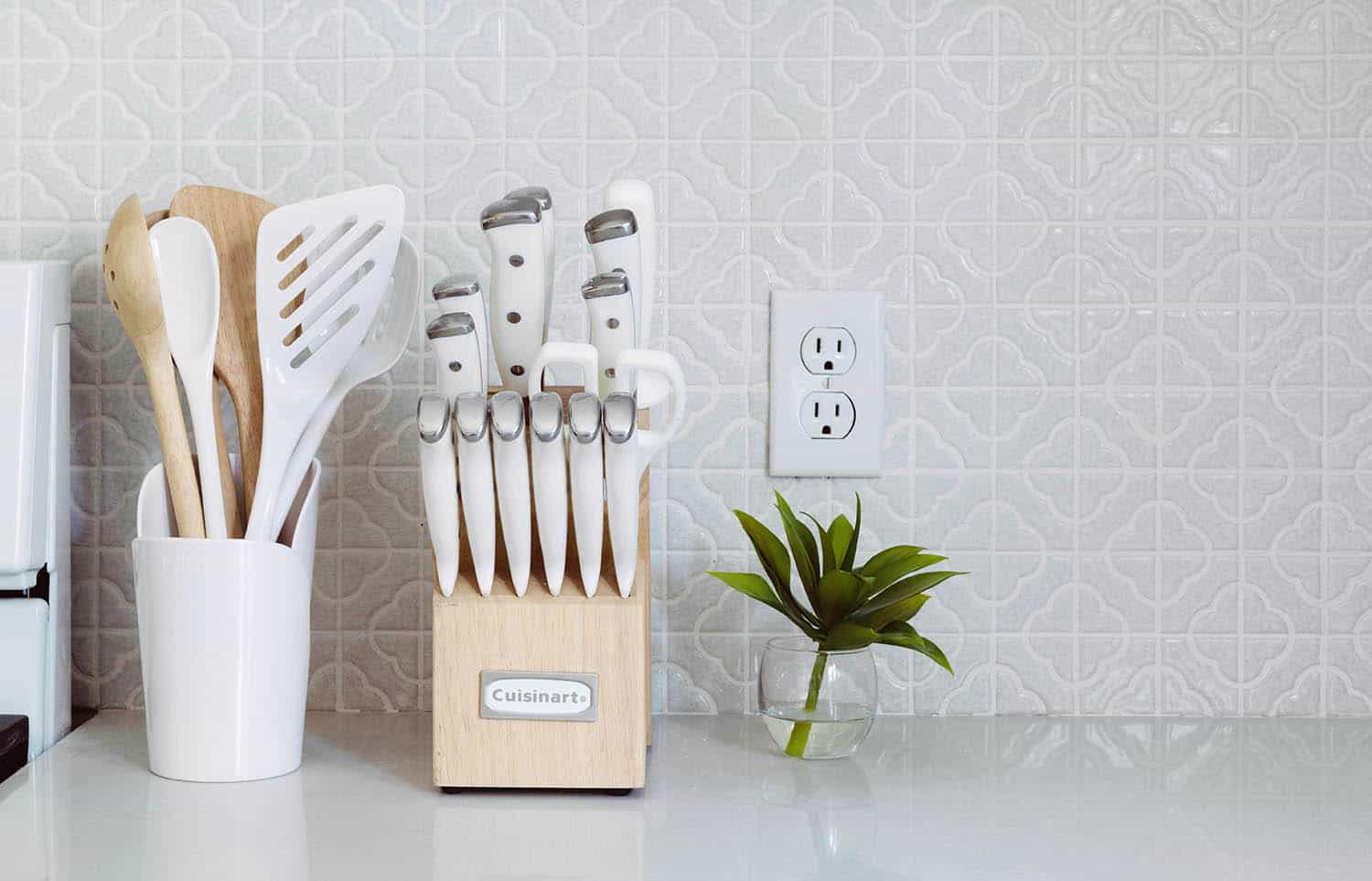
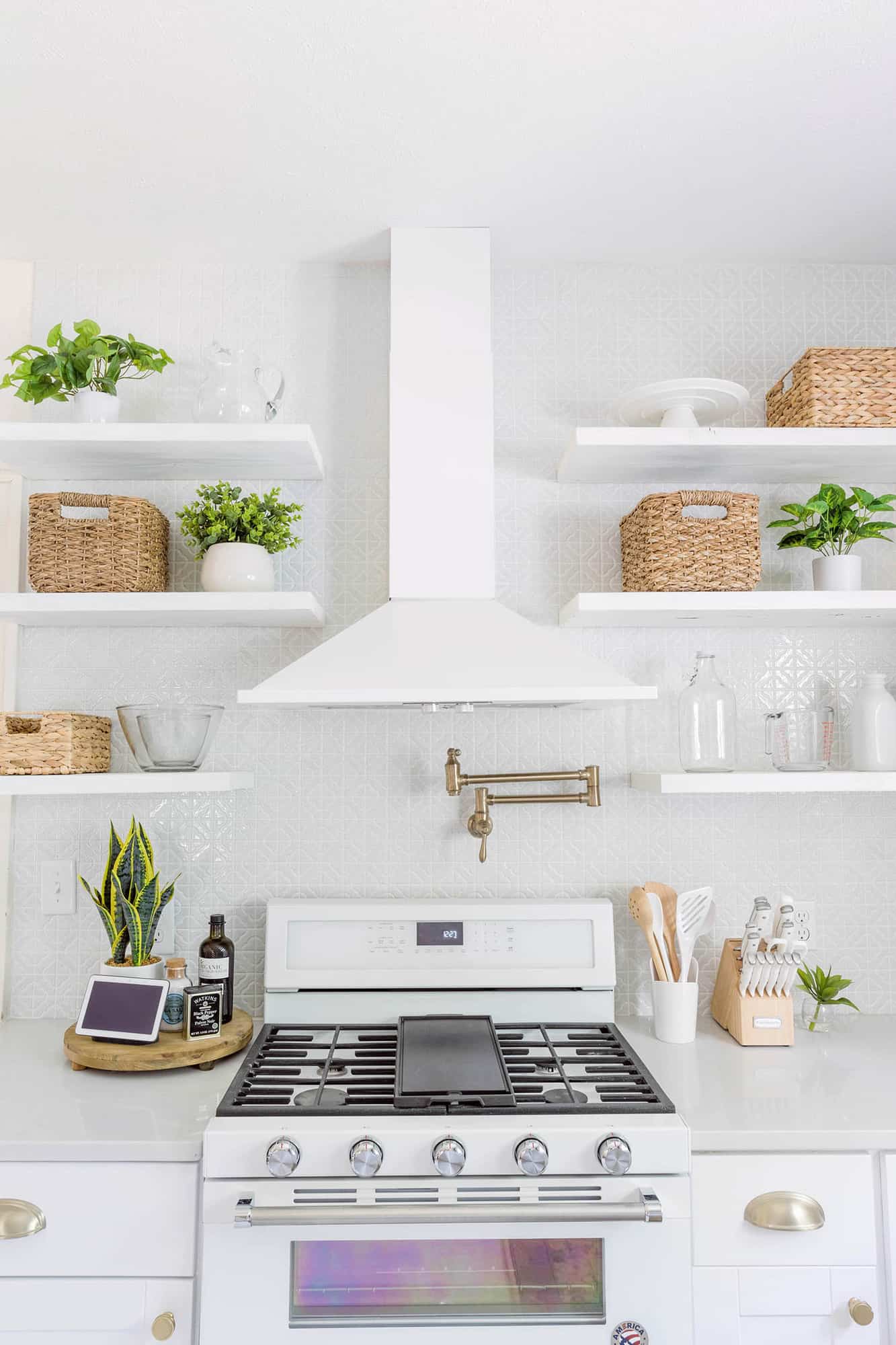
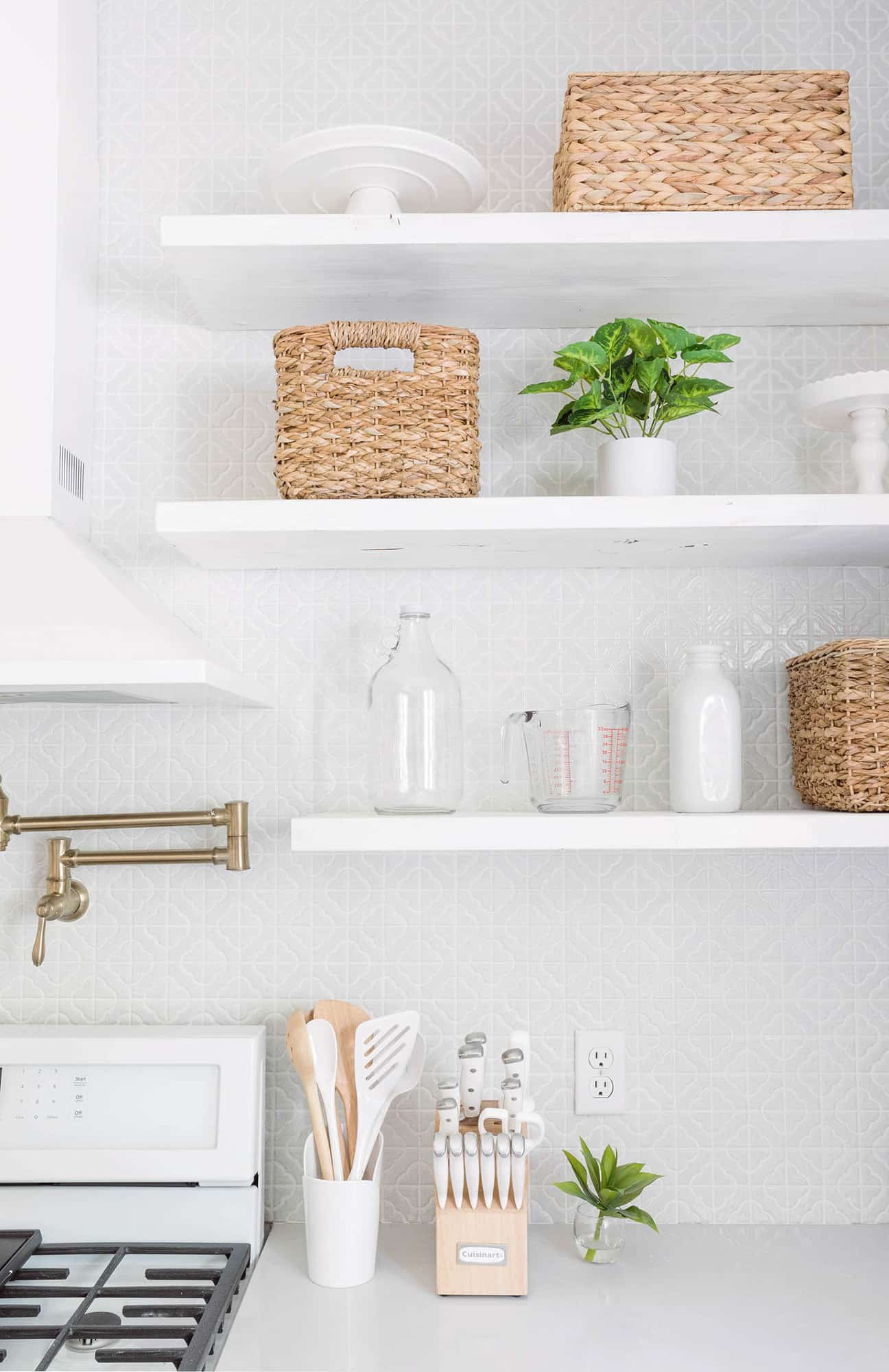
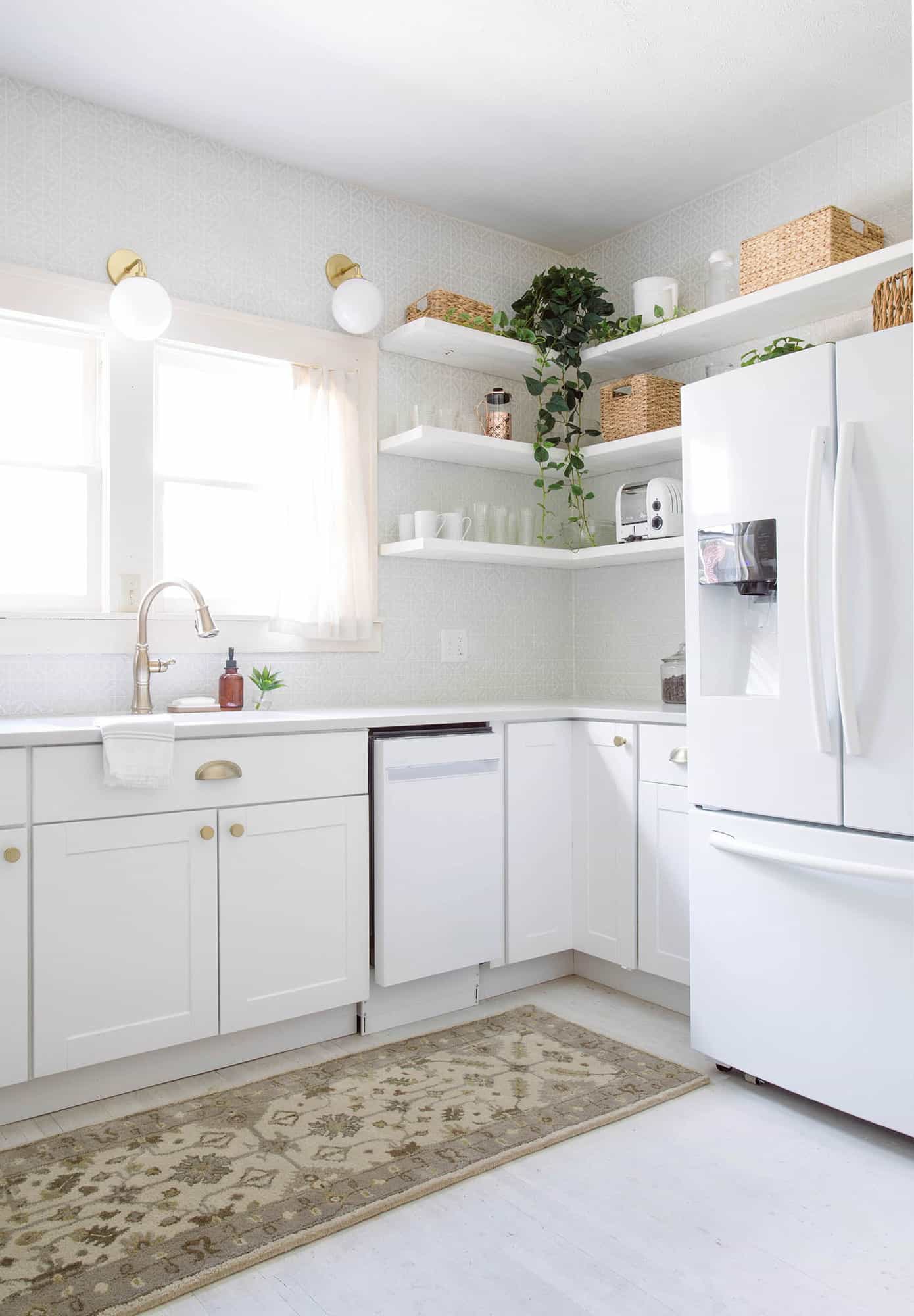
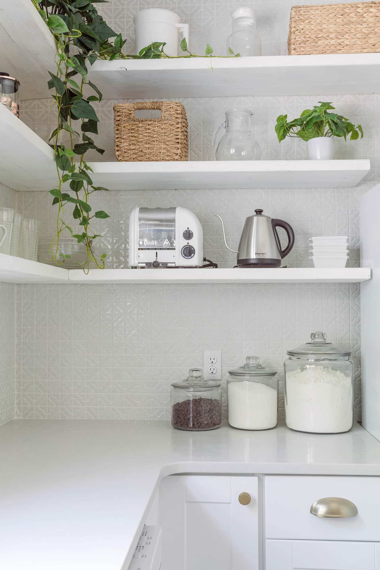
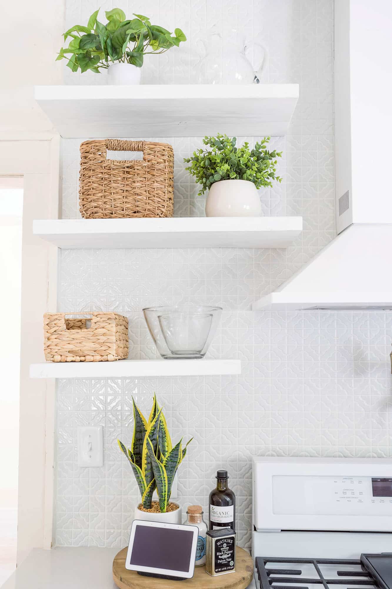
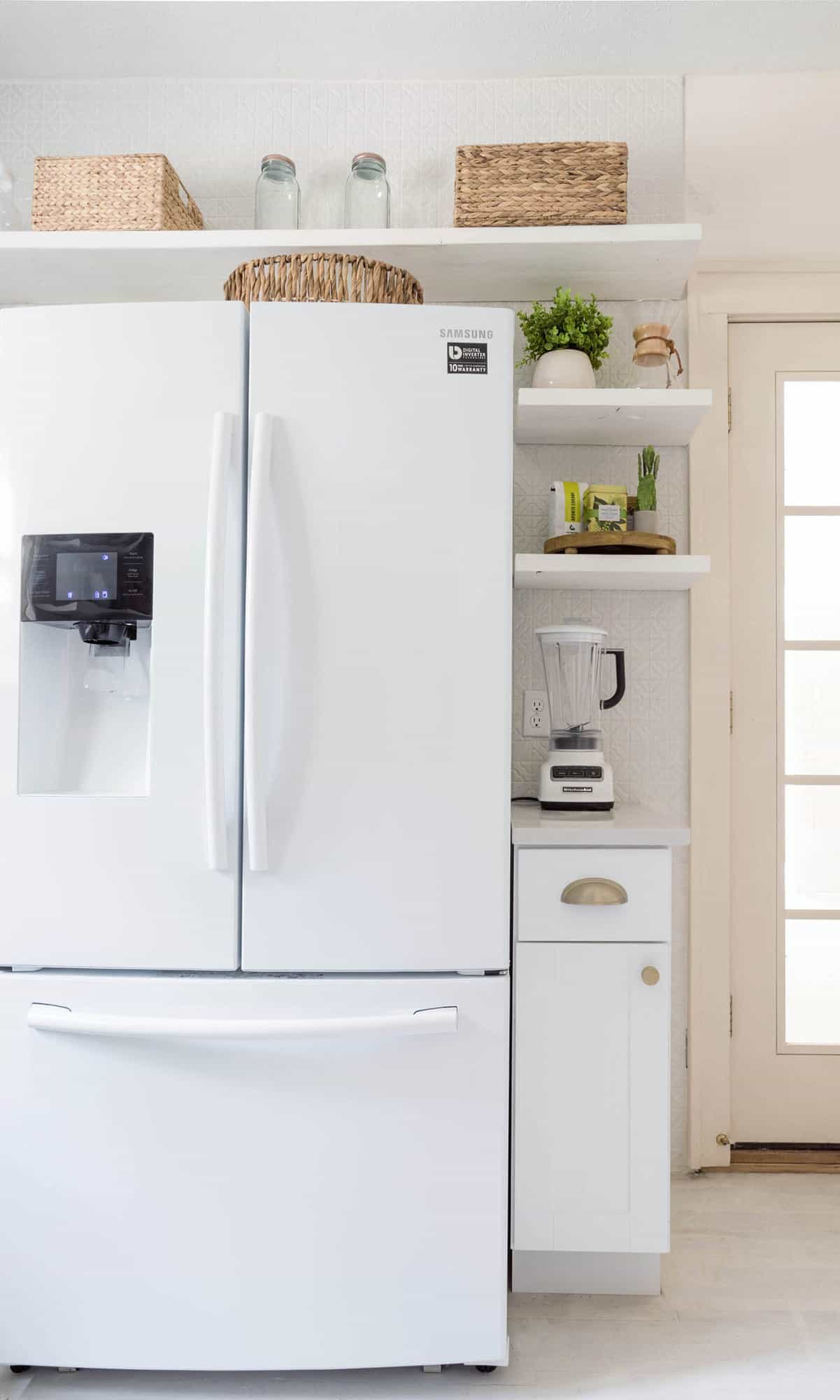

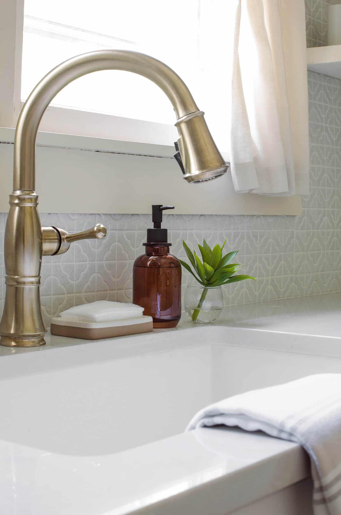
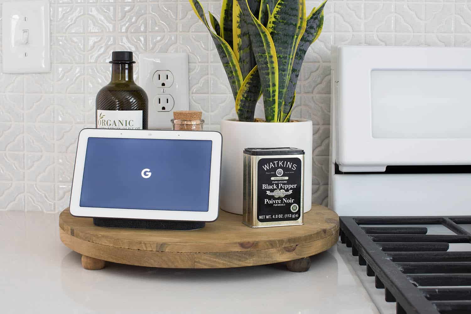
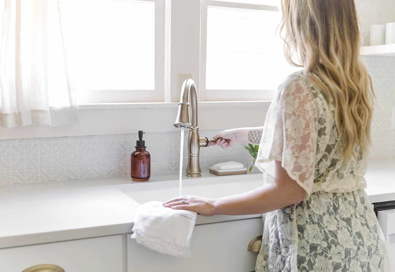 I’m going to link everything at the end of this post in case there is something in our kitchen that you want to read more about. But I wanted to point out a few details that we are obsessed with. First, we LOVE this kitchen faucet and pot filler. They also ended up going really well with the cabinet hardware we picked. Even though these are all brand new, they have that old-charm feeling so they felt perfect for this space. We are also really obsessed with how pretty (and functional) this range is!
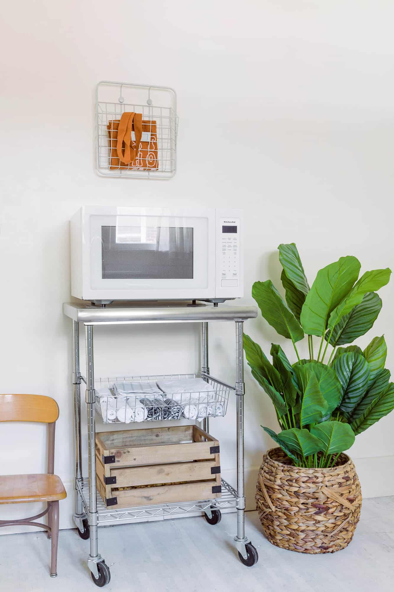
Elsie and I have had one major disagreement in this kitchen—and it involves the microwave. Ha. First, let us know if the comments if you are a “I like microwaves” person or a “I hate them!” person. Elsie really doesn’t care for them (although she admits this one is quite pretty) and I like them fine. It’s not my favorite feature in a kitchen per se, but I just feel they are useful and especially if you’re planning for being an Airbnb. So we decided to get the prettiest microwave we could find and just have it on a cart that could be wheeled out of eyesight if needed. 🙂 That was the great kitchen compromise of 2019.
Really this wasn’t much of a fight. I’m just framing it up that way because it’s sort of funny. But we did disagree, and now you know what kind of high drama you could expect if this was a reality show.
I also want to point out our Google Hub, which is that device that sort of looks like a mini tablet. This connects to many of the smart devices we are installing throughout the house (like light bulbs and our front door Nest by Yale lock). I love that you can see who is at the front door from this screen in the kitchen and you can unlock or lock the door from it. However, I have mostly done this from my phone so far, as no one is yet staying at the house (we are still finishing a few more things).
I already mentioned the tile backsplash, but gotta mention that again because isn’t it just lovely? It adds so much character to this kitchen! I’m also obsessed with the star ceiling light.
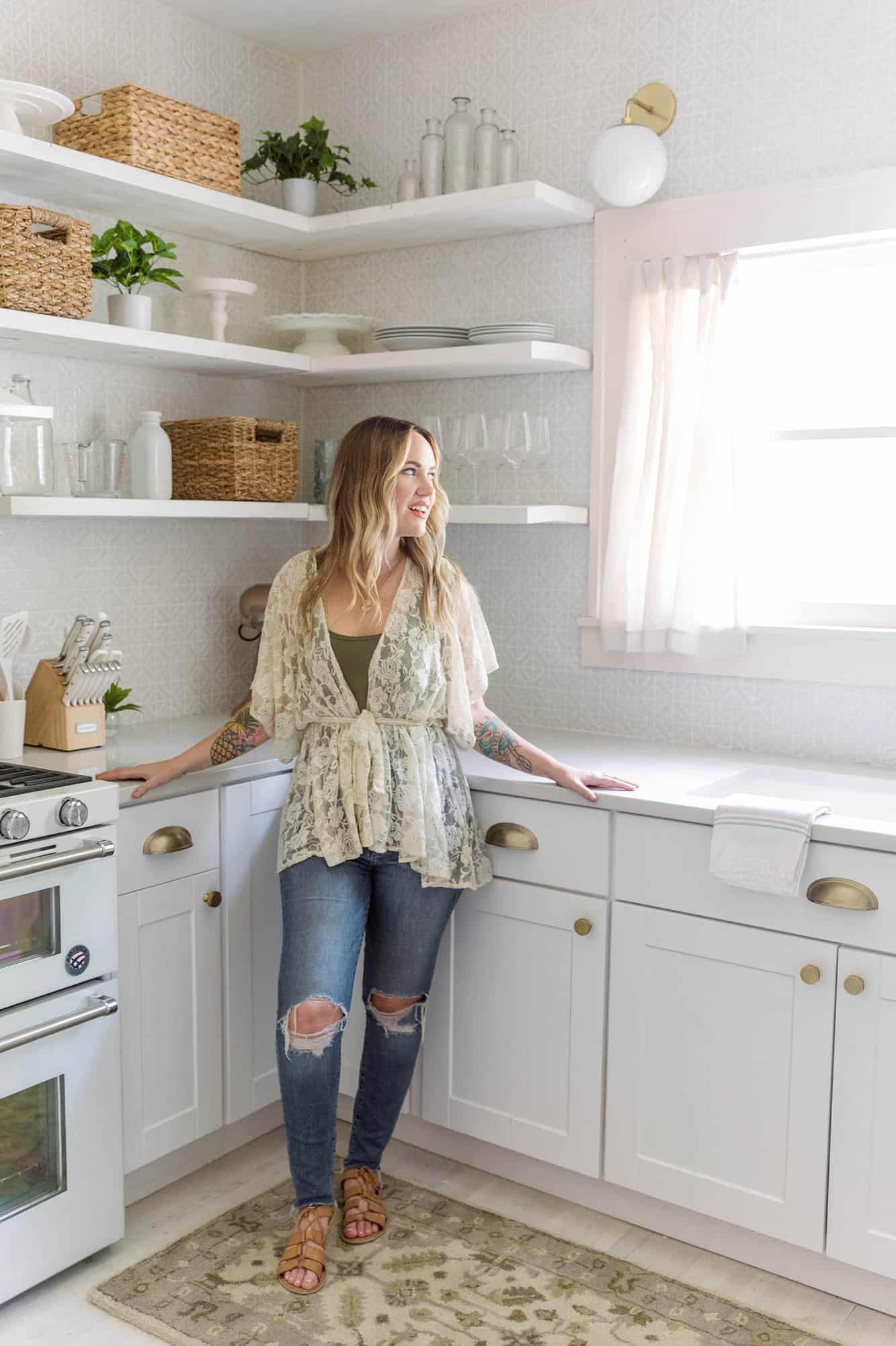 I am beyond thrilled with how the kitchen turned out! A big thank you to The Home Depot for sponsoring this kitchen renovation. I seriously cannot wait to makes some memories in this house with Elsie, Jeremy, and my soon-to-be two nieces when they adopt again next month. Thank you for letting me share and I cannot wait to give you a tour of other spaces in the holiday house soon. xo. Emma
Room Details: Lower Cabinets / Cabinet Pulls and Knobs / Countertops / Sink / Faucet and Pot Filler / Oven Range / Hood / Refrigerator / Google Hub / Backsplash Tile / Ceiling Light / Wall Sconces / Microwave / Cart / Stand Mixer / Knife Set / Rug / Canister Jars / Dishes / Small Cups and Large Cups / Nest x Yale Lock / Toaster / Tea Kettle / Chemex / Google Hub / Wood Tray / Round Basket (by microwave cart) / Utensils (wood and white set) / Blender









 It feels like summer is all the way here (finally!) and it’s putting me in the mood for a flavorful margarita. This one has a little of everything—fresh watermelon juice, a spicy

 You can serve this spicy watermelon mezcal margarita fresh or frozen. Both are delicious and refreshing. Also, both are pink, and a pink drink is better than a not pink drink. Am I right?
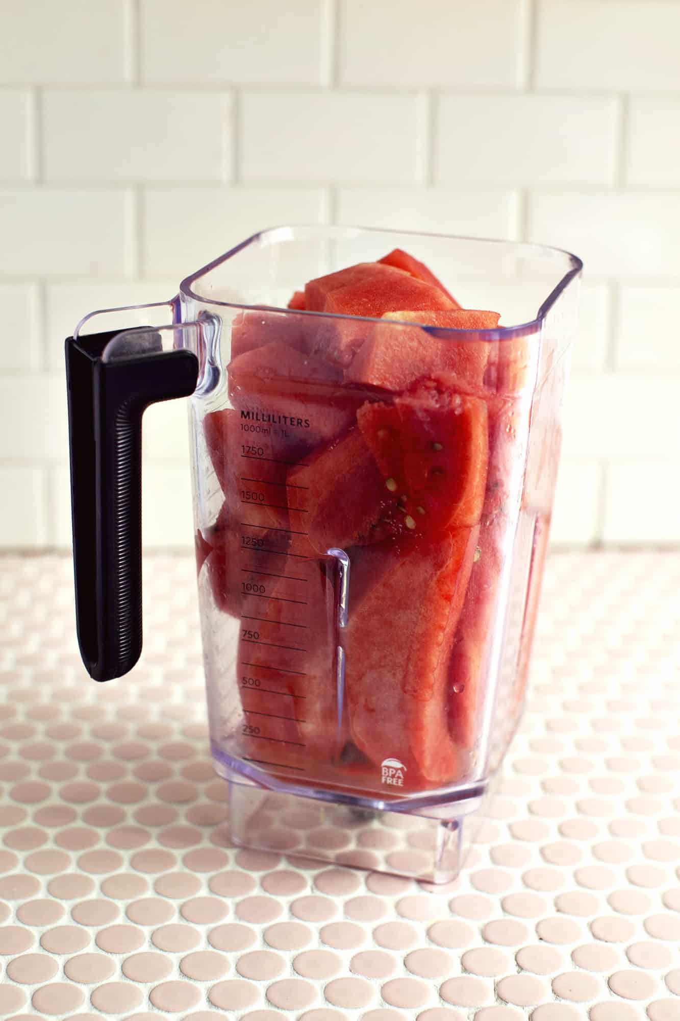 You can make homemade juice without a juicer in a blender anytime, but I must say, watermelon works best because it’s, well, mostly water. 🙂 I also think watermelon is basically what summer tastes like.
 Once you have your spicy margarita mix and watermelon juice made, you can store them in airtight containers in the refrigerator for a week (or more probably). So you can make this ahead if you are hosting next weekend, or you can just enjoy a spicy watermelon mezcal margarita all to yourself every night for a whole week if that is just where you are at right now.
 Cheers to the summer! I hope you have a lot of plans to see beautiful places and spend time with the people you love this season. xo. Emma

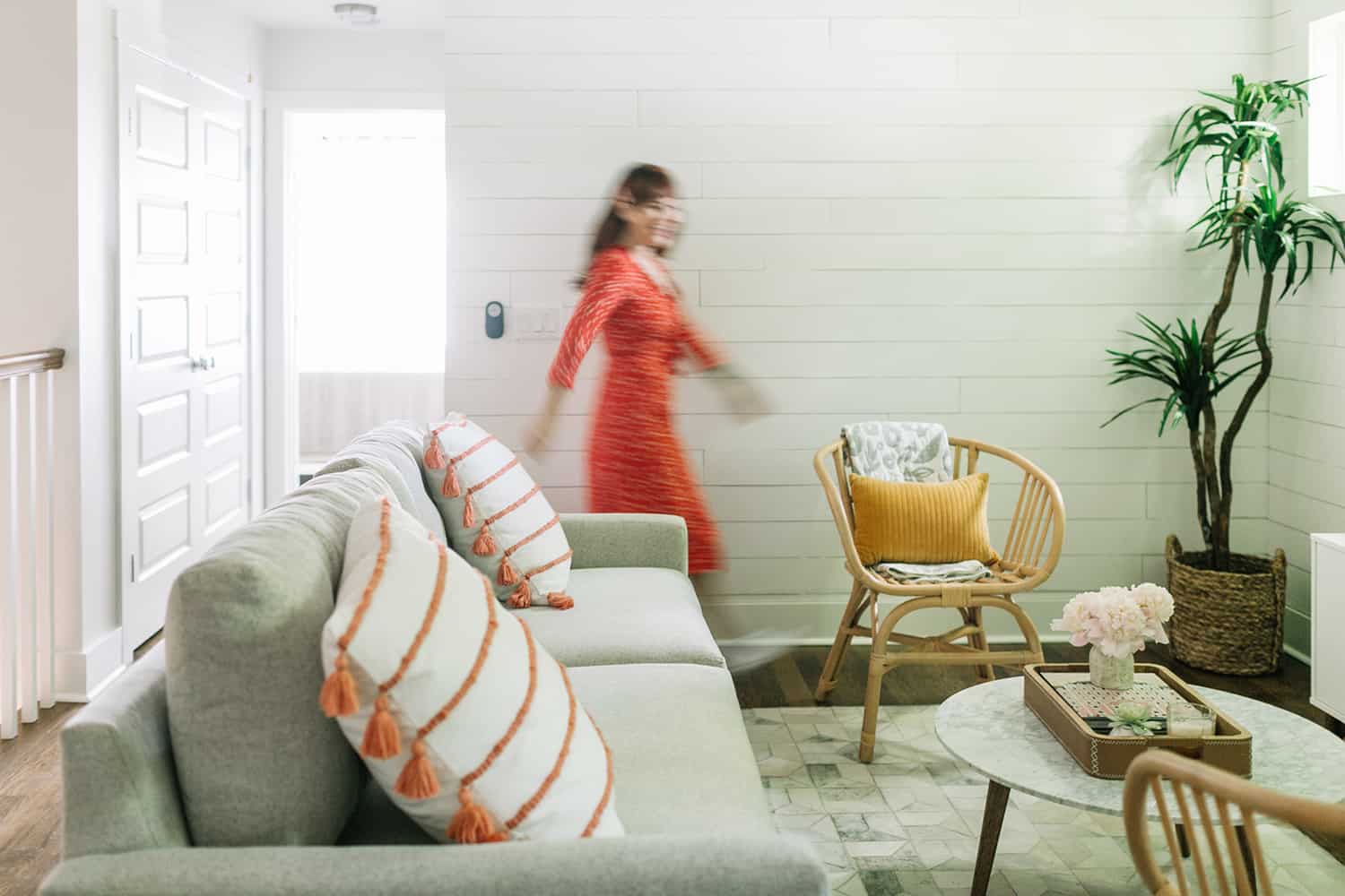
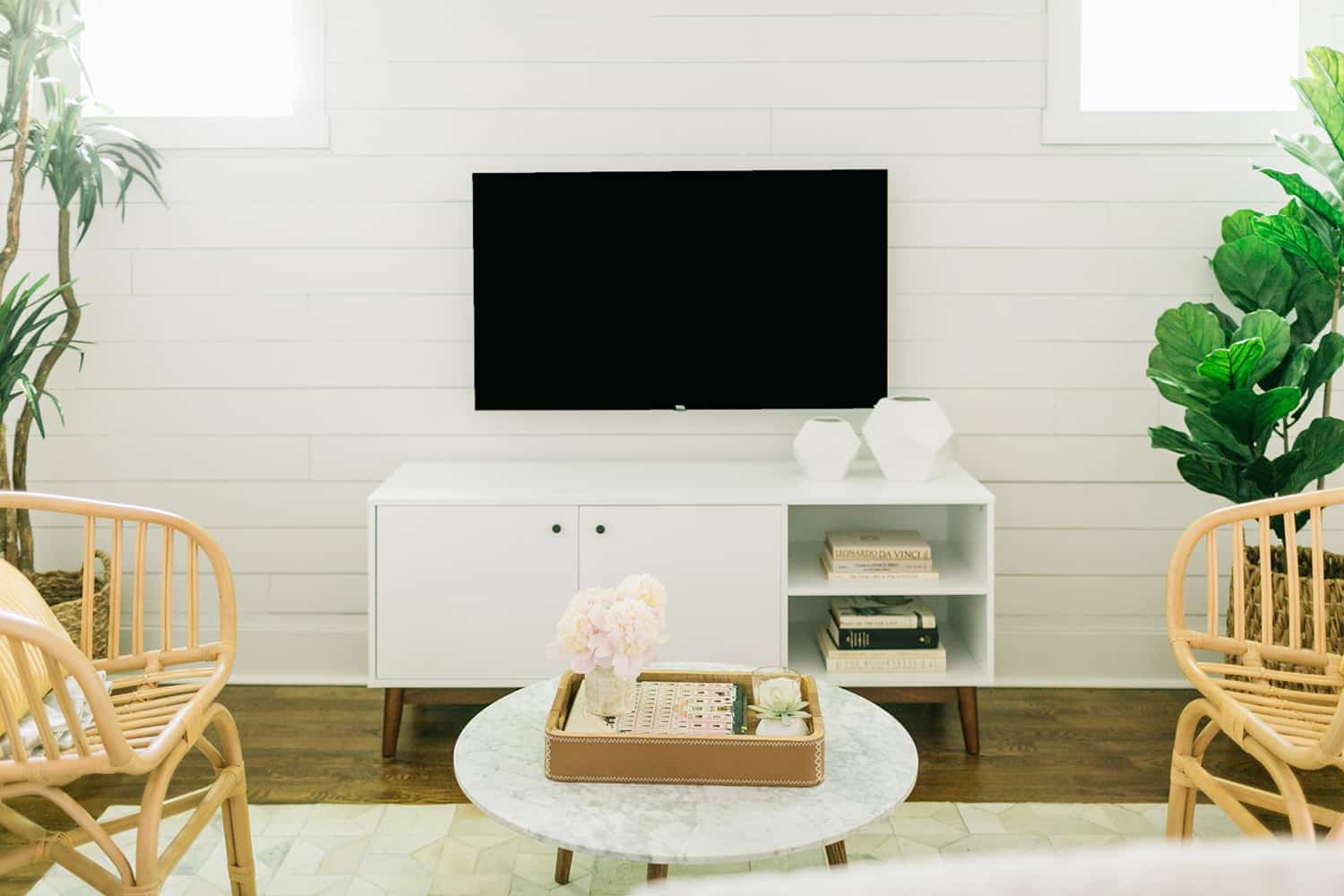
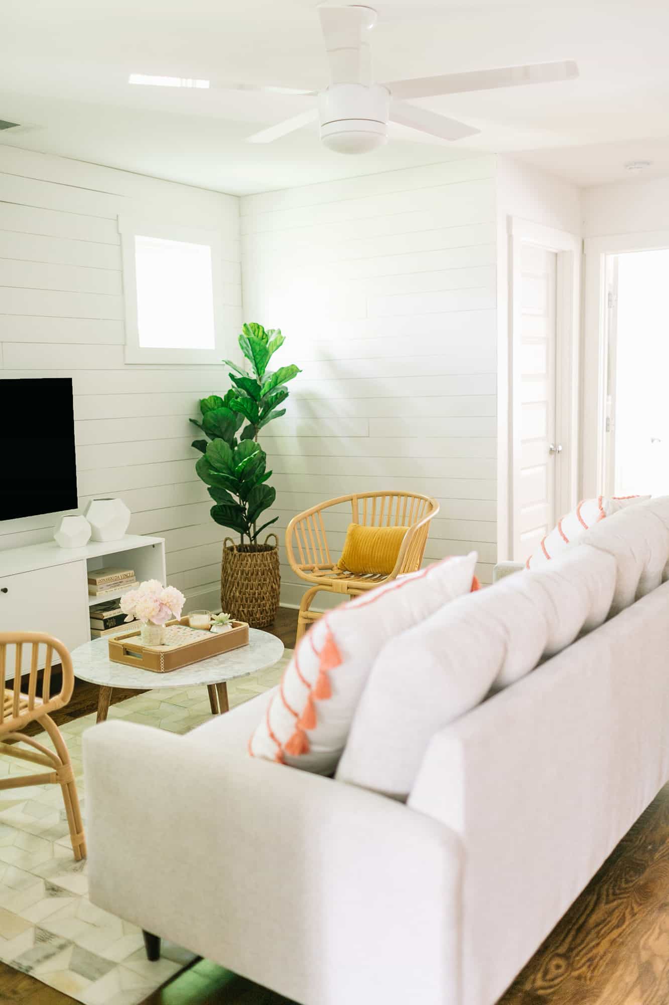 I’m so excited to share my first bnb tour with you today! My Nashville bnb has a cute little living room nook on the second floor at the top of the stairs, between two bedrooms. It’s a really nice layout for the size (1,711 square feet), as this home does a lot including three bedrooms, three full bathrooms, laundry and two open living areas. My goal was to keep it airy, while still fully furnishing the home and making the space feel a bit more cozy.
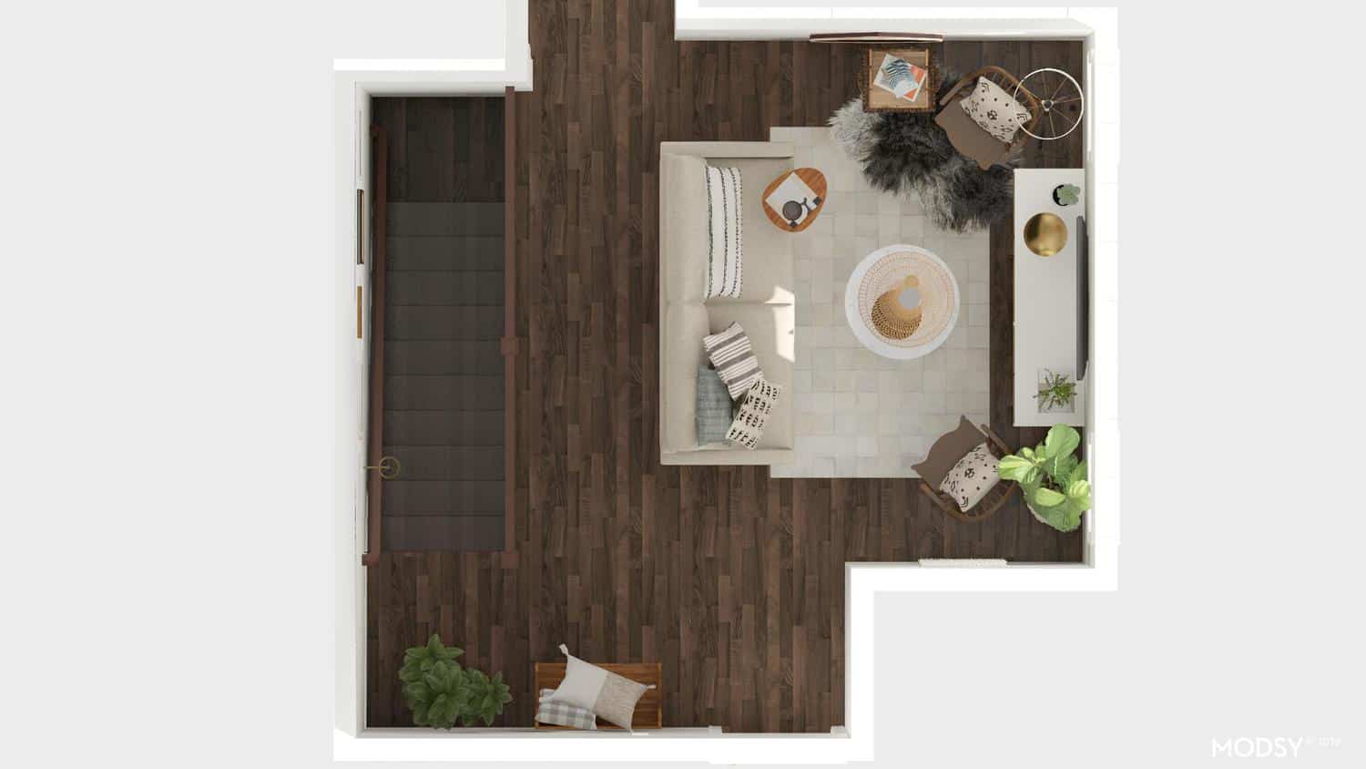
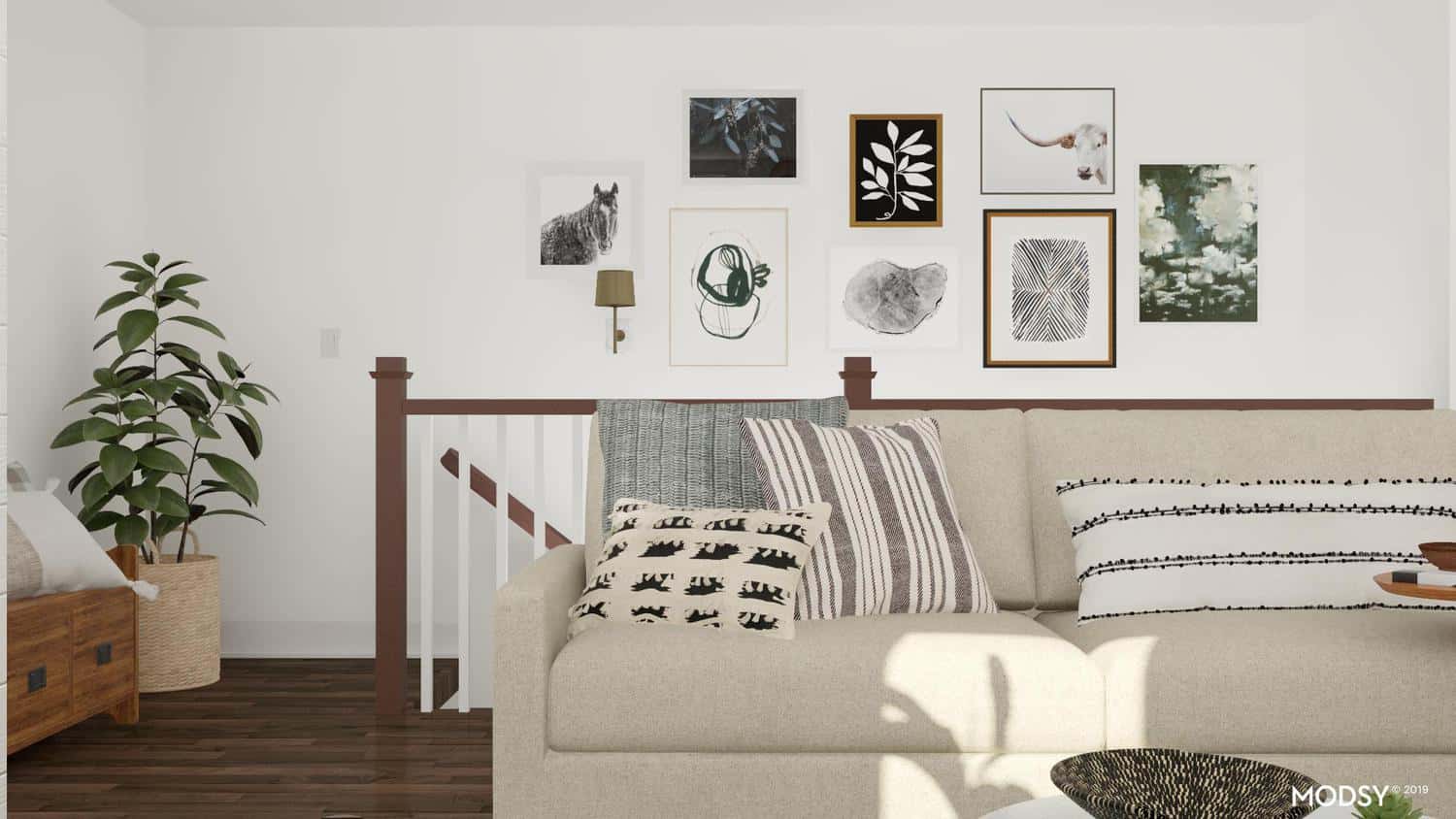
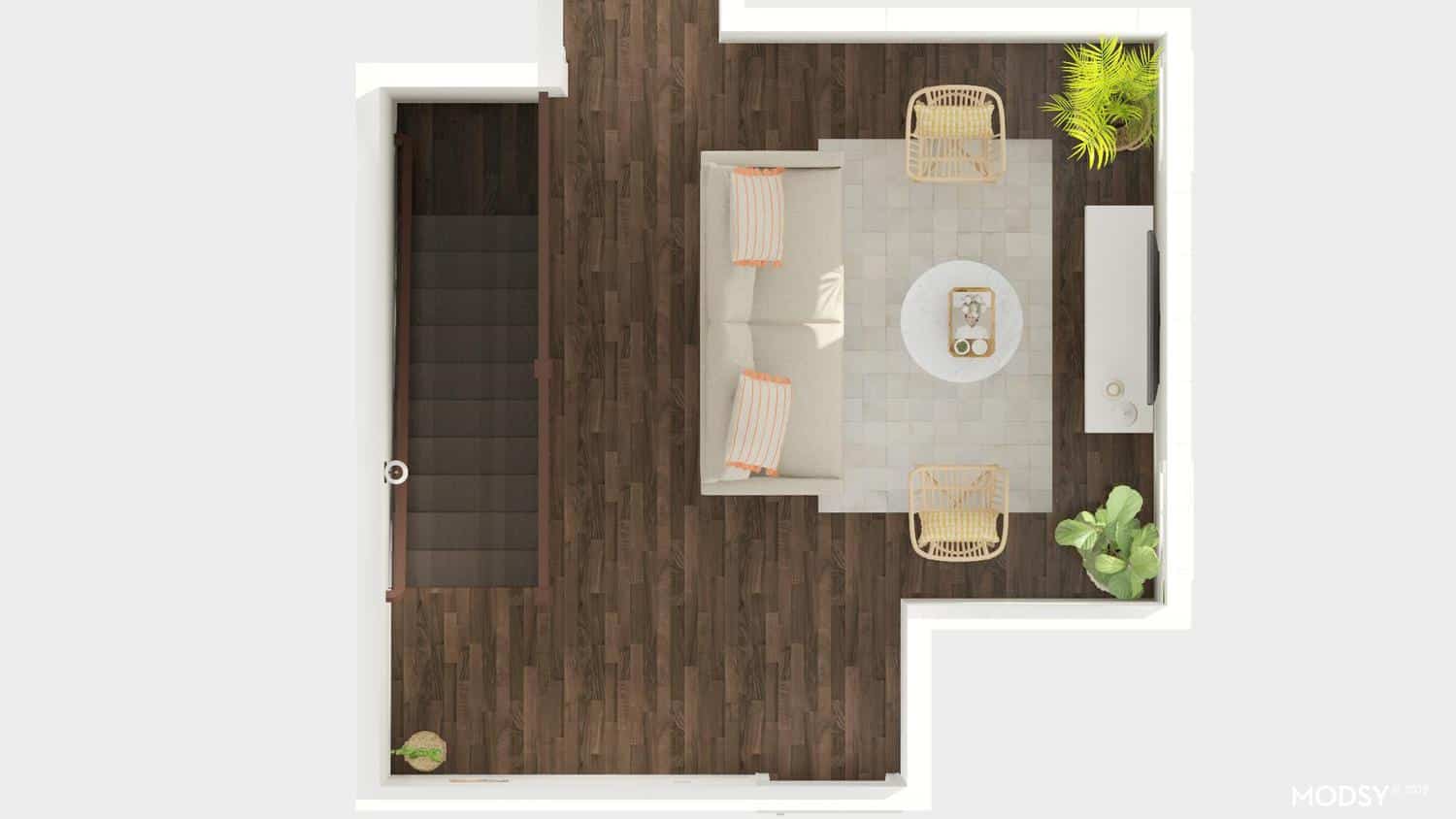
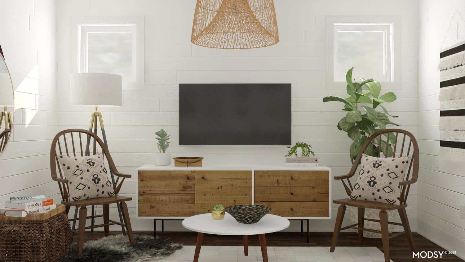 These were the first set of renderings that helped me see what I wanted to change and re-arrange in the room. It was fun to see how they could be updated to get to a final design in place and then bring it to life by moving furniture around. Below is the same set just updated with where the design landed. I really liked using the tool as we were mixing and matching old with new pieces and the layout of this room wasn’t a standard size, especially coming from the stairs.
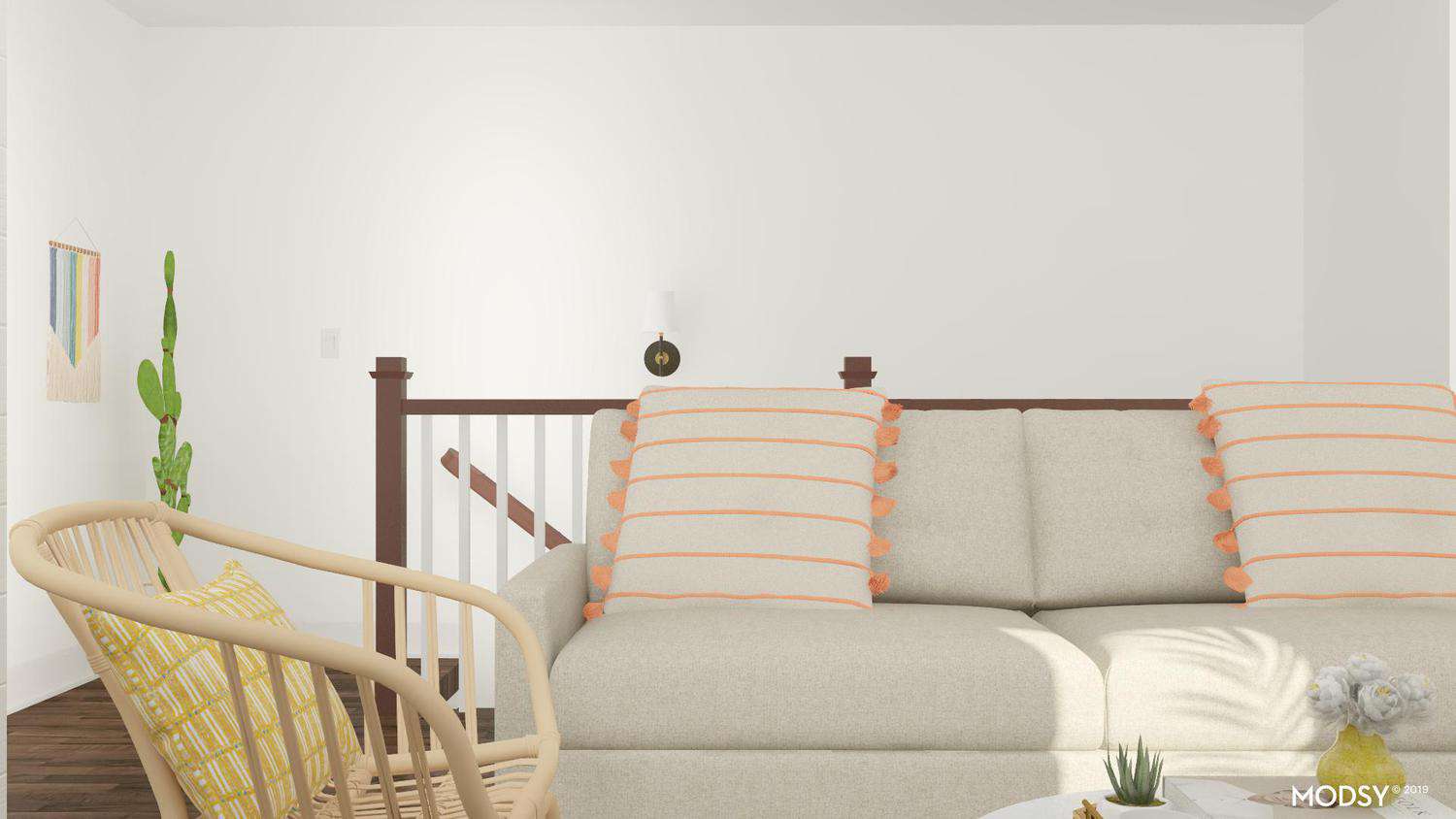
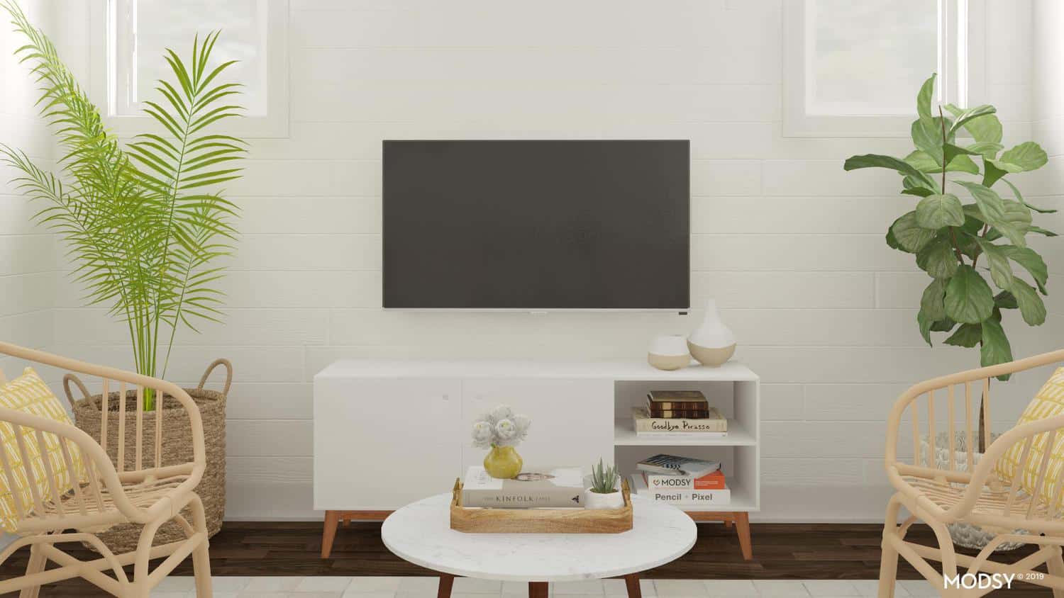
 As soon as we purchased this property, I knew I wanted to add some shiplap to two areas of the home to add some detail. The home was builder grade in every sense. We got lucky and loved the tile and bathroom countertops they selected, but overall the home was lacking in personality and it was up to us to create some charm. I chose DIY shiplap because

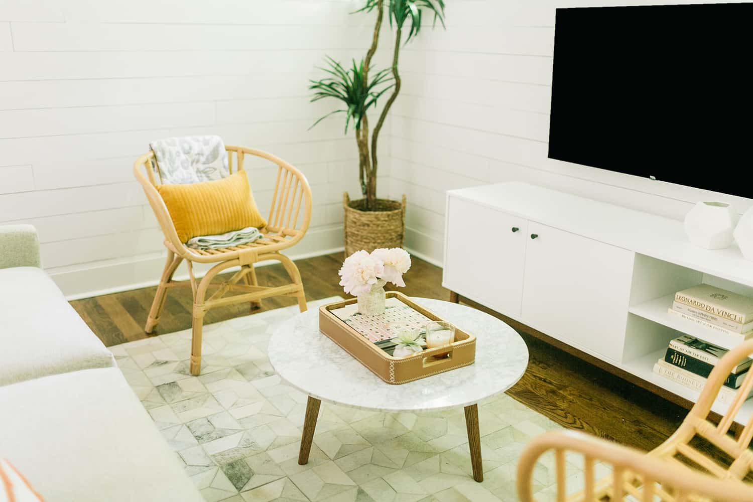
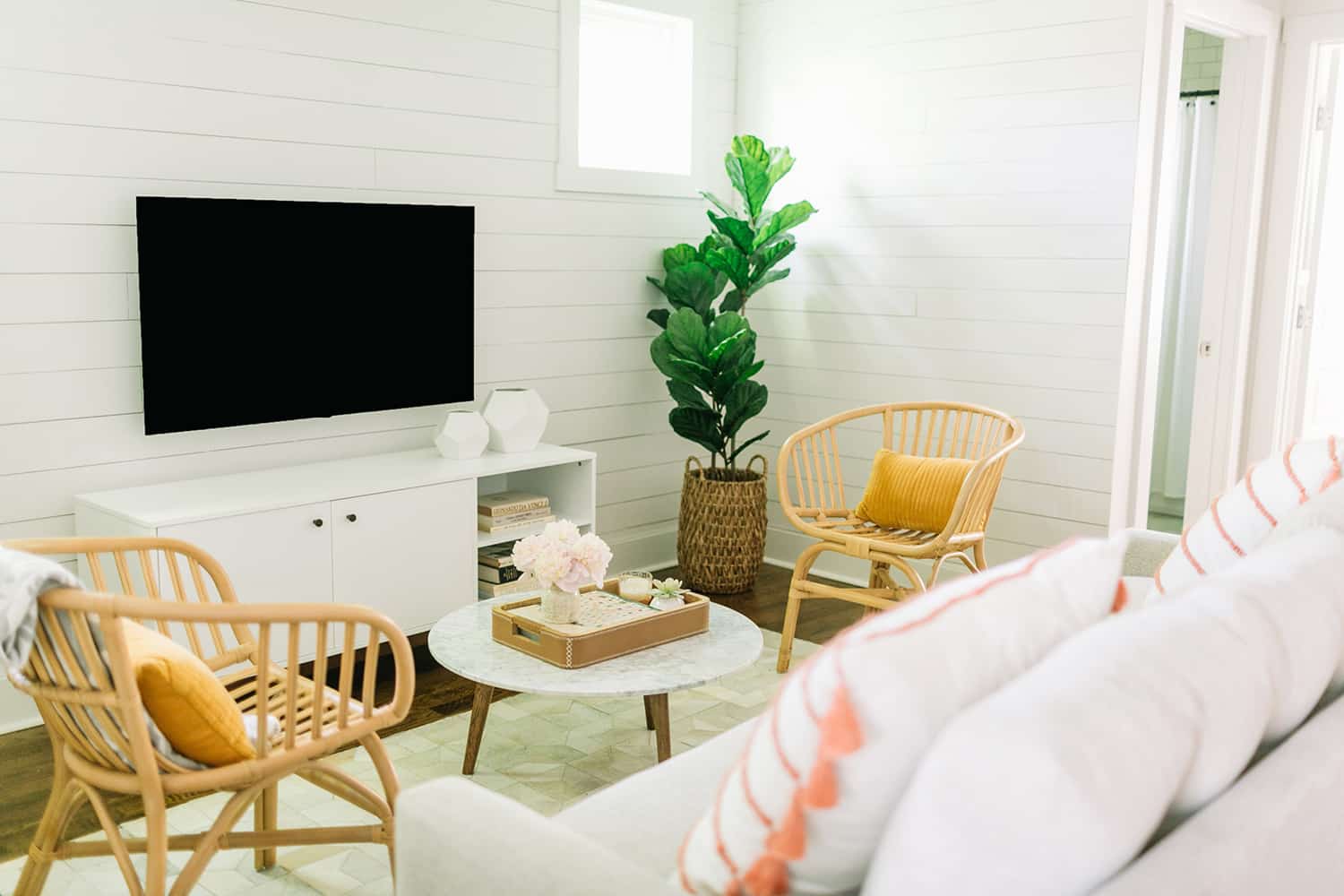
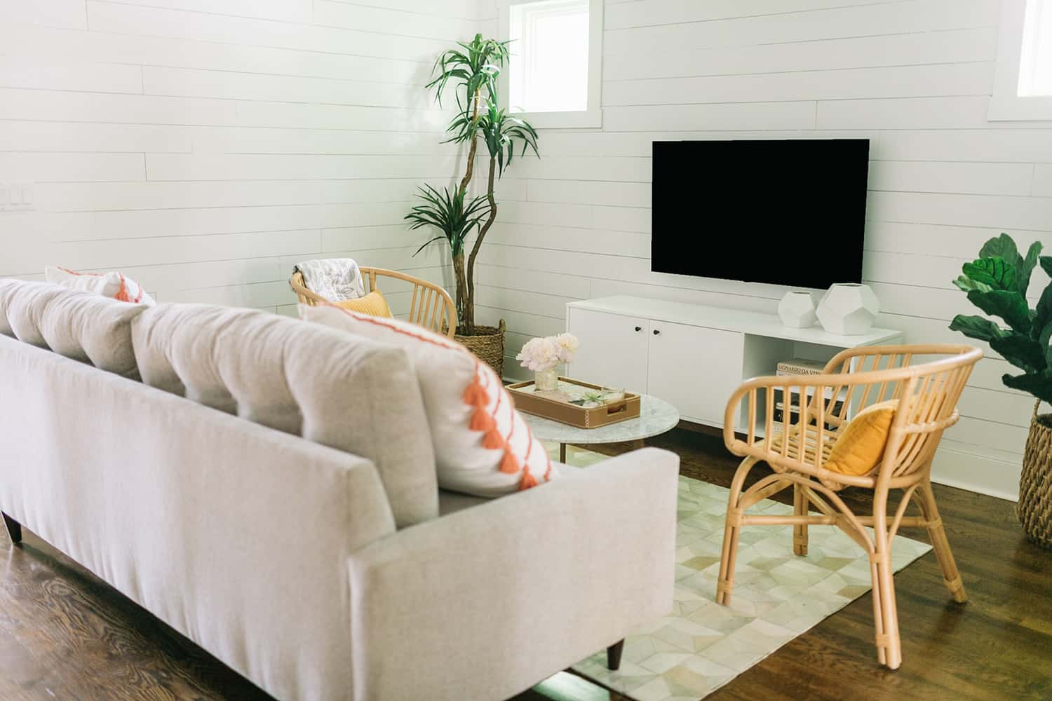
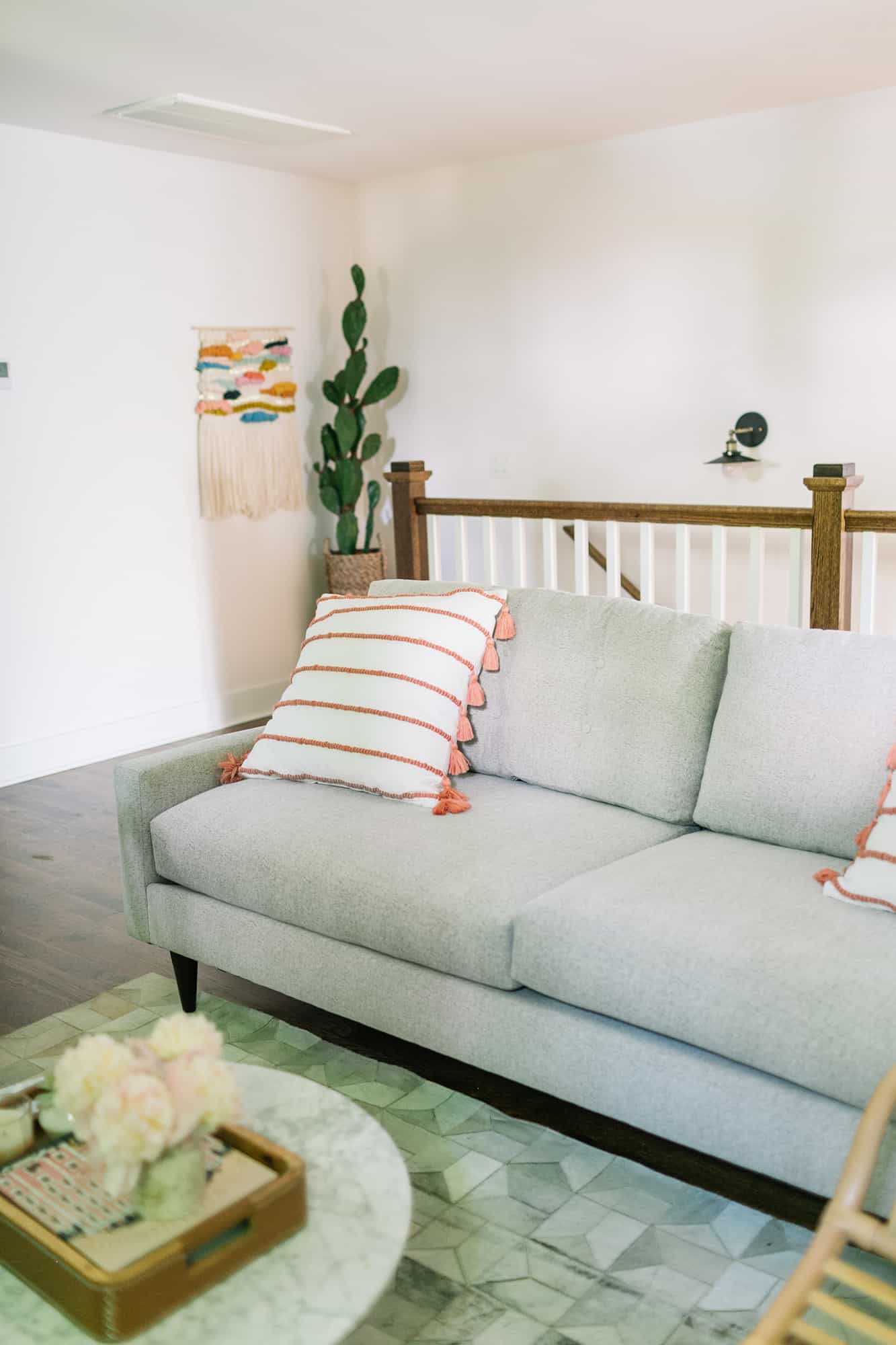
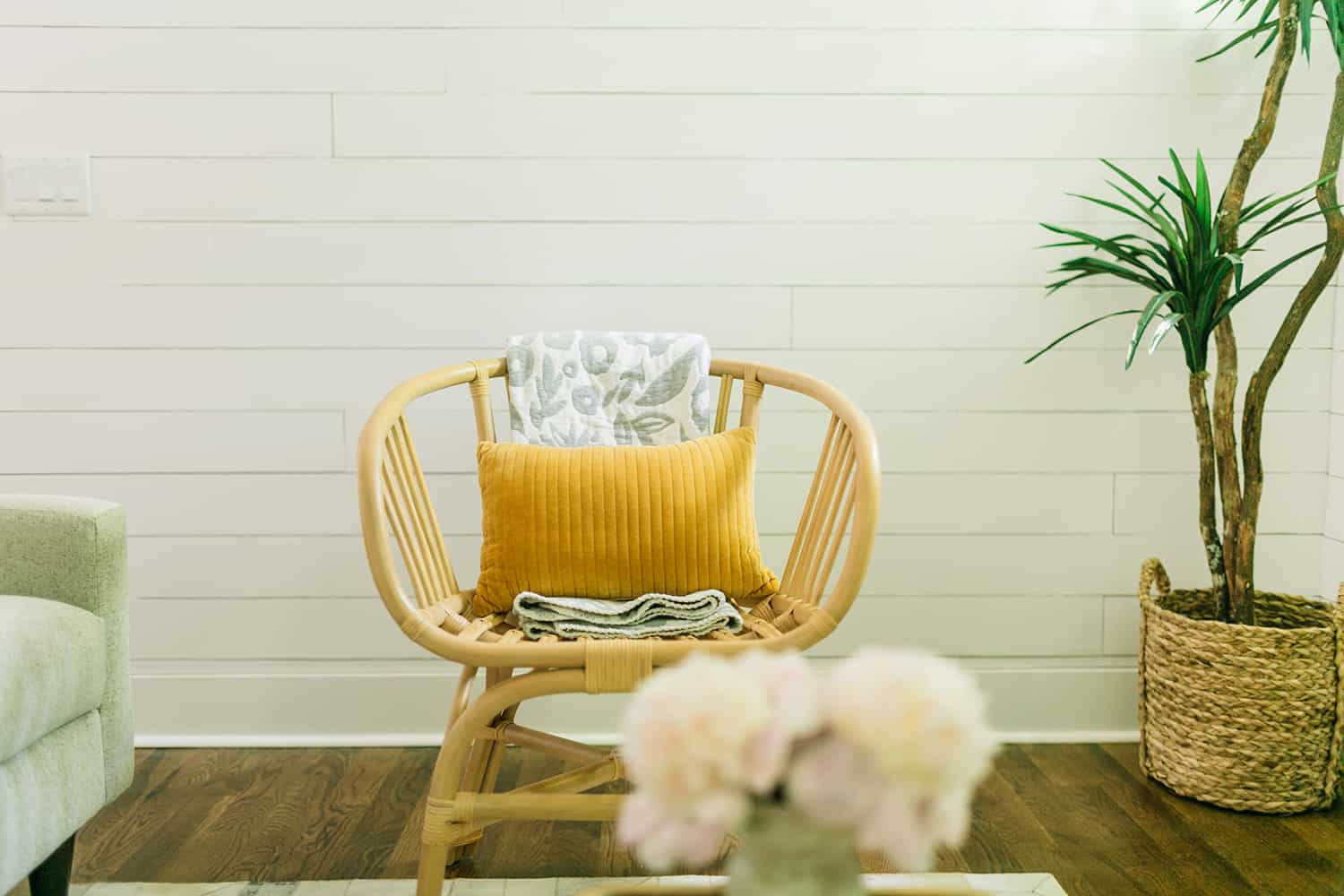 The next step was selecting furniture. We used as much furniture as we could from our previous bnb space, and mixed it with a few new pieces. The biggest addition was the new sofa from Modsy’s team! They just launched their
 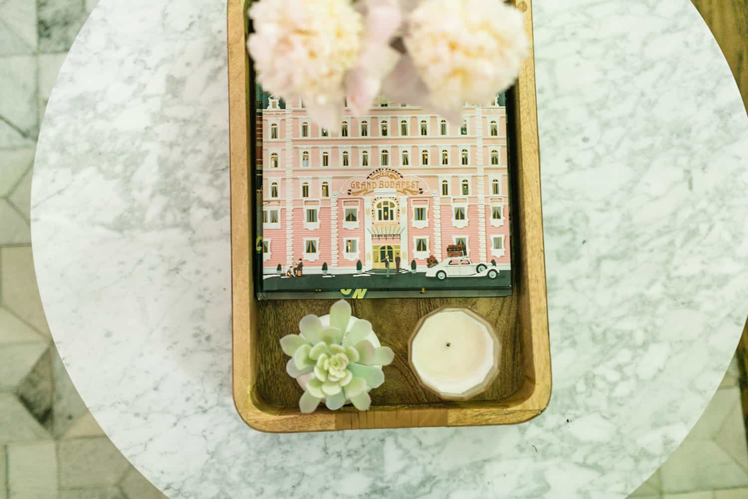 In a bnb space I think thoughtful details are super important. I don’t know about you, but I’ve definitely stayed in a few bnbs where you could tell the owners never stayed there, and maybe had never even been there. It’s SUCH a bummer when you stay in a bnb that technically has the amenities of a home (kitchen, multiple bathrooms, living spaces, etc.), but lacks common sense details like salt and pepper or a way to make coffee. This is something we try to be really conscious of.
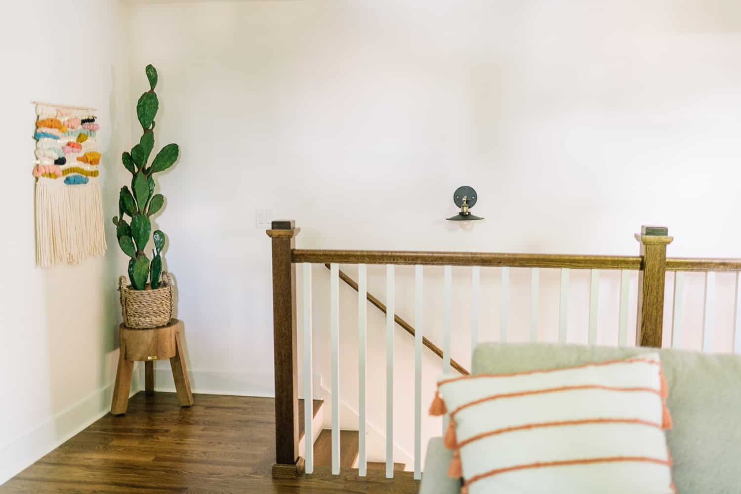
 I always “shop my house” for last minute details and this time I ended up taking over this amazing weaving
  Sigh! This sofa is so comfy!
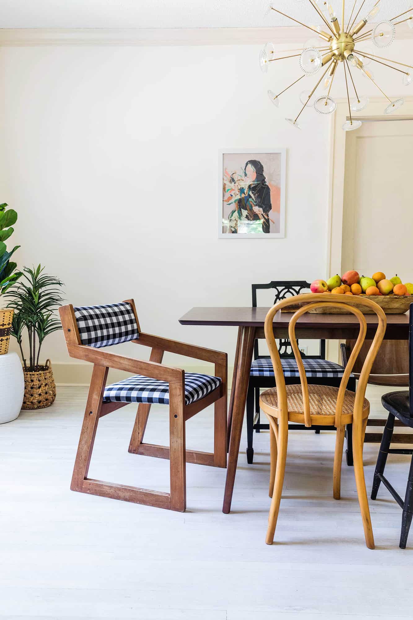
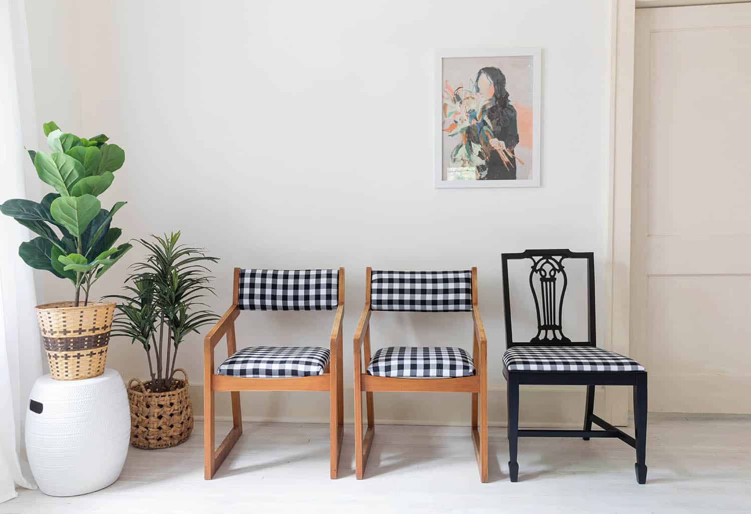
 If you follow us on Instagram, you’ve probably seen many behind the scenes at the Springfield Bnb house (Elsie’s second home for the holidays). We are still finishing up many things, but some rooms are beginning to come together and I am starting to add some furniture. I am normally a very slow decorator, and it’s taken me about four years to “finish” my personal home. So I am getting started on Elsie’s Springfield home (along with her, we email and FaceTime about the house a LOT), knowing that I’ll likely add more and tweak things as we still finish many projects. Today, you’re getting a peek into the dining room because I wanted to share these super simple reupholstered (thrifted) chairs.
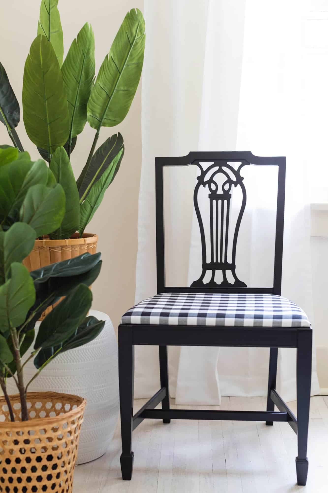
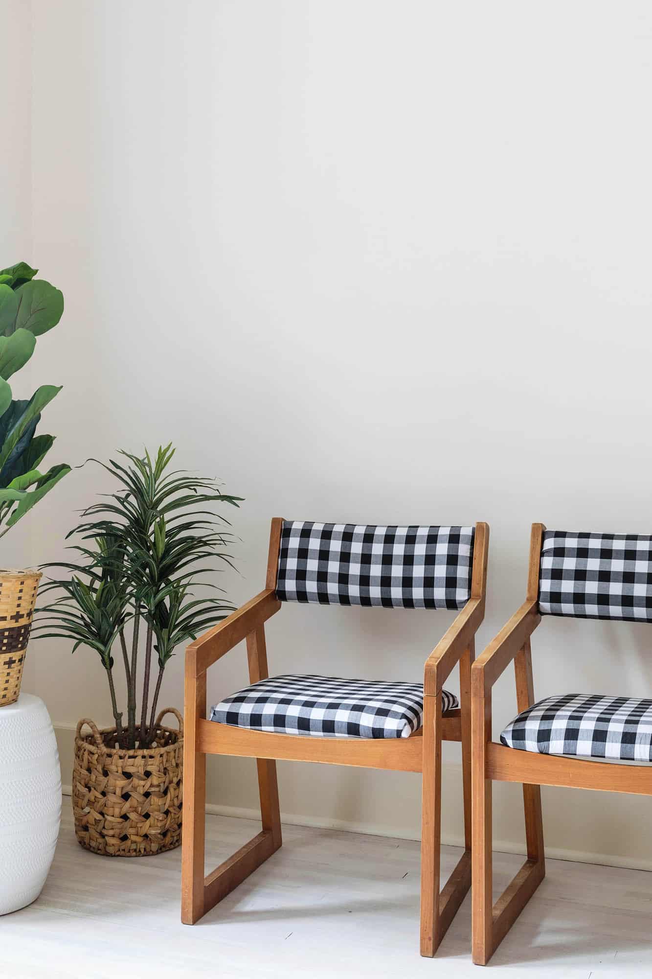 If you’ve never reupholstered a dining chair before, let me start by saying this is the perfect project to start with if you are new to reupholstering. Anyone can do it and I don’t know about you, but I find it a little bit thrilling to find something at a thrift store and give it a new life. It’s like the object is getting a second chance at life. Maybe that’s cheesy? I don’t know. But it sparks some joy for me!
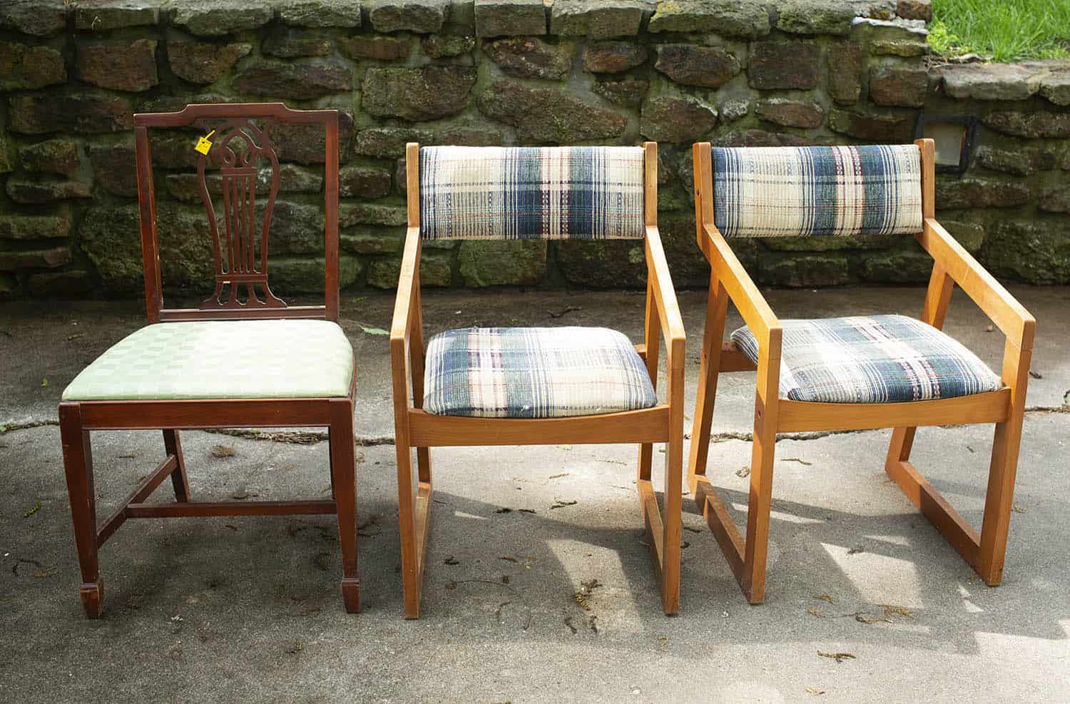 Here are the three chairs I thrifted that needed to be reupholstered and painted (the other chairs were also thrifted or from flea markets, but they were cute as is). The one on the left is the easiest type of chair to reupholster. You simply unscrew the cushion from the bottom, swap out fabric, and screw back on. I did one like this when I was in high school. So if you’re at all nervous to give this a try, look for chairs that are this type of shape/style for an easy option.
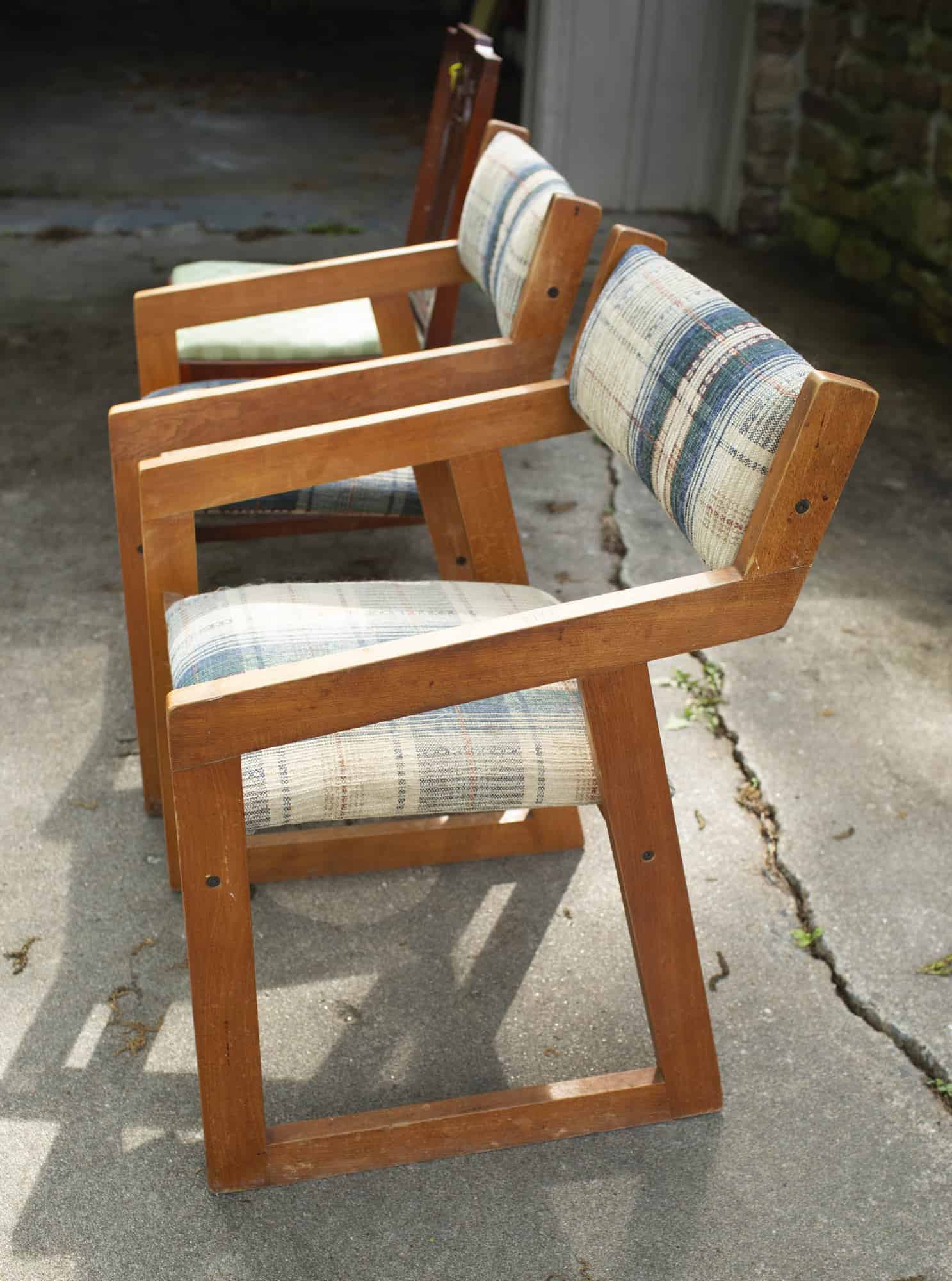 A couple of tips when shopping. First, this is a bit obvious but easy to overlook. Make sure to actually sit on the chairs when you are at the store. No matter how rough they look, you want chairs that are structurally sound, unless you feel confident you can repair them. Don’t buy a chair that’s completely falling apart unless you know you can fix it. It won’t matter how cute it turns out with your reupholster job if it’s not useful.
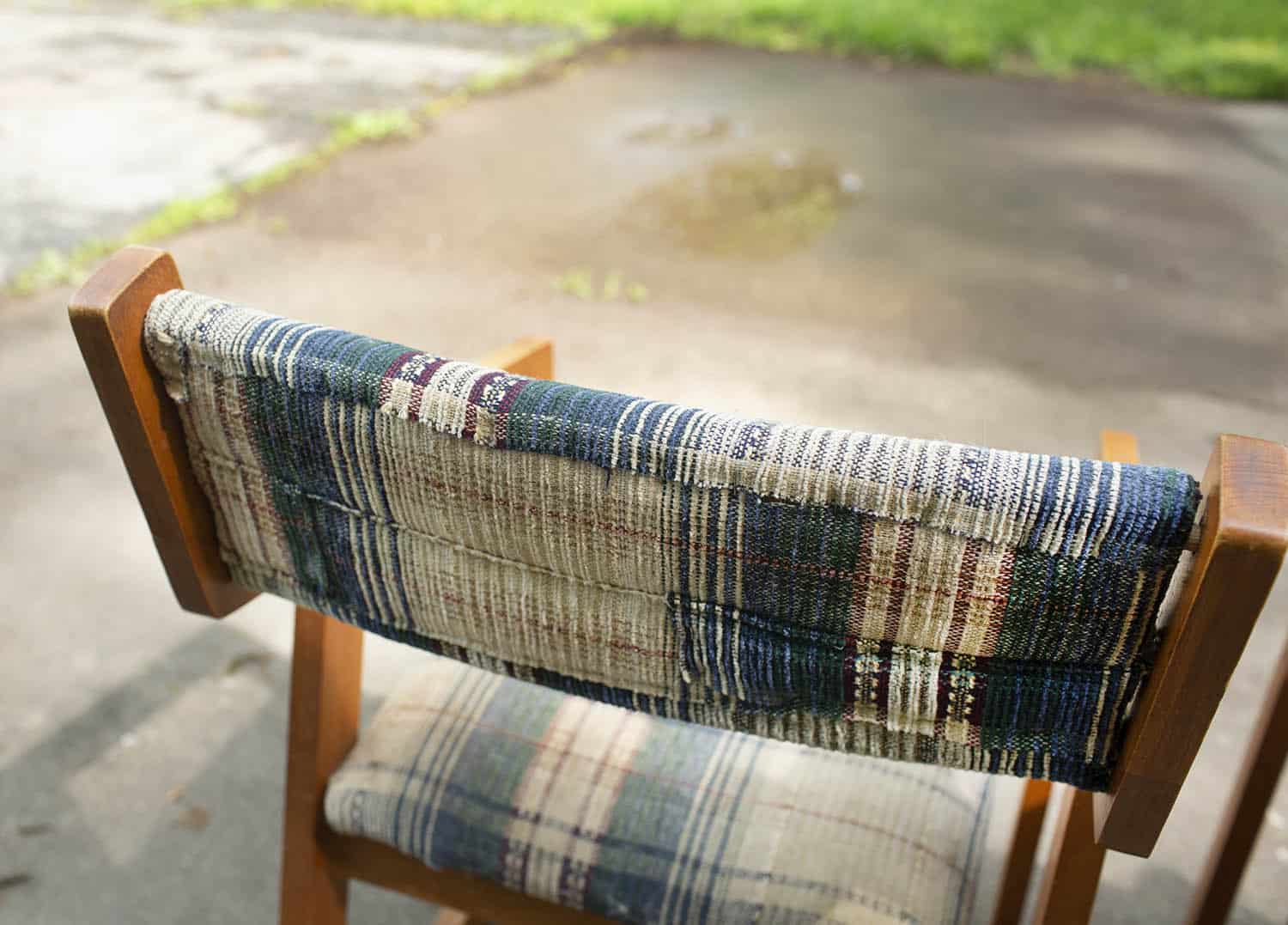 Here you can see the previous upholstery job—I’m guessing it was also a DIY for someone? I wasn’t 100% sure how I would do these back cushions, but I felt I could at least do better than this, so that gave me some confidence.
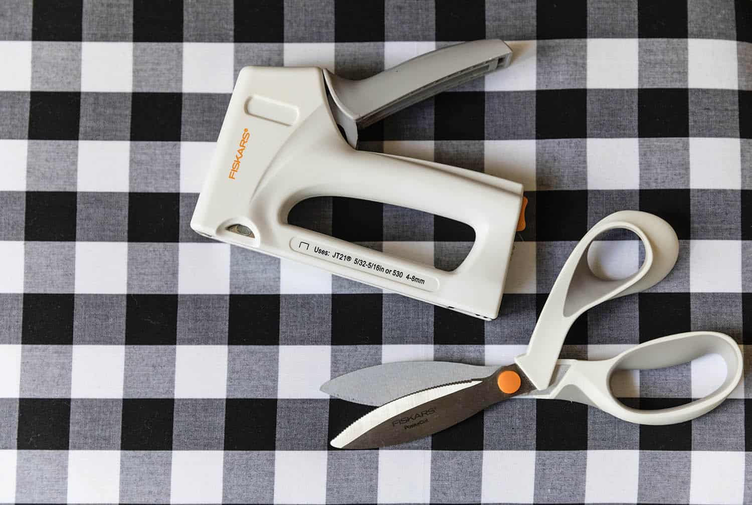
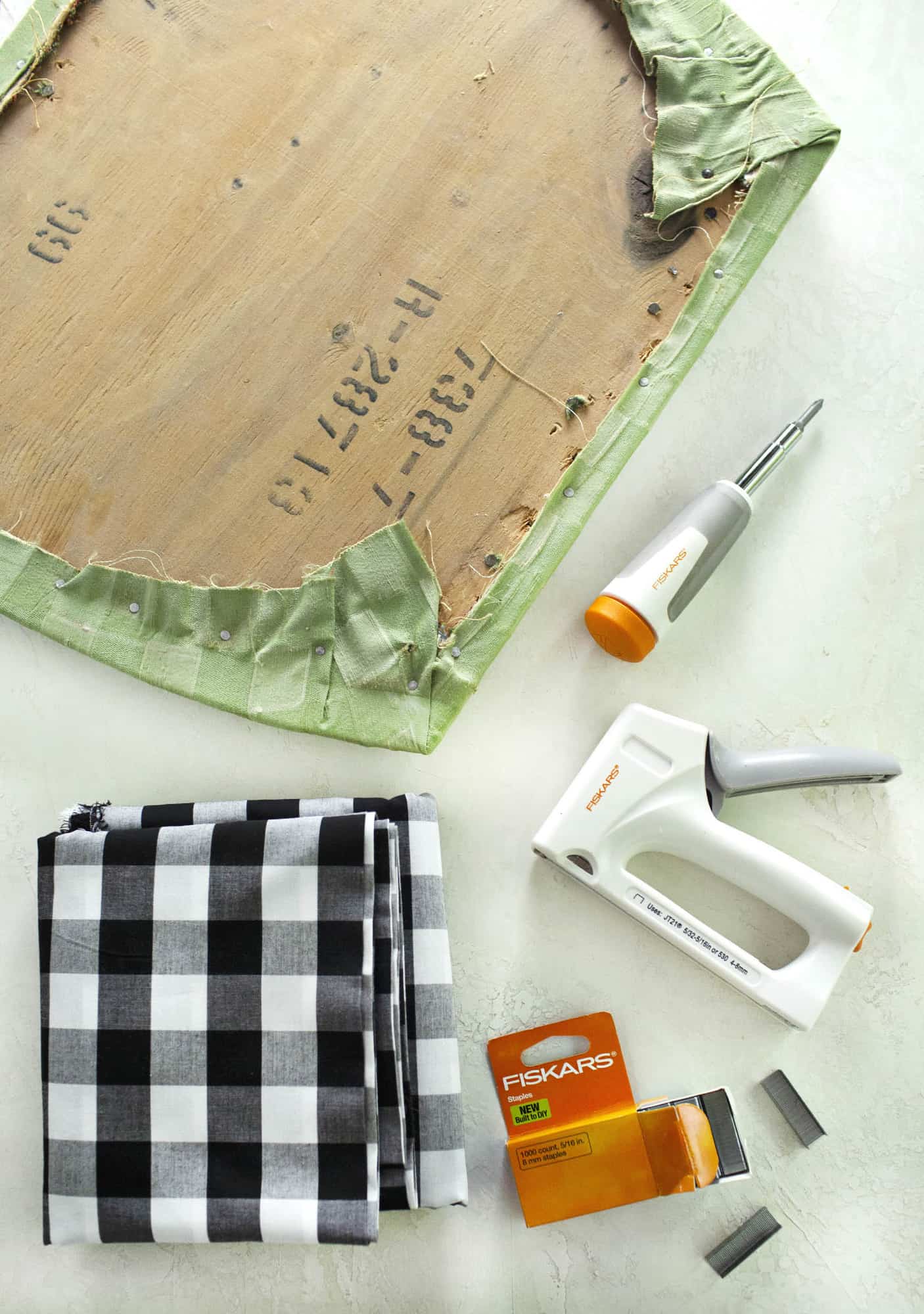 Supplies:
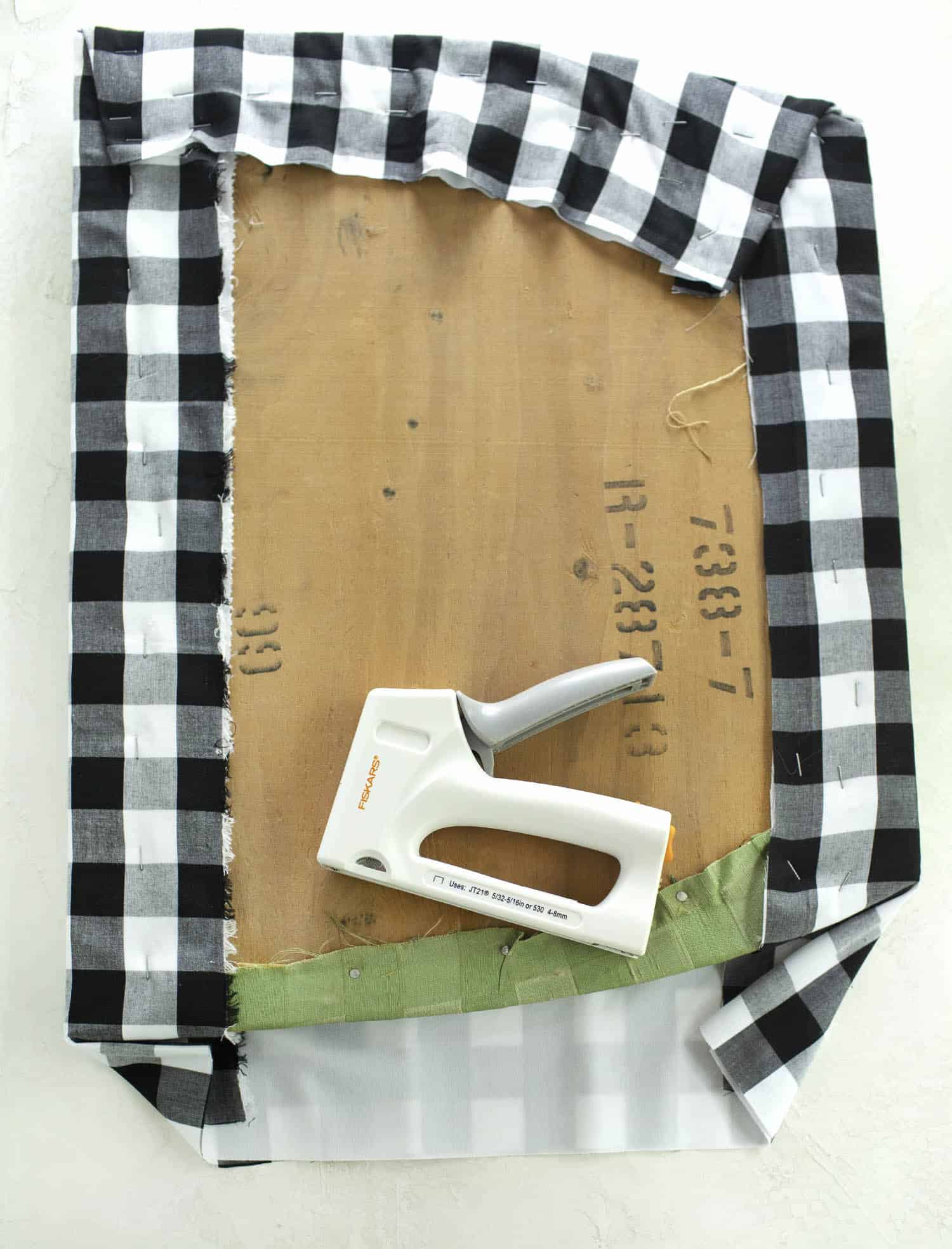 Step Two: Time to wrap the cushions in the new fabric. Think of this like wrapping a present. It’s super easy when the present is in a perfectly square or rectangle box, but it’s more challenging if it’s not. Right? I like to do two opposite sides first (stapling down the fabric as I go, like using a LOT of tape on a present), then folding and figuring out my corners as I wrap the other two sides. See photo above.
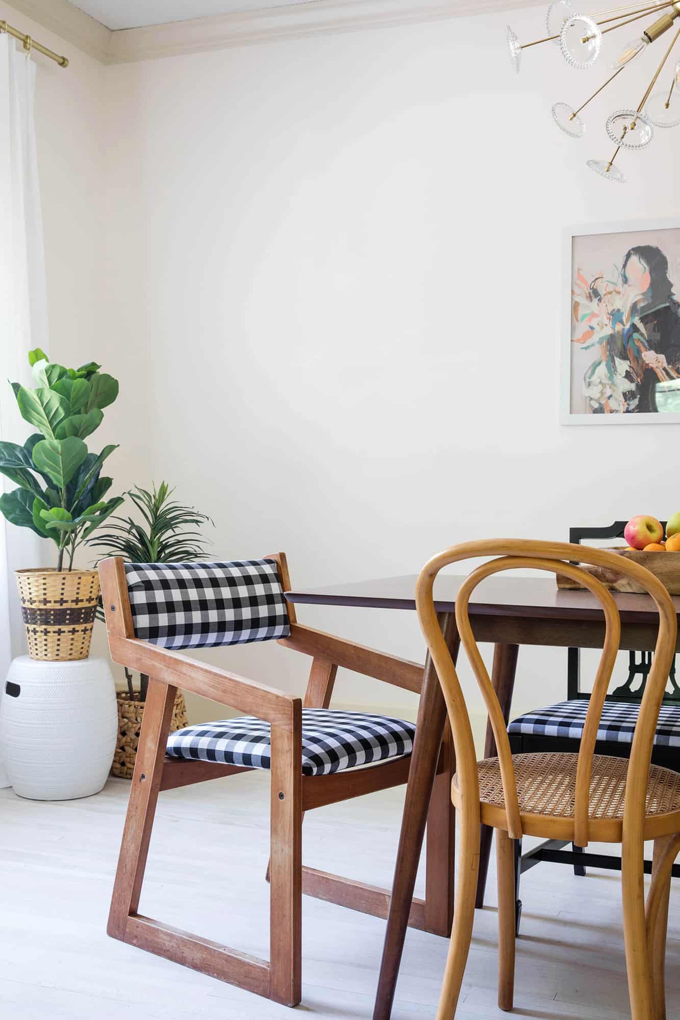
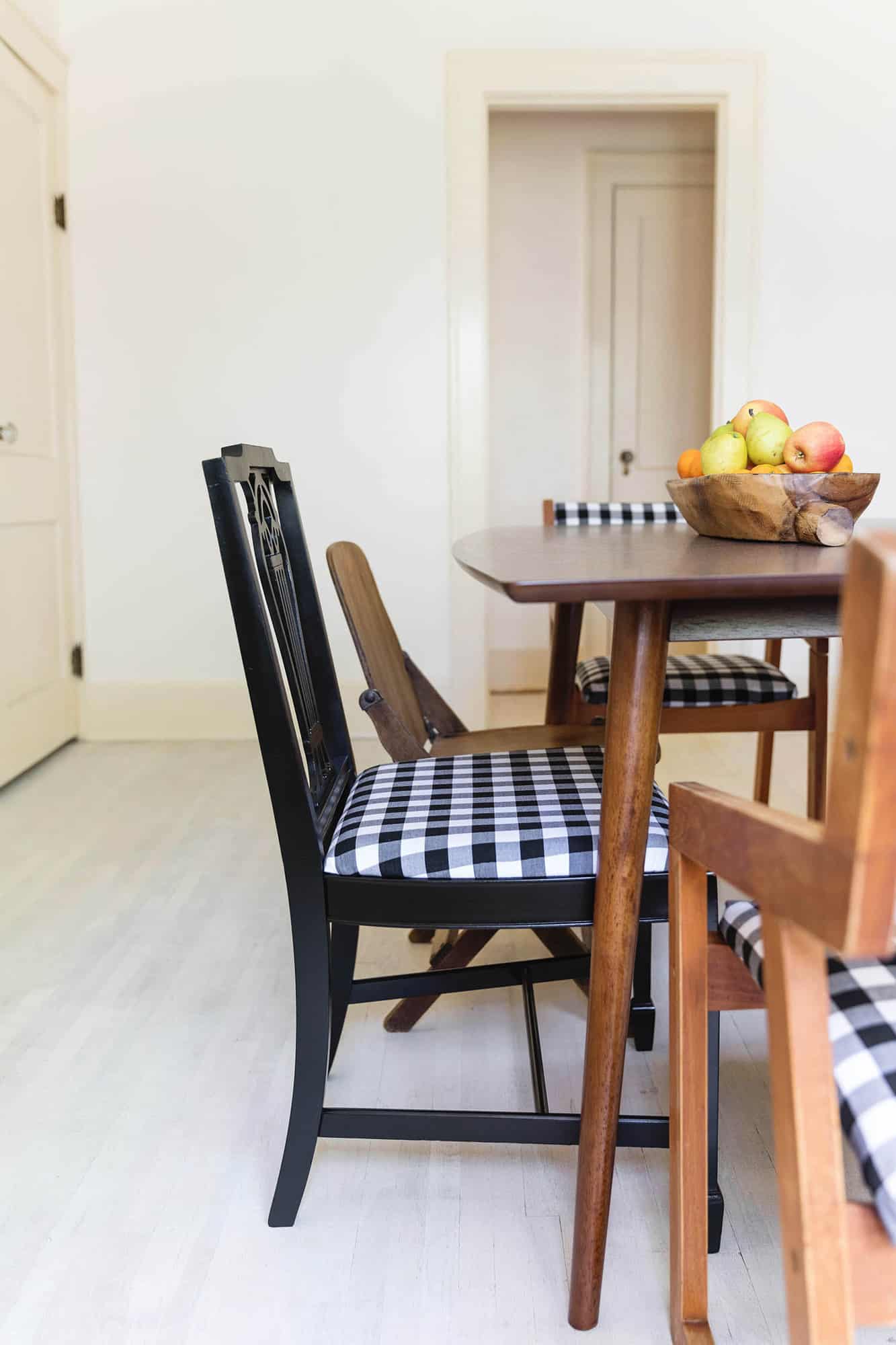
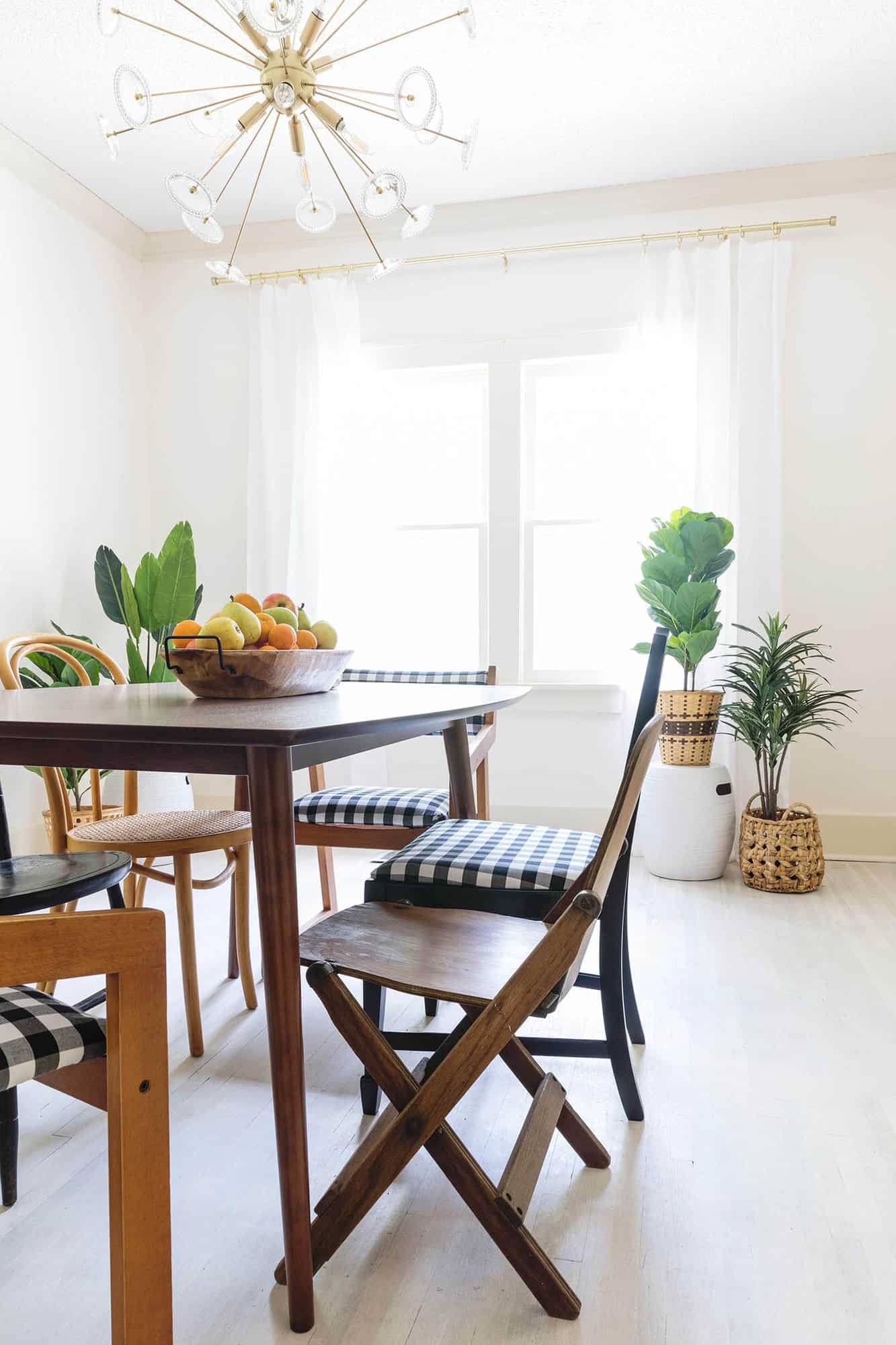
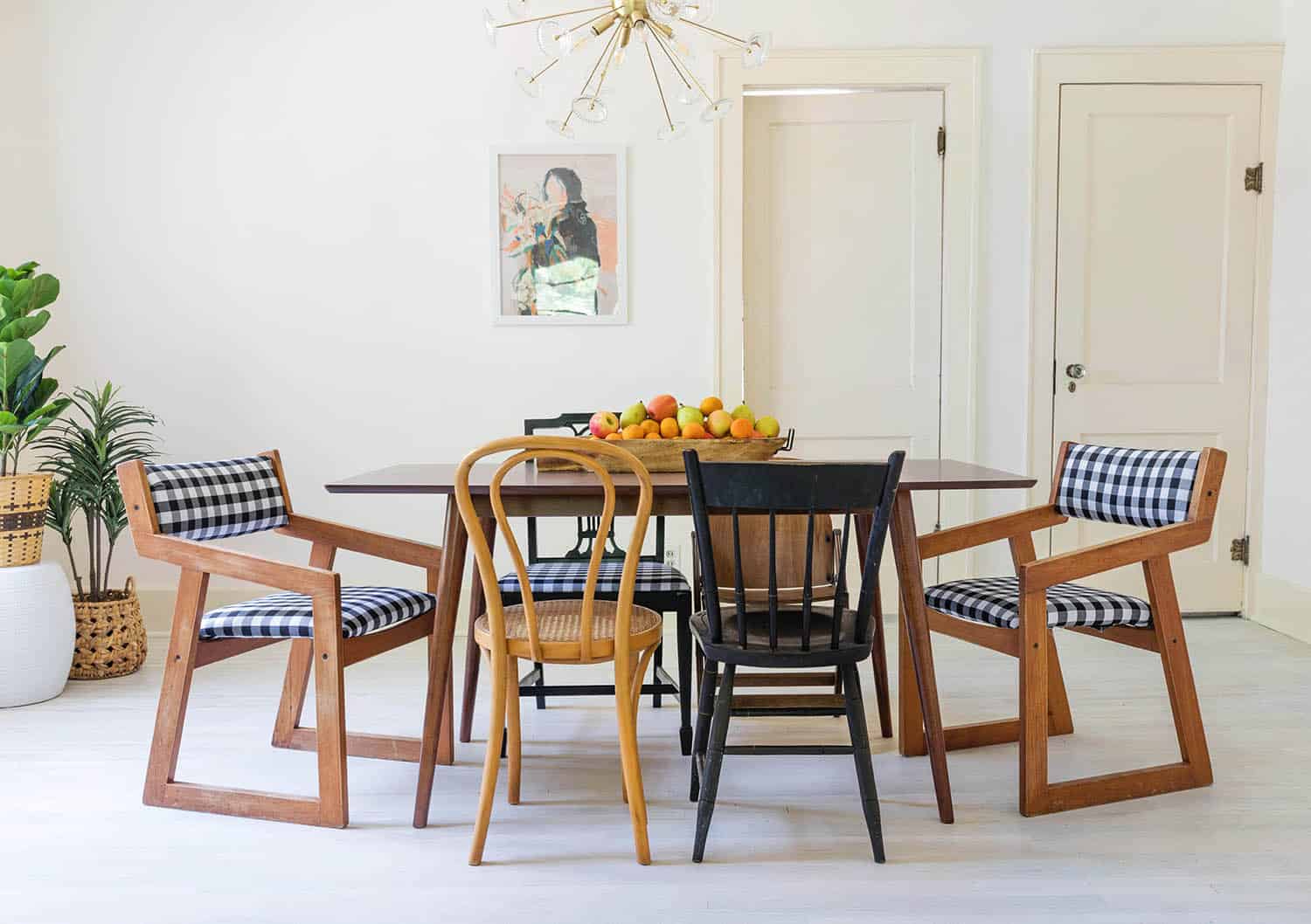
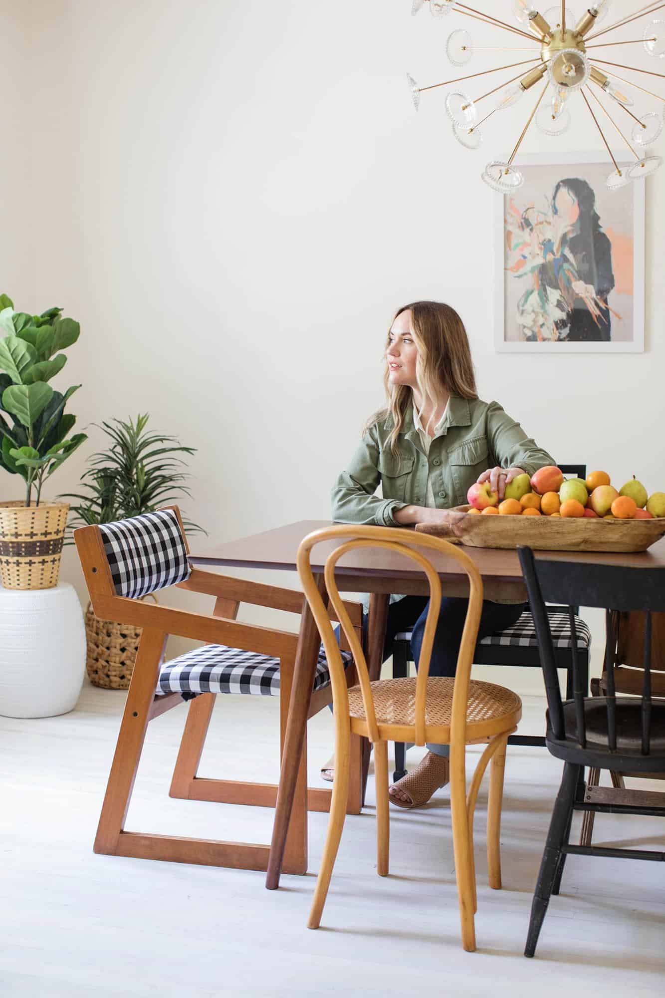
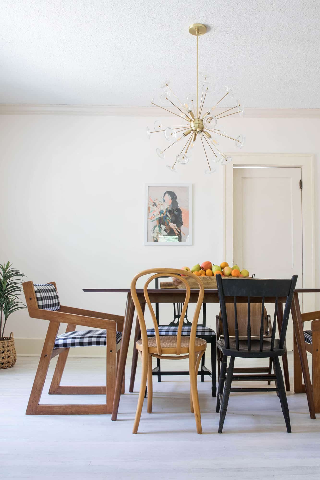 Even though I am not 100% done decorating this room yet, I knew it was going to be a fairly simple space, which is why I thought mismatched chairs might be a cute look for this dining room. What do you think? I also felt a little unsure on what fabric to choose, so I went with a classic black and white gingham. But I may swap this out six months or a year from now for something darker if things end up getting stained. I am still a little unsure how “high traffic” this home may be. But the good news is if I want to reupholster these again next year, it will only take me a few hours. So it’s a pretty simple weekend project. Anyway, thanks for letting me share! xo. Emma

