 Today, we are teaming up with Living Spaces to show you a big refresh I recently completed in my living room. I got a few really cute key items from Living Spaces: throw pillows, pouf, and this pretty rug! And I used these items to help tie the room together a little more. If you aren’t familiar with Living Spaces, you should definitely check them out. They have stores in a quite a few regions (check here), but they also can ship many of their items right to your door.
Before I give you a tour of the room, let’s take a little walk down memory lane …
 On the left is what this room looked like right when we moved in to our home about two years ago. You can also see a video tour of the house before we moved in here, if you want to understand the spaces a little better. So, initially the overall layout and structure of this house is what really made me and Trey fall in love with it. It has three bedrooms and two full bathrooms, so it was similar to our last home in that way; but it had WAY more square footage. This was great since I was planning to transition to working from home, so I needed more space for a home office. And I think the extra square footage makes the house ideal for entertaining, which we love to do. I’ve already hosted a few family holidays and also birthdays and other parties in our home, and it’s one of my favorite things!
So, the space rules. But probably the thing that we didn’t love about the house was most of the color choices in it. There was lots of dark wood and black trim/cabinets. Almost all the walls were painted a dark beige. And overall, due to the mature landscaping (aka we have lots of tall trees in our yard) and the fact that the house is partially built into a hill, it’s surprisingly dark inside, especially on rainy days and the winter. So, one big goal we’ve had throughout the house is to lighten it up without necessarily removing any of the features we love (like the wood ceilings in the front living spaces).
Here’s a mini tour of this room from last year.
You may have seen in this post when I updated you all on the fact that we finally pulled the trigger and had the floors redone. I also spent a few weeks staining the ceilings so they would look more like whitewashed wood. I am VERY afraid of heights so this was a big deal for me. 😉 These two updates have made a HUGE difference throughout our house and I think you can really feel it in this room especially.


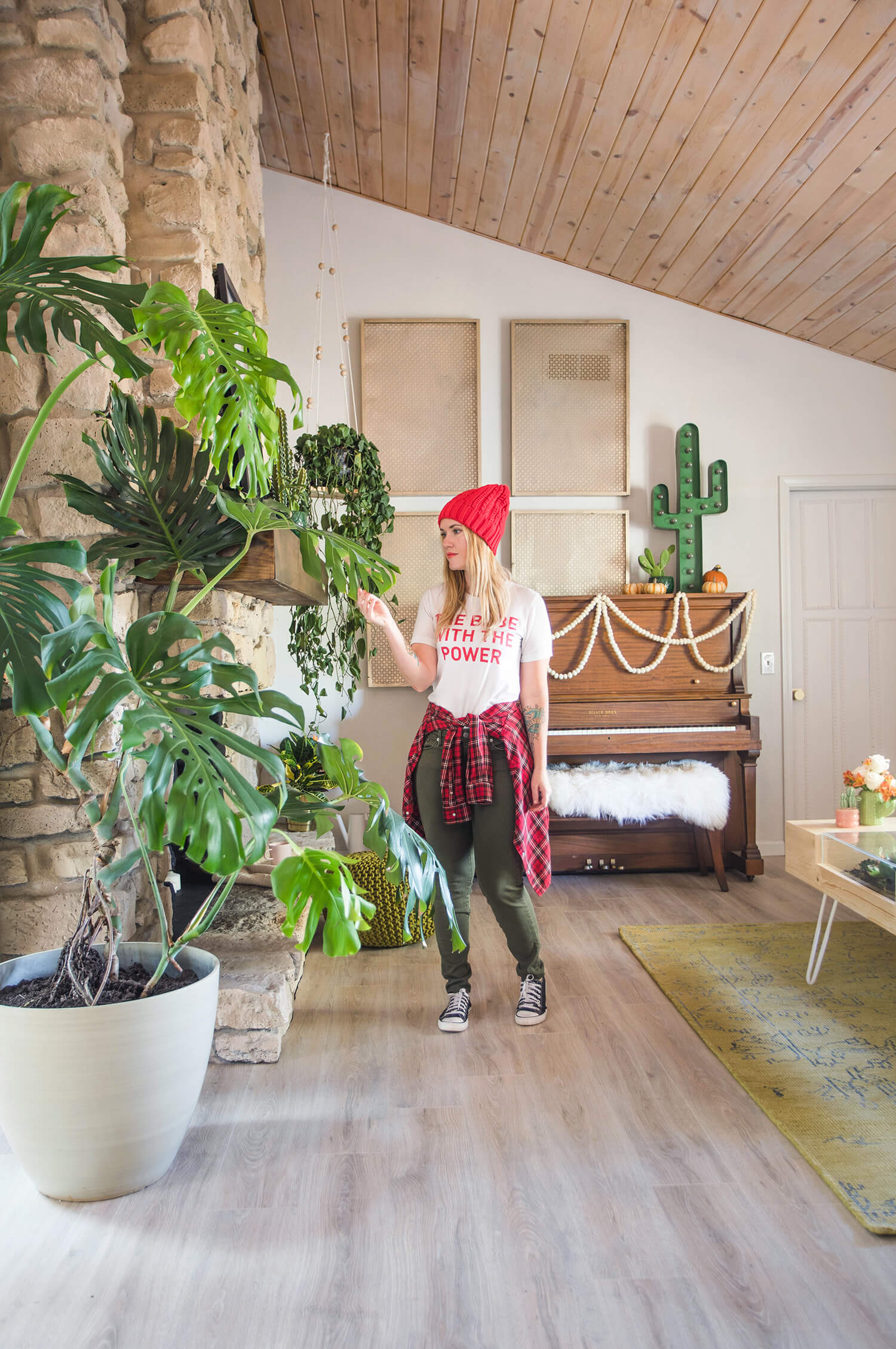 The room has two main focal points; one being the piano. This is a piano that Trey grew up with from his parents’ home. Trey plays a little bit (he also plays guitar, some drums, and a few other instruments) and I always love to hear him playing the piano randomly in our house. Something about it feels really homey to me. There was really only one space in the house where we felt the piano could fit, but I think it works really well in this space.
I recently added the gold metal frames you see around the piano and I am still on the fence about them. Let me know what you think. My goal was to minimize the look of the vent that’s right in the middle of the wall there (why do vents have to be in the middle of the wall!?), but still allow it to serve its function. I also like how they fill up the space but still feel a bit minimal. But, I must admit, I’ve already painted them three times and I’m still feeling like maybe they aren’t quite right. Next, I’m thinking about painting just the frames white and leaving the inside part gold. Thoughts? I also had a friend (hi Holly!) recommend hanging some macrame over the vent instead as it could also feel minimal (same color as the wall) but still allow air to flow. So I guess I’m thinking on that option too. I’m a bit of a slow decorator if you can’t tell. I like to try things out for a least a few months before I fully commit. Thankfully, I have a pretty patient husband.
We also have quite a few plants in this room. I LOVE plants. Most of them of are real, but a few are fake too, as I don’t discriminate. I recently moved that plant that is hanging in the corner by the piano into this room. If you follow me on Instagram you may have seen that he was getting some yellow leaves and a lot of people suggested I move him to a spot with less direct light (he was in my office before), so now he’s in this room and I think he’s doing better. Hard to say yet.
I also LOVE this giant split leaf plant you see me with above. Two friends of mine were moving to Portland recently and couldn’t take their plants, so they let me come over and buy a bunch of them. I immediately fell in love with this one and I am SO nervous about killing him. Any tips for this kind of plant would be much appreciated!!!!
We also updated the door next to the piano, which leads to the laundry room and garage. The door was pretty standard and dark brown (almost black before), which really drew your eye to that spot and also I think made the room feel a little smaller. So we added trim (similar to this DIY), painted it white, and swapped out the doorknob to a pretty gold one instead. Although it’s kind of minor, I think it all makes a big difference.


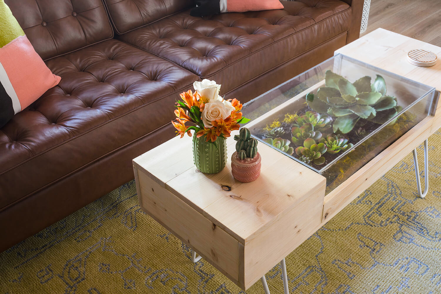 You might remember this brown couch from the old ABM studio, if you’ve been following us that long. The leather works really well with our dogs (I let them on all the furniture in the house), even though brown is not always my favorite color. I was super excited to get this green rug, as I think it goes great in the space and makes a great companion to the brown couch.
Ethan recently built this coffee table. I was wanting something similar to this side table I shared years ago, but a different shape and size. I was thinking of having him teach how to make this on ABM. Would you all like that? It’s pretty fun! The plants inside are faux, so you don’t have to water them or anything.
I also love the pink and green throw pillows on this couch, I think they add just the right amount of color in this spot. There’s a photo above the fireplace where Trey is wearing a pink sweater and to me it just all ties together really nice.


 If you had seen this room in my last update (here), you’ll notice that I changed out the mantle. It just needed something bigger to feel more balanced. I went with a dark mantel this time but have been considering painting it white. What do you think? Would you paint it white?


 I love the green pouf we got as it makes a nice little reading or chill area by the fireplace. I added more candles and I’m excited to light them all some night soon as it just feels like the perfect hot chocolate and cozy socks spot for autumn.

 And here you can see how this space connects to our kitchen area. I recently updated our bar stools by spray painting them copper. We have a few gold and copper touches throughout this space, so it just felt right.
That’s basically it. It’s honestly a pretty simple space but all the little updates we’ve been working on lately have finally made it feel like this space has come together—I love it! Thanks for letting me share and please do let me know if you have any tips for caring for any of the plants you see in this room, especially the giant split leaf. I am always looking to keep my plant babies healthy as I am no plant expert (not yet, anyway). xo. Emma
91 Comments
NOOOO don’t paint the mantle white 🙂 I love the brown with all the plants. Where did you get your mantle?
It was custom made by a contractor I work with often. I wanted one that would fit around my fireplace and didn’t find anything in stores on online that size, so had one made. They did a great job! And I’m marking you down as a strong no on the painting white vote.
🙂
🙂 I seriously love the mantle as is. Plus if you paid money to have it custom made why paint it, ya know? This gives me ideas for my way to skinny mantel! Thanks for sharing!
I agree! I think the mantle perfectly accents the piano 🙂
Absolutely love the combination of the wood, leaves, and copper in this room! The succulents embedded in the coffee table are so cute!
I wouldn’t paint the mantle white. I kind of like the frames above the piano, but think a macrame piece would look fantastic.
I really love the updates! I agree that all the little changes really made a big difference. I love how much the door changed the space and the new mantle and painting the inside of the fireplace, wow! The new table is so fun! I would love to DIY one, but my sister is anti-coffee tables, lol We did build our kitchen table inspired by a combination of some of the ones you guys did and we love it.
Wish I had tips to offer on the plants, but I have killed almost every plant I have put in my house, which is sad because I love plants. Good luck though, it is beautiful!
Anti-coffee tables. Hmm. That’s a new one to me. Ha! We all have our things I guess. 🙂
My partner is anti-coffee tables, too! And I am STRONGLY pro. I want a place to set my tea or put out some snacks! He prefers vast open spaces. I like cozy. It’s a struggle! So far we’ve agreed to get one once we replace our couch and find one that we can both live with that goes with the new couch. It’s been two and a half years living together without one, so…we’ll see how it works out.
I love the dark mantle and think the things you did to brighten the space up really worked! I’m also a fan of those vents….they’re so subtle but in such a nice, large scale way. It’s hard to fill up high walls like that.
I love how the small updates make a huge difference, especially the new floors and whitewashed ceilings! I vote keep the mantle wood until you can’t stand it. I think it goes well with the fireplace and your contractor did a fantastic job on it!
With the frames hiding the vent, something feels off for me. Maybe it is the pairing of four frames? It could also be cool to do a photo project with your Canon printer and do an extra large print that is above the piano. Maybe transferring a landscape photo or personal photo to a material with smaller holes for airflow? Hopefully that makes sense 😉 If not, I think macrame would look great or even an extra large scarf hanging? I’ve seen these around a lot lately!
Either way, the room looks great. I’m a small decorator as well and you’ve done a great job!
Such a pretty space, you can really tell how much lighter it is now! I would not paint the fireplace mantle white, the wood matches the piano and couch so nicely and balances those so well without being overwhelming. Re the gold frames – the vent draws my eye more than it did before (easier to ignore something that your brain says should be there, harder when it coincides/interferes with the artwork). What about uncrewing the vent cover and spray painting the interior of the vent and the back side of the cover white to match the walls? It should make the vent less noticeable. Food for thought!
Love that idea. Also Elsie was visiting this weekend and she suggested I add some white (or slightly off white, whatever matches the walls best) fabric to the back of the frames so the one hiding the vent will really hide the vent but still allow air flow. I am for sure gonna try that soon!
I love the brown mantle! I think the thing about the frames is that the piano is not centered under them and that your mind is constantly trying to center that configuration. Would just two of the frames stacked close together horizontally and centered over the piano work? Possibly add a tall plant then on the left side of piano to balance? The macrame art work could be sucked onto that vent each time the furnace or air would come on. (I am assuming it is a cold air return vs. a heat vent. If I am wrong nevermind. Lol)
I love it! I love it! I love it! I love the gold squares. I love the mantel. I love the table and want the DIY. I want to live in this room. 10/10.
Hannah, you seem fun! Come over anytime friend. 🙂
I’m still team “paint the stone fireplace white,” but definitely leave the mantel brown. And I agree that a big macrame piece would be great above the piano instead.
Yes! I would suggest to paint the fireplace white (the stones) and leave the wood mantel brown 🙂
I love the rest of the room!
I would keep the mantle with the darker wood, it definitely adds a warm touch to the space and plays well off the copper and gold accents and next to the large plant, it looks fabulous. I agree that the gold frames definitely help disguise the vent… but I can’t put my finger on why I want something more. Maybe macrame, maybe just wanting more within the frames. Maybe you could add a few more rectangles and squares in similar tones (1 shade lighter, 1 shade darker) and create a monochromatic color blocking. As it is, the frames help disguise, but your eye still travels to the vent.
Love the updates you made to the room! And absolutely would love a detailed DIY for your coffee table so I can make one as well <3
Cool deco
New post:https://thepinkpineappleblog.blogspot.com/2017/10/london-fashion-week-day-12.html
I agree with those who are advising NOT to paint the mantle. I think the darker wood continues the color from the sofa. It doesn’t seem to over power the room at all. The 4 screens framed on the wall definitely don’t work for me. Personally a beautiful piece of artwork on the wall would create enough focus that the grate wouldn’t be an issue. I did see one home that made a custom wood insert and drilled some holes strategically to still allow airflow yet create a more farmhouse/modern look. It was painted white like the walls and it looked really cool. I’ll try to find the link and share it with you.
All your plants look gorgeous! My house if full of them and to me it makes a house a home 🙂
Love the room updates. I like the combination of the cosy items with the wood as I always think exposed wood looks so pretty inside a house. I’m particularly fond of your throw cushions and cactus lamp!
Have a great week!
Abigail Alice x
I found that link for the vents! It’s from remodelsta and here it is. I hope the link works!
https://www.remodelista.com/posts/architectural-detail-owl-hole-heating-vent/
Please don’t paint the mantle! I also feel something is off about the 4 frames, but I know you will work it out, previous posts had some good ideas for you. Hope you’ll update us on what you decide. I love the room otherwise, beautiful!
What if you did some kind of geometric or floral needlepoint on the gold frames? You could break a pattern up, so it’s spread over all four, but centered in the middle where the four corners meet? Or, have a pattern cascading down diagonally?
Love this update and what those ceilings have done for the space! Please share a how to for that coffee table.
I’m the director of a botanical conservatory and field a lot of plant care questions.
The best advice I can give for plant care is classifying them and researching their specific needs. Then creating a routine watering/inspection schedule.
As far as your split leaf (Monstera deliciosa) is concerned, they prefer indirect light and humidity. I keep a spray bottle of rain water on hand and mist pretty generously. You’ll also want to give the aerial roots something to climb. They’re very hardy and easy to care for and they’ll let you know if something is wrong. 🙂
Thanks for that info about the split leaf. I have one and will use q those tips. Thanks!!!
Ohhhh the vase and ceramic jar on your coffee table! Where did you get them?! Also, I’m in love with that coffee table in general, also the Poof’s shade of green. My dining room has a similar color palette and i love it.
The mantel is amazing in wood!
Ooh! Are those Schoolhouse Electric fixtures in the kitchen? The space looks amazing.
They are from Anthropologie 🙂
Don’t paint the mantel!!!! The picture of you and Trey and all the candles ?SO GOOD
I feel like the gold grates art (even though I LOVE them) actually draw MORE attention to the vent. I didn’t notice it at all in the before picture. But it was the first thing I noticed in the after. I thought it was interesting that you were covering it, but the framed grates seemed to draw attention to the fact that you’re hiding it.
I wouldn’t even worry about hiding the vent. Vents are like crazy aunts. Everyone has them, but they’re best left alone.
Don’t paint the mantel- I love it! It suits the brutal stonework of the fireplace.
I totally agree about the vent! I had to scroll back up to the before picture to see it because I hadn’t even noticed it before!
I wouldn’t paint the mantle either. There is something really interesting about the gold frames, they are almost like an impression of a window- and it is clever to pair them with that vent too. At first it threw me that it is cut off by the piano but actually it kind of adds to the window feeling. I wonder could you play around with that arrangement of shapes in that area a small bit more. It might just take some final tweaks to get it just as you want. Other peoples suggestions for what to do in that space are also interesting- like the wall hanging idea, not only are your frames cool as they are, you could probably weave or stitch into them too. I love all the touches of green and copper throughout. Your coffee table is so inspiring too.
Wow, Emma. This is so, so beautiful. I like seeing what you guys do in all your houses, but this is the first room that’s floored me. I actually nearly cried (how weird is that). I can’t say enough how much I love your aesthetic here! The wood, the stone, the plants, that succulent coffee table! All of it is divine!!! And is classy, beautiful and homey all at once. I really love it! I think when we ever get a place (who knows when that will be – Australian house prices are bananas) I’ll be subtly replicating this one!
Love the changes!
Where did you get the cactus marquee?
Hi! It’s linked at the bottom of the post 🙂
I like it 🙂 so calm and cozy but interesting. Just my opinion, but something about the frames over the vent seem off to me, I would love to see what other creative ideas you come up with instead!
It is looking beautiful! The door changes really makes a big difference! Especially along with the floor and ceilings. I love the lighter and natural look of everything with the plants and green and beautiful stone fireplace and love the photo of you and Trey in the slim black frame. I would definitely leave the mantle!! It ties in great with the piano and sofa and overall vibe of the room. Ah I love it!!
The plants are AMAZING. And I like the gold screens – maybe leave them for winter and add white paint for spring if you still don’t like it?
I LOVE the mantel the way it is the contrast to the stone and the plants is excellent! Also, I would love to learn about how the coffee table was made!
beautiful room!! although i’m not a huge fan of the frames, they looked a bit off to me even before you mentioned them. would absolutely love to learn how to make the terrarium coffee table, it’s gorgeous!!!
Love this space!
An idea for the 4 frames covering the vent space: what if you stitch a four letter word;) such as HOPE or LOVE in the mesh, with a bright, bold or subtle yarn or other material? That way the “O” in the 2nd frame in front of the vent could still let air pass and this could add a bold graphic in a large space?
Lovely living space.
“SOUL” “MOJO” & “COZY” are good 4 letter 2nd letter “O” words too!;)
Love the gold frames I honestly thought the vent was a part of the art work…
I second the humidity for the split leaf! I recently made a cutting of my much larger split leaf and had it by my kitchen sink. After about a month one of the leaves was almost leaning into the sink — it kept growing down. I think it liked the steam from when I washed dishes!
I would also advise keeping the soil nice and wet. Not soaked necessarily, but I never let my split leaf’s soil completely dry out. I water a little bit (rather than a lot) every couple of days and it seems content. They take up SPACE though if you let them – they don’t call them monstera’s for nothing. My first cutting was VERY scary, but something needed to be done. There are some great tutorials online if you get to this point and need to trim the monstera back. I had my cutting in a vase full of water for about 3.5 weeks so it could root, then planted it in soil. As long as you cut under the nodule, and there’s a nice little root growing off of it, then you should be good. Good luck! They’re hardy, happy plants. 🙂
Absolutely love it with the stone wall, the plants and the piano! It fits so perfectly!
https://www.makeandmess.com/
I vote NO on painting the mantle white. The mantle, as it is now, warms up the white that you already have in the room. I used to love the white shabby chic look, but so many people have adopted that look over the years that now I can barely stand it.
I wish we had a fireplace! My parents have one and I miss it lots.
just follow houseplant journal on instagram for your monstera, he has all the tips! so jelly!
I think the frames on the wall evoke a window, which to me is really nice way to break up that wall!!! Gorgeous space 🙂
What if you moved the four frames to the wall on the other side of the door? I love them, but I think they draw more attention to the vent. Looks awesome! Very Big Sur!
Looks amazing! Loving all the vibes!!
Katie | http://www.meshkomoments.com
Love the space and the change of floor and ceiling (much lighter). I’m a strong NO for painting the mantle white. It’s beautiful as is and as pointed out by another reader, why spend the money to get it custom built if you’re going to paint it over? As for the gold metal frame, I’ll be honest, as soon as I saw the first picture I though they were way too busy in this space. The macramé idea might work but I wouldn’t charge this wall too much as the piano is already a nice focal point.
i also have an eyesore next to my piano, however mine is the electrical outlet box. I put a macrame wall hanging over it and not only does it cover the space, but the color is a nice contrast to balance the dark wood of the piano. My vote goes to macrame!
Love this room! My initial reaction was to say paint the mantle white (and yikes! I think i’m the only one!), but after looking at the photos more, I agree-it looks nice with the piano. I get weird about having too many different colors of wood in a room, but this looks beautiful.
Two questions: Is the cactus in the little white pot on the mantle real? And where are those white metal stool things from that have the plants sitting on them by the stools?
Thanks!
I beg of you not to paint the mantle white! I think it would be too much of a contrast on the stone and stick out more than you would want. I like the frames alright but am thinking a macrame piece would be really cute instead. Definitely worth a try as the frames can be easily swapped back in.
I love the new mantle! And how much lighter the room feels with the new flooring and re-stained ceiling. I would definitely leave the mantle as is – it seems to balance the room out (with the couch and piano).
I would leave the mantel as is. I think it matches the couch and the piano well.
I love all the updates. Those candles in the fire place made my heart skip a beat!
So many plants in your space, I love it!!!
Hi Emma! I love the room refresh! I was wondering if you had a link to the gold doorknob? I am doing similar door makeovers in my house and love this knob!
Thanks,
Sarah
Yes, it’s from School House Electric. They have awesome stuff, I love all their hardware.
I love the large gold frames by the piano! Did you buy them or DIY them?
I love the new mantle and I would leave it just like that! Did y’all buy it or build it? I want a dark wood floating mantle like that for my living room fireplace and i would love more details. Thanks!
I love all of the wood tones and bright colors!
Paige
http://thehappyflammily.com
My thoughts on seeing your space –
1) Leave the mantel as is, it looks great
2) The piano wall feels off for me. I am afraid that by trying to hide the vent you are actually drawing more attention to it. I would make a large collage of items on the wall over the piano, and wrap it partially down the wall next to the piano. Collage could be art, pictures, and objects of interest. Use various sizes and different frames for the art and pictures. Also, I think the cactus is too big in scale compared to the size of the piano. Once you hang a collage that ends closer to the door frame, you won’t need to put such a big piece on top of the piano to fill the space; you can find other items such as books, or other items more to scale.
3) I think the couch, pillows, rug, table and plants are fabulous! Also enjoyed how you showed how the room flows into your kitchen, very helpful.
Thanks for letting us play designer!
Always enjoy the room tours – they provide inspiration!
Wow, there’s so much to love about this space! The lightening and whitewashing of the wood has done so much to modernise the look and feel of your home – beautiful. The colours are lovely and the plants make it feel like home. This space is so lovely.
As far as your request for feedback goes..
1/ the mantle is gorgeous – it’s warm wood tone provides such a lovely contrast in tone and texture to the stone, if you painted in white it would visually disappear and make everything on it seem like it was floating – so I wouldn’t change it – you nailed it the first time! (pun unintended…)
2/ to my mind, the gold frames to hide the vent only draw attention – so how about making the vent part of the arrangement by making it a gallery wall by adding several other pieces to the wall of various sizes and, even, shapes – then you wouldn’t even notice it – you could use one of your gold frames as one of the pieces and, heck, even paint the vent and its frame gold too – if you can beat them, join them!
3/ the cactus light is awesome but feels too large for above the piano – the scale feels off to me and I think that might be part of the imbalance of this area – it’s hard to judge its size, but I think it might work if you put it on the stone hearth to the left of the fireplace which would give you the opportunity to hide its power cable (if it has one)
Anyway, I hope this is helpful. Thanks so much for your inspiring spaces and sharing your passions with us all! Love your work!
Emma, please continue to share more. Your house is incredible, it’s come so far!
Charmaine Ng | Architecture & Lifestyle Blog
http://charmainenyw.com
Is there are garage behind the airvent wall? If so, why not plan in the future to move that vent away from where it steals focus–maybe over to the right, above the door? If the garage is unfinished, you may have an easy task moving that ducting. Just a suggestion….
Love that table sooo much! Please have a lesson for it!
LOVE it! It looks like such a warm, cozy room 🙂 And YES PLEASE to a coffee table DIY!
I see the brown couch was from a different space, originally – but can you tell me where it’s from? Living Spaces?
I love, love, love your room redo. I had not seen the way you had it originally, but it now looks so Grand and homey and cozy all at the same time. I would not paint the mantle white. It really helps to ground the big expanse of rock/brick fireplace and ties so well together with the sofa and piano. You have just the right amounts of bits of color.
Love this update! I think your color scheme is gorgeous. It’s fun and inviting while still feeling ‘grown up’ if you know what I mean. (I’m a woman in my early thirties and I’m trying to figure this balance out for myself!) This feels like a room you can truly live in and I think that’s important. Also, the brown mantle looks perfect. It brings in the brown from the couch and the piano. I noticed how well the colors were balanced in the photos!
Just scrolled through once more and was thinking that when you were ready for an update on your coffee table you could add some rocks in there similar to your stone wall. 🙂
DO NOT PAINT THAT MANTLE. I know your style is very clean, but the couch, piano and mantle are the perfect warm, brown frame for the room.
Plus I love the frames behind the piano. The area is such a strange shape, but the frames do the job well. They also reflect the colour of the stools under your counter, so they reflect the room symmetrically really well. The style of the frames is very colonialist, which is a beautiful style very popular in South Africa. I feel like you could be a designer for these guys:
https://www.weylandts.co.za/
Absolutely love the updates that you’ve done since the last post. The mantel is perfect as is – please do not paint it white! Such a cozy, clean vibe.
Love the refresh and agree with the other comments not to paint the mantle. I am generally a “paint everything white” kind of person but the mantle ties everything together and white would almost be distracting.
Good call on the functionality of the big frames behind the piano but I think I get the vibe your are getting from them. What if you used the gold grids to hold a few pictures? Maybe even use them to display holiday cards?
Great job! Love the green and pink accents!!! XOXO
The painted bar stools are stunning!!! I need to know more (what kind of paint, etc)!
The touch of plant all around is fascinating. And that sofa is marvelous. Everything looks fantastic, congrats on the transformation!
I looooove your floors. I’m in the market for new ones myself. What kind are they? A source would be so helpful. ??
I love the dark mantel! It coordinates perfectly with the piano, the couch, and all the plants.
Also PLEASE share a DIY for the coffee table, I love it so much and it would be great to have a guide to make something similar 🙂
Love the spray painted stools! What paint did you use?
Rustoleum in metallic copper
It looks great! You seem to have all the required things to fill up the front living room at the right place especially big plants which rarely seen inside in homes. Sorry, I am also not a plant expert. So, I can’t help you on this.
The whole room looks great, except that hanging plant. It looks like it is root bound. I would suggest repotting into a bigger pot with fresh soil. You can also trim it back and give it lots of water. I love how you have it hanging from the ceiling! I am also a slow decorator.
Just a note of caution: that hanging plant looks like one I just got rid of. I found out it’s toxic for dogs.
A rule of thumb for me is go to ASPCA.com, there’s a very extensive list of toxic and non-toxic plants in regards to our furry friends.
Take care.
Thanks for the link!
I love the room now, it’s bright and beautiful. However, the art over the vent just doesn’t look right to me, perhaps try your friends suggestion of a woven wall hanging, but to be honest no one notices vents as we all have to have them. Please leave the mantle as it’s beautiful. I normally prefer painted wood but in this case it’s too beautiful to cover x