 Hey, friends! You may have noticed that our site is looking a little different this weekend. What gives? For the last year (yes, a whole year! crazy, right?), we’ve been working to update our site in a LOT of ways. There are a lot of things we’ve changed, we hope for the better, and I’m excited to walk you through a mini tour. First let’s look at some of things you can see, and then I’ll tell you a little more about improvements we’ve made “under the hood” too. 🙂
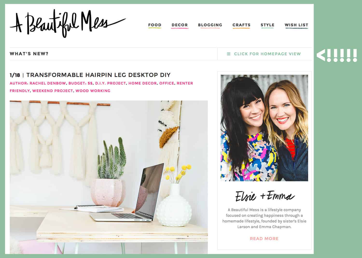
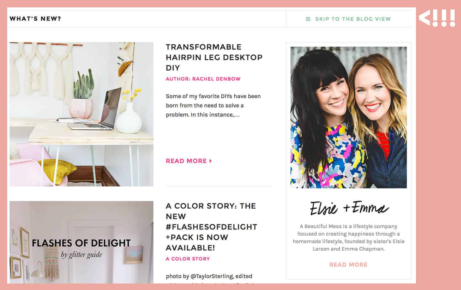 When you visit abeautifulmess.com, you are landing on our homepage. That’s right, we have two main views on our site. We call them the homepage and the blog view. The blog view can be seen by clicking “skip to the blog view” or by bookmarking abeautifulmess.com/blog.
 So what’s the difference + why did we want to add this homepage view? A couple reasons. First, we wanted to create some better tools and resources for you guys in case you were looking for a certain DIY or might’ve missed a particular post we’ve done in the past. And second, we realized our site might not be as “new user-friendly”. While many of you check in on our blog regularly and are able to keep up with the chronological feed, we also get a whole lot of new or more casual visitors that found us from Pinterest or a Google search. We will have created 10 years’ worth of content this year, so we wanted to give those new readers quicker access to the breadth of content we’ve done over time.
However, we didn’t want to transition the site into a whole new homepage-style structure when so many of you, our core audience (hi, friends!), were just fine with the OG blog view. So we left that entirely in tact with abeautifulmess.com/blog. The latest post is up top and you scroll to see everything. We had considered adding jumps (read more) to this page but decided not to for now, although that’s a tricky one. Here’s why. Our site is extremely photo-heavy. We like it this way and have a feeling you do too. But the problem with this is it can lead to really long load times, which tends to turn readers off a site. We’ve heard from many of you that our site takes a long time to load, and we knew that adding jumps would cut down on this. But ultimately we decided that for now, we are OK with longer load times so that our site can feel more like an old-school blog. We’re exploring other solutions for cutting back on load time, and I’ll talk about that more at the end of the post.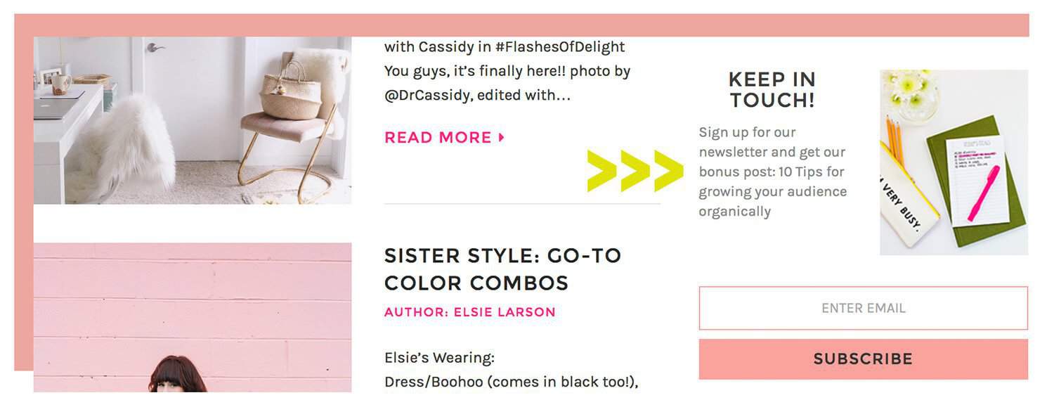 We kept our newsletter sign up in the side bar and added a freebie! When you sign up, you will get an article called ’10 Tips for Growing Your Audience Organically’. Fun, right? We hope to update the freebie every now and again so that you will be getting something extra just for signing up. And if you are already signed up for our newsletter, check your inbox later today, as we’ll be sending it out to all our subscribers shortly.
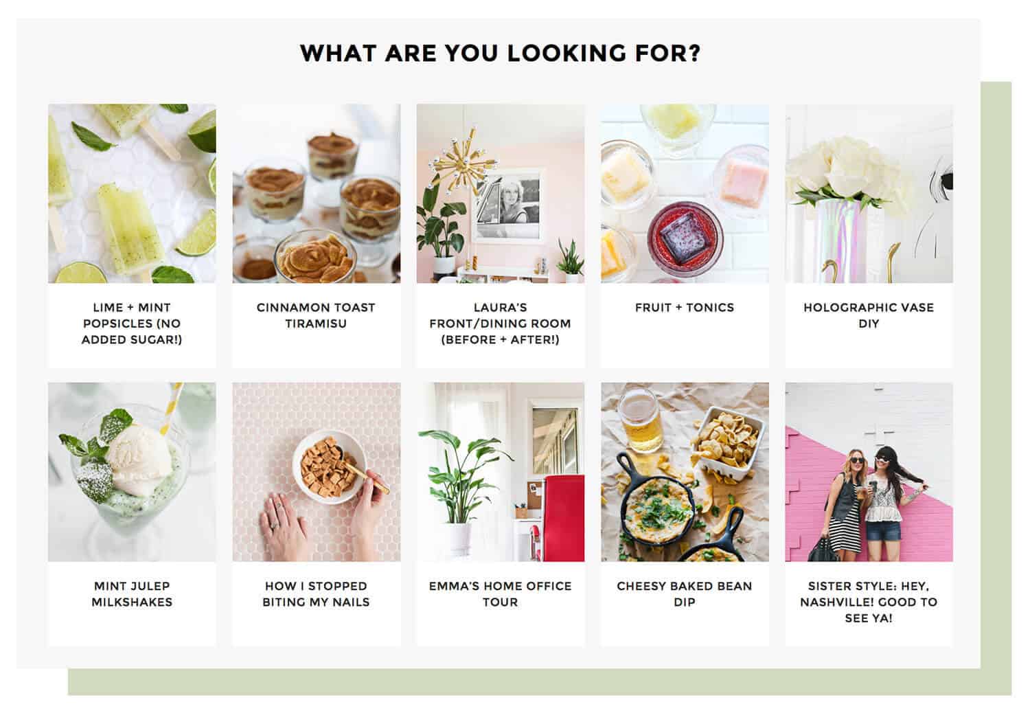 On the homepage, if you scroll just a little, you’ll see this area called ‘What are you looking for?’ Our goal here is to keep some of the most trafficked posts on our site easily accessible, again, in case a reader lands on our site from something that may not have been linked correctly, and they want to find the project or recipe they are looking for FAST. We hope this area helps! If you’re curious what some of our most popular posts of all time have been, you’ll probably find them in this area. We’re actually still updating this section, as I write this. 🙂
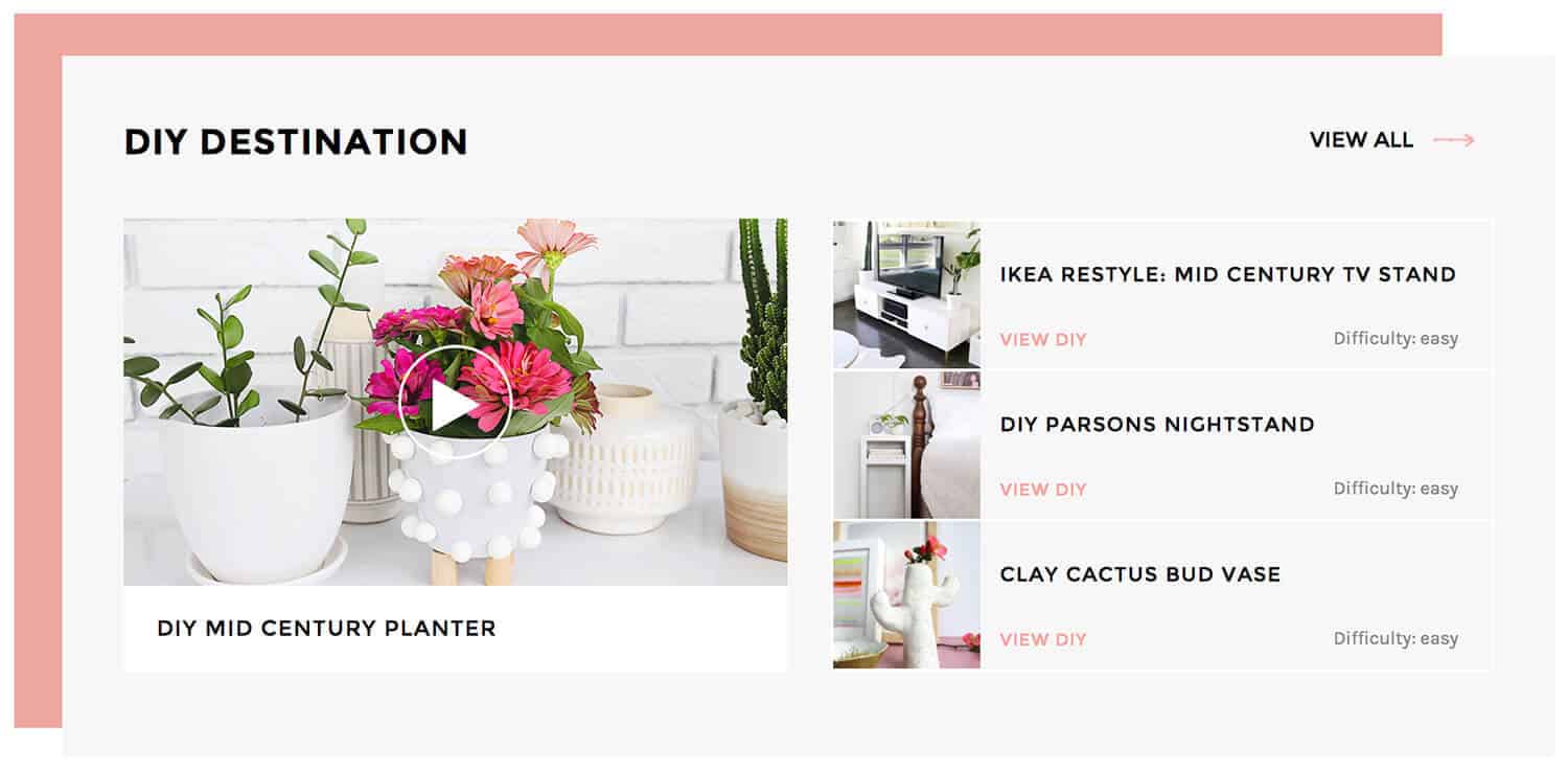 We’ve also added a ‘DIY Destination’ area on the homepage. We are still tweaking this area some, so right now you can experience the beta version. The main idea here is to highlight tutorial videos and other DIY content by certain categories (budget, difficulty, purpose, etc.). We hope that anyone looking to make something will be able to quickly find a great resource in this area. But again, you may see some changes to this area over the next few weeks as we finalize things.
And the last thing I’ll mention for now is something that you can’t really SEE. It’s under the hood. We have moved our site to WordPress! For the last ten years we were blogging on Typepad, which we really enjoyed. But as we’ve watched WordPress grow and grow, we felt the resources available on the platform suited our needs at ABM better. So, we’ve made the switch. With well over 5,000 posts and lots of needs and users to consider, this has been a MASSIVE undertaking for us. To be honest, it was really scary and still is.
But, we felt that making this switch would allow us to have a faster load time, a better experience for our readers, and more tools available for our blogging needs. So we held our breath and took the jump into the deep end of trying to move a massive site to a new platform. I am sure we will have more tweaks and things to fix in the coming days/weeks, and we’d love your help! We’d also LOVE to hear from all you fellow WP users what your favorite tools and plugins are. We are new here, and we’d love to learn more as we’re excited and a bit overwhelmed by everything the platform seems to offer.
OK, that’s the new site in a nutshell. We hope you love it as much as we do—we’re excited to continue doing what we love most here on the new A Beautiful Mess. Hooray! xo. Emma + The ABM Team
98 Comments
This new look is gorgeous! I love how it’s so bright and clean, plus there’s so much to see and do here. Congrats on making the change.
Very good look! Well done. I’m a web developer, so naturally I see the little things:
1. Submit button in this page below is cut off on an iPhone 7. Need to adjust button positioning in the responsive part of your new theme.
2. The layout on mobile is slightly off. Again, responsive design needs a touch of adjustment.
3. You are worried about images and load times. Switch to a CDN for image delivery. There are several. Cloudinary is perfect. You can get an enormous amount of server side image resizing so that you always deliver optimally sized images to any device.
4. Homepage on mobile seemed “cluttered”. Desktop looks great. Mobile needs a little work.
Awesome, super helpful notes. Much appreciated!
LOVE the new look!!! I’m so glad you decided to feature a second homepage with an old style blog layout, you’ve built the best archive ever, it looks like everything is reachable and I’m grateful for that, because I often find myself browsing through your archives for tutorials and inspiration. Congrats! <3
Hooray! Glad you like the change. 🙂
Quick thing: Under the picture of the two of you, it says “sister’s” where it should say “sisters”
Good catch!
Love the clean and bright look!
Congrats to you all for this major accomplishment! So far I’m loving the new look. Although I’m a pretty frequent visitor to the blog, I really appreciate the homepage view. After reading the most recent blog post, I find myself lingering on the site and browsing old posts. This new layout will likely indulge that even more 🙂 also, welcome to WordPress! I’ve only used it for really simple things like portfolios, but I really appreciated how user friendly it is. Can’t wait to see all the ABM potential that is unlocked through this new platform!
Absolutely loving the update! And really happy that you didn’t go with the jumps/read more since I personally actively avoid any blogs that have this. For me, reading a blog is all about scrolling through the different posts so when I have to click “read more” to be able to see the whole post, it ruins the blog experience for me. Just thought I’d share this since I wasn’t able to fill out the reader survey.
Thank you for a great blog!
Yeah, we totally get that. Our number one goal when it comes to web design / hosting / etc. is to make sure you all have a good experience reading. If a website is hard to navigate, annoying to read, or loads too slow then the experience isn’t as good we so are aiming to try and make it the best we can. But, there are a lot of things to balance and consider. So… we’re doing our best and continuing to evaluate as we go. 😉
I like the new look 🙂 it’s working great for me
I love the new look! I’m also a frequent visitor, and while I will probably mostly look at the blog page, the home page is SUPER helpful for finding old posts! Love it!
– as a side note, one of my other favourite blogs recently added jumps and I found it didn’t interrupt the timeline feel as much as I thought it would, and I really appreciated the faster loading time.
Great work guys!
Hmm. Interesting. Thanks for sharing! Good to know and hear more perspectives from you all.
The two home pages are brilliant! I’m a long time reader so appreciate the OG view 🙂 Thanks for always being so thoughtful.
Thank YOU for reading for so long. We get to keep sharing stuff we love online because of you all, and we appreciate you!
Love the new look! I hope you guys like WP. I’ve been using it for years. I’m a designer and I love setting up my clients with WordPress sites because of the many options as well as the ease of use with the CMS.
In terms of must have plugins I’d say Jetpack and W3 Total Cache, although Cloudinary sounds amazing too.
Awesome. Thanks for the recommendations, I’m gonna add them to my list of things to research. 🙂
It’s absolutely gorgeous, team! So well done. It instantly felt fresh and exciting while still being completely and 100% ABM. Two thumbs up!
Hey Elsie and Emma! Long-time reader here and I love the new look! I’m such a creature of habit that whenever blogs and websites I like are redesigned, my first response is “Ohhh noooo!” 🙂 But not this time. I love how you’ve made your content more searchable and kept the “blog view” option. Nice work!
OMG that seriously means SO much! I’m honestly the same, it takes me a while to get used to new looks and I sometimes find myself wishing the website, app, etc. hadn’t changed. But then I usually get used to it. But I’m a total creature of habit myself so I completely feel you! Means a lot that you are already digging it–makes me feel like we did a good job.
that true, it is beautiful
Correction needed in introductory paragraph: When you visit abeautifulNess
Got it. Thanks!
Hi – British reader here. There seem to be a lot more adds in between the text of your post (4) and a pop up banner ad at the bottom. Major turnoff for me.
On the design side the titles on the clickable images below ‘total collection’ ‘lightbox magic collection ‘ etc are not centred and the words on the longer titles are cut off.
Good luck
There are actually the same amount of ads in between posts as we’ve had for the last 4-5 months, but maybe they feel different on the new site? Idk. There are actually less ads overall, but of course we still have ads and I don’t necessarily think any one is counting them as they read our site… but just wanted to point that out anyway as it is something we took into consideration while we were building this. Thanks for the input!
I have to say, it does FEEL like there are more ads now. Maybe it’s just the big ad at the very top of the page? Are the ads on the right sidebar larger? They feel more important than the content almost.
PS – Thank you for not add “Read More”!!!! I literally stop reading blogs that do that.
Agreed that it seems like more ads!! The one on the righthand sidebar takes up almost half the page. It’s a real turn-off 🙁 I think the overall look is a nice change, but the ads are a real bummer!! (even if there are less, it just looks like more somehow!). I’ll continue to read your blog everyday but I wish there was some way to minimize the ads.
I feel the same. And I really dont like those personalized ads. For me running over partners´ ads was part of the ABM experience. I live in Brazil so the robot shows me just Brazilian companies now. 🙁
Yeah, I really liked discovering new companies through abm’s ads – now I just see the same ones I see everywhere else on the internet. Not sure if that’s something you all even have control over but just my two cents!
The new face-lift is fabulous! Everything looks so clean and fresh.
I was anti-jumps for the longest time until I actually start implementing them myself on my blog. They’ve grown on me and I really don’t mind them anymore on other blogs. I think I was just being stubborn and millennial-minded (I want everything NOW!) but have had my mind changed. Being able to load a blog and quickly scroll for content I’m interested in is really what sold me on using jumps. Just my two cents!
Hannah | The Outfit Repeater
Good to know. Thanks!
I love it!!! So beautiful <3
Yay! Congrats! The new site looks BEAUTIFUL.
For plugins, I HIGHLY recommend CoSchedule. It’s an editorial / marketing calendar plugin. Super great for teams.
I noticed one glitch: the last post to come up on the ABM Bloglovin account (which is what I use to stay caught up on all your posts) hasn’t pulled up a post since the Grown Up Strawberry Shortcake post. So, it looks like it’s not pulling up your posts since the switch went live.
Congrats again!
xo, Caitlin
I noticed this too… following abeautifulmess.com/blog over at Bloglovin’ seemed to do the trick, but I was definitely scratching my head and wondering where the new ABM posts were this morning while I checked my feed!
This broke my Feedly feed as well! I was wondering where all the new posts were, but I was able to re-subscribe with abeautifulmess.com/blog.
I LOVE the new site! ABM is my favorite blog and I’m thrilled that you’ve made all these cool updates! Way to go!
The new site is so beautiful!!! I absolutely love it. I’m viewing on a desktop and it’s so clean and bright, and I really like that the bios have been updated with new pictures. Well done, ladies.
(A quick thing, I noticed that Laura’s last name is misspelled under the “Meet Our Staff” section, just wanted to give you a heads up!)
The new site looks lovely…. I’ll go for a pootle around in a bit and check it all out. It’s a big deal, so well done!
Just wanted to add my two cents about the ‘read more’…. I am so delighted you decided not to add them. The long-form action is much more like reading a magazine with it’s inherent sense of relaxation and ease. Clicking around completely changes that feel for me. So much so that I’ve stopped reading or greatly reduced reading blogs that have introduced the jump. It wasn’t really intentional. With the new reading experience, the blush had just gone off the rose, so to speak, and I found myself wanting to visit less.
Love your stuff! And thanks. 🙂 Keep doing what you do.
Congrats on the new look! I really like and appreciate that I can read whole articles without clicking through! On the other hand you’re absolutely right, faster loading time makes a big difference. Jetpack plugin has this nifty feature – Infinite Scroll, which loads next posts automatically, when the reader is near the bottom of the page.
Love the new look, really clean and fresh! What a treat. Your blog is by far my favourite and have to say that reading up on your experiences has taught me loads about marketing and inspiration for my own website, as well as SM. We use I Color Story daily for our insta pics and it’s a delight to see you guys succeed so much. Well done, from the UK!
Elsie’s name is spelt wrong in ‘about us’ on the welcome page.
Ok thanks for letting us know!
Wow, the redesign looks great! I haven’t poked around too much yet, but look forward to doing so. I’ve been reading for a few years now, but this may help me find older posts from before I became a regular. Yay! Good work!!
I AM OBSESSED!!
This is so cleaner, more user friendly and just dang right GORGEOUS! Way to go ladies, super impressed viewer here!
Lo
http://www.themixtures.com
The website looks great! Beautiful, clean yet FUN design. The only turnoff is all the ads – the one on the right takes up almost a third of the page and the ads in-between the text in the post are really distracting. I totally understand ads are an important part of your revenue but I wish they didn’t have to be SO big and such an eye sore on your beautiful page! Other than that – your update totally paid off 🙂
I had been noticing a quick onslaught of the read more on blogs I frequent. I don’t care for them, but I still follow along.
When I saw the change, my heart soared. Why? Because I knew you would lay it out for me to understand both sides. Thank you. Thank you for explaining. Thank you for continuing, year after year, to blog about things that inspire me, make me giggle, expand my thinking, and grow my confidence.
What a great village you have created.
Love the new design!
Could I suggest putting a redirect on abeautifulmess.typepad.com? Right now it’s loading very slowly without any styles and just a bunch of links on the side.
Yep. On our list. Thanks!
This is a really smart approach since you guys have evolved to be so much more than a blog. Also, I love how much advice you offer to other bloggers. Very cool. I used to blog professionally, and haven’t done it for years, so it’s nice to come back and get some fresh tips since I’m starting back up with my craft and cocktail blog, http://thatsfestiveaf.com. (Yes, a plug. I had to.)
Thanks, ladies!
Not sure if this is intentional, but on the Homepage view, when you click ‘Older posts’ it redirects to the same current posts, but in blog view. My intent clicking there is to see the same homepage view of posts, but older ones…but maybe that’s my misinterpretation. Just a heads up!
I’m so so glad you didn’t add in jumps! I am so turned off by them because they usually load a whole new page. Don’t add jumps; they’re the worst!
I really, really like the new look! I missed a few of your posts and when I came back, the site was all different. In fact, you’ve already mentioned it. The theme looks gorgeous now and is a lot more usable too!
Charmaine Ng | Architecture & Lifestyle Blog
http://charmainenyw.com
I am totally risk- and change-averse by nature, but I think the blog changes are FANTASTIC. I love having the OG blog option – that’s where I’ll be. When I mention your blog to others, I’ll have them start with the homepage/archive page. It’s genius to offer both. I also LOVE that I don’t have to click “after the jump” to load content. I appreciate that you explained the benefits (faster load times), but I know I’d read fewer posts and miss some good content. I don’t know why that extra click is such a mental block! In short, I agree with all the decisions you made and am so happy to be here for the next chapter at ABM. <3
i love the look! i am also not a fan of the “read more” links.
Just one thought after reading a few posts in the new style – I miss having the author’s name at the top of the post. All of your posts seem so personally written and often allude to the author’s background, which I love, but now I have to scroll to the bottom first to see who’s talking! I loved having it right at the top – just a thought!
I agree!
I totally agree!!!!
Awesome changes! I was away this past week in Iceland and just checked your site now and was like…what happened!? Haha. I love it! It’s so modern and happy, just like your content. Also thanks for sharing those tips through the newsletter, I really loved the motivation and support. Congrats on making the move to wordpress – I imagine it was a difficult switch!
http://www.shessobright.com
As a UX Designer and a long term reader, I have to say bravo! Your new experience is clean and easy to understand. Switching to a new platform is always scary but I’m glad you made the leap. Also THANK YOU for the “blog view”. I get the “homepage view” and how it is more efficient but when I want to spend some time browsing to catch up on posts, there is nothing that irritates me more than having to go to a different page to finish reading (especially when I want to read every post) so I am very grateful for this option. Well done!
Love the new layout, it’s so clean. I miss the author’s name at the top of the post, though. All the authors refer to themselves and I’m thinking ‘who is this?’. I gotta scroll down to see who it is and back to read the post. Thanks for not making me click ‘read more’, that’s a pet peeve for me. Small things. Also a redirection on TypePad because I have you bookmarked. Good job, guys!
I really like the new layout, congrats!
Just a note, because it hurts my eyes: in the “Elsie+Emma” box at the box, it should be “founded by sisters”, not “sister’s”. The second one means “of the sister”, like “hers” of “his” would, and is not the plural of “sister”.
Anyway. Loving all the rest, just hope you’ll change this one, it kind of jumps to the eye :/
My only comment would be that I didn’t know this happened until today because I follow y’all on an RSS reader, and the switch-over completely stopped picking up new posts JUST BEFORE the post on the redesign/transition appeared. So I only twigged that something was wrong when another blog mentioned you and I went, “Huh – I haven’t seen anything from the ABM girls lately…” and came over and had to scroll down a few days before seeing this.
I know I’m probably in the vast minority being an RSS-reader-devotee, but it’s helpful to know how your content is transitioning on all the platforms that people are using to read it. Also important to know that new posts are only showing up on the /blog extension, and not if you only plug in the website.
Yeah, we’re actually looking into this as we speak. We got it to switch over on Bloglovin, but we’re not totally sure how to get it to do so on things like Feedly. Anyway, working on it!
Not sure if it helps, but I readded you on Feedly and now I can see the feed again, this time I searched for http://abeautifulmess.com/blog and it found the updated rss. Unfortunately I don’t use Bloglovin anymore, but I heard other bloggers contacting their customer service to update the feed rss.
Looks great!
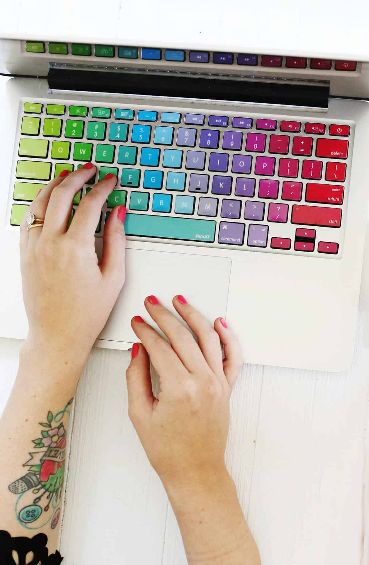
Hello! First off congrats on the huge success on your blog! You gals do such a great job! Secondly, I’m looking for the rainbow keyboard cover you have on your Mac in the blogging tips post. I’ve looked all over your site and can’t seem to find where you got it. I’ve found similar ones on amazon but since I trust you guys I wanted to get the same one!
Thanks
Reese
Hi Reese! Thanks so much! It’s from Amazon 🙂
Thanks! But do you know which exact one? Sorry it’s just that Amazon has so many similar ones and and I really like that exact one! Please send a link if you can!
It’s a few years old, so we don’t have a link but this one is similar: https://www.amazon.com/dp/B00ZQMHAFU/ref=twister_B00ZPKKR8K?_encoding=UTF8&th=1
Omigoooosshhh! Okay so I still have the old abeautifulmess.typeface.com site bookmarked and until this weekend it has always still gotten me to where I needed to go. Since Sunday it was just showing me the plain text of the blog, no photos, nothin! And I started to panic that something was wrong with the technical side or something, but thank GOODNESS it was just my bad with the domain.
It looks sooooo good you guys! I love the feature home page, the sleek menu, and I really, really love that you still kept the chronological view for us chronics 😉
Hi Em!
Looong time follower here!
I don’t want to disapoint you!!! But I like much more the blog view!! Many people are switching to this kind of view now and i find it a bit messy. It was much more simple and clear in the previous version. But this is just my opinion.
Many congrats always for your much earned success!!
xoxo
Lovin’ the new look!
Congrats on the new site! It’s beautiful. Hope you love WordPress as much as I do!
Congratulations on moving your thousands of posts and comments to WordPress! I’ve been to a similar (yet much smaller!) move recently, and I can say it wasn’t a piece of pie.
The new ABM design looks fresh, clean, less “messy”… The posts stand out more, and I must say it’s easier to catch up with your latest activity!
As for WordPress plugins, as you ask, may I suggest a few ones I’ve been using for a long time and that I would recommend?
First, whenever you need a cache plugin, WP Rocket is really excellent. Another reader suggested you’d host your images on a CDN – WP Rocket can handle that, too.
WP Retina 2x is another solid plugin which helps you deal with retina/hidpi images. Much, much needed, especially on a photographic blog like yours.
EWWW Image Optimizer is a must-have for compressing images! It works well with WP Retina 2x, too. Useful for reducing page load, especially on mobile devices.
At last, you may be interested in letting your readers know when you reply to their comments!
Subscribe to Comments Reloaded does just that. It’s easy to set up, and really useful to generate more engagement. When you subscribe to comments, you can choose either to get all comments (which might be overwhelming) OR only the replies to your own comments. Which is pretty sweet!
New look is absolutely gorgeous! Love how bright and clean it is.
xo, Diana
http://unusuallylovely.com
Love it so much! Great work 🙂
Nikki
http://www.nikkisplate.com
I have pinned a lot of your ideas over the years and am wondering how this will affect the links. If I click on my original pin or someone else does will it still take me straight to the DIY or will I have to search for it? Pat S
Hi Pat! It will still go to the original post. Let us know if it doesn’t for any reason though!
I love your keyboard! I need one, I want one now! It would most certainly brighten up dull UK days!
https://www.bohaglass.co.uk
thats good.
awesome.
Farmacia cialis sildenafilo pillole disfunzione farmaci generici prezzo erettile
hi, when i click on the older posts link it’s kind of annoying to have to scroll past the three posts i already read or chose to skip. just a suggestion, thanks.
thanks so much for this homepage change! i must admit i stopped visiting regularly because the photos took such a long time to load/lagged. for me personally the new homepage is much more easily digestible so thanks thanks!! xxx
I’ve been looking for this a long time
Hi, thanks for sharing, I really like it.
I absolutely adore the appearance of this blog!!
It looks amazing! Good work
I love it !!!!!!!!!!!
Hey ABM!
I have been playing around with youtubing and blogging, and have decided to relaunch my whole blog/vlog process properly. I would like to hire someone or a company to create a top of the line WordPress theme with me. Your blog is absolutely the best out there, is there someone you could refer me to please? I am aware this costs thousands. I want to (re)start right. 🙂 Thank you!
Love,
Lizzy
awesome and the super splendid , i have been looking for this a long time.
new year eve day
I just can’t seem to skip a day without reading your blog. Everything in it just fascinates me, specially that you are able to send the message across very well. Thanks again Emma!
Wow This is awesome
OMG! This is magnificient
What template are you using? I love it!!!
Our site is a custom design. 🙂
Your app
A Beautiful Mess does not work on my phone anymore
I can’t seem to upload pictures to it and it keeps shutting down