 Thought I’d share a little peek into some of the decor updates I’ve been working on in my dining room. First off let me just say, I LOVE our dining room. It’s not exactly a formal dining room in that it’s not separated into its own space by walls and a door, but is rather part of a big open living area that has our kitchen, a living room, my office, and our dining room. Check out my empty home tour to get a better of idea if that doesn’t make sense.
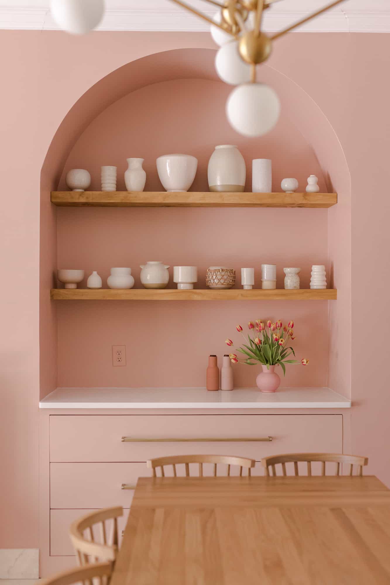
I love that we can fit a large dining room table, seating 6 to 8 easily in this space. It’s great for entertaining – I even hosted my family for Christmas this past year and LOVED having so much space to entertain in. I also love that it has a few large windows on one wall, making it feel bright and inviting (or vibe-y at night). And I love the shelves/extra counter space that we mostly use as a bar area and glass storage but could also become a small buffet counter for casseroles or other dishes at a big dinner event.
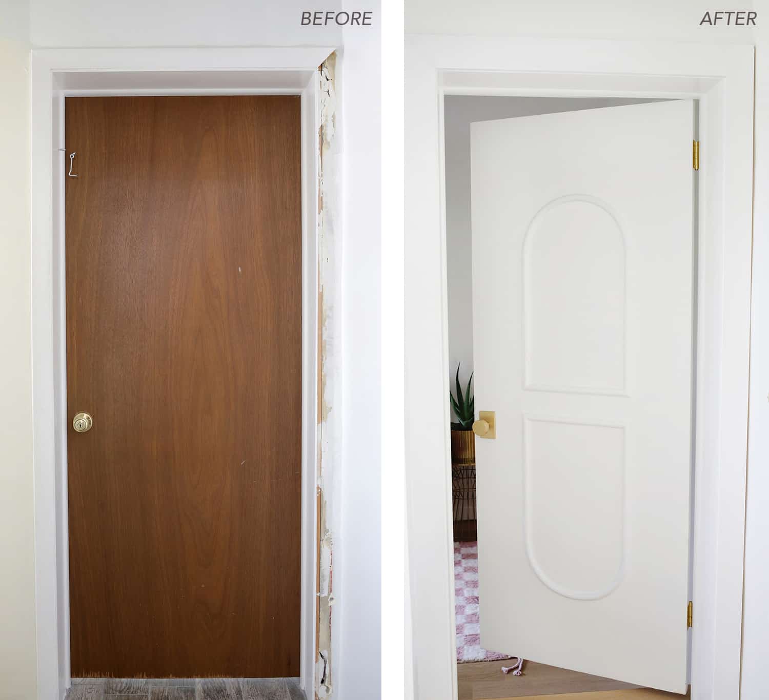
Can you tell I’m excited to host in this space?!? Here’s a (blurry) photo of the dining room just after we bought the house. Although I loved the space, I wasn’t in love with the black, distressed look of the cabinets. The upper cabinet doors weren’t really my style, and the light fixture also wasn’t exactly my taste either.
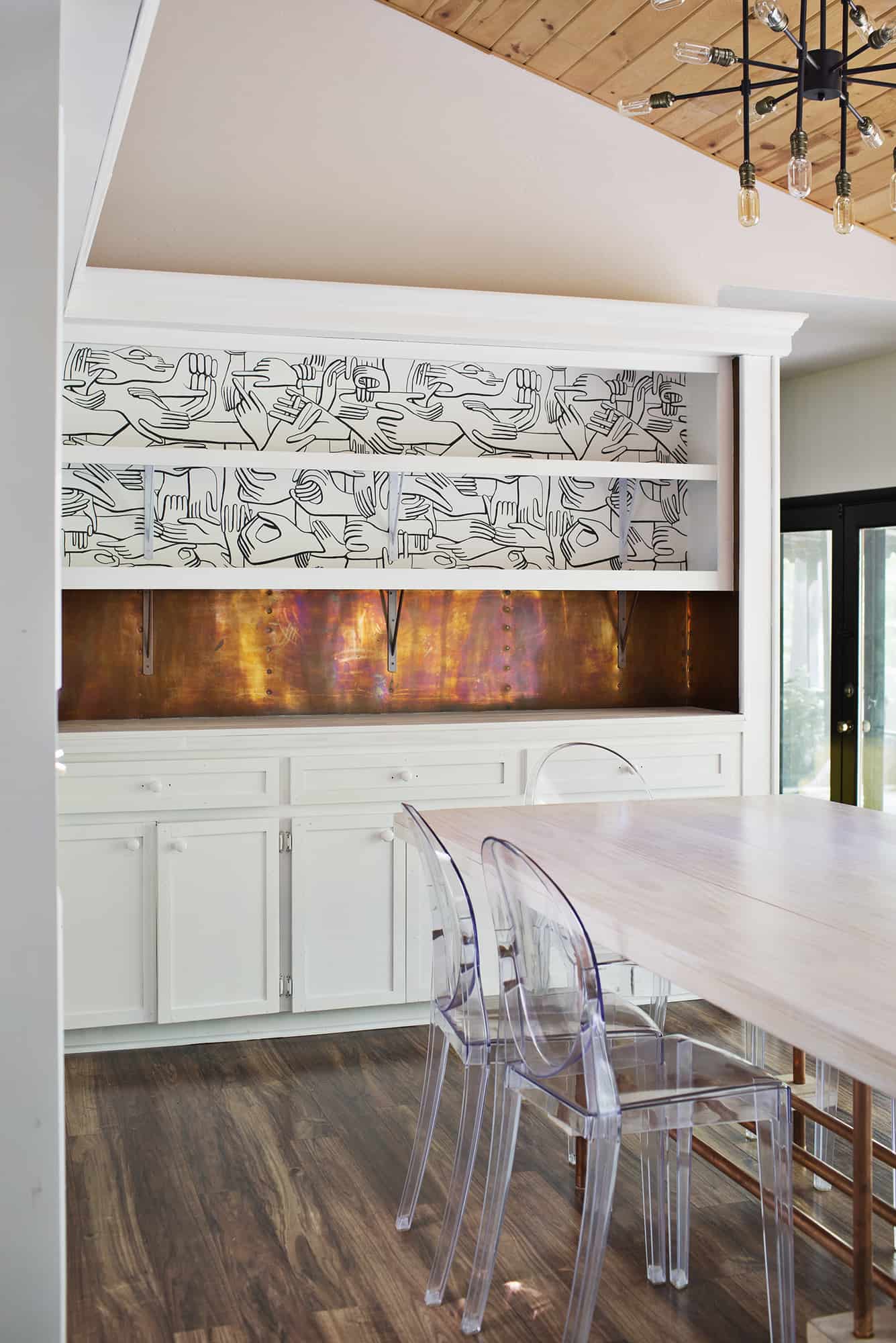
First, we had all the cabinets painted white. We’ve done a lot of painting ourselves in the house, but I did hire a professional to paint our cabinets as they are much more labor intensive if you do them right (taking off all the doors and hardware, etc.). This made a HUGE difference to the space. But after living with it for a couple of months, I decided that I just didn’t like the upper cabinet doors, mainly the arched glass. I thought about just getting new, plain cabinet doors or even having something made out of acrylic. But in the end I decided that open shelving was more my taste and worked better for us functionally because we store most of our “pretty” glassware here, and this makes it even easier for us or guests to find and grab and make a drink. So, I had the doors taken off. The way they were installed meant losing some inside support beams, so we added support brackets under the shelves in similar colors. You can kind of see this behind me holding that birthday cake in the photo above.
Trey and I really loved how the open shelving turned out. My only thought was that it felt a little plain. Many of our glasses and items on the shelves only took up about half of the height, so I thought about adding some kind of risers or something to create a better visual look. But then I got it in my head that I wanted to add wallpaper or some kind of painted design to the back of the shelves.
 It took me a while to finally commit to a wallpaper. The space we were covering wasn’t large, so I wasn’t super concerned about the cost. But I didn’t want something too busy, or too colorful, or too trendy, or wait… maybe I do?!
Yeah, choosing wallpaper is tough! I basically had about 10 I was considering, narrowed it down to 4, and then bought samples and taped them up in the shelves to try visualize what it would be like.
In the end I chose Hands by Pottock that Laura also loves (see here). It is fairly busy in its design, but being black and white kind of works for our space as it helps to blend in with the white support brackets and works with all the glassware that is stored here (or at least I think so).
 I realized that buying a roll would leave me with quite a bit of extra paper. And I thought, waste not, want not….

 So I had the remaining wallpaper from the roll installed in the bar seating area of our kitchen – and I might like it even more than the shelves!
Thanks for letting me share a little peek into our dining room decor. I’m still working on a few things in this space. One is I’m still trying to figure out how to best display our glassware on the shelves. Any tips? I’ll share more as we finish it up, including my light fixture. 🙂 xx. Emma
Credits // Author and Photography: Emma Chapman. Photos edited with A Beautiful Mess actions.
33 Comments
That wallpaper is siiiick.
I love everything you did! I’m always waiting for your next blog!! Where is the table from?
Thanks for all your inspiration.
Evelyn
Wow! What a change!
http://soldenochedecocrochet.blogspot.com.ar
This looks awesome, Emma. It plays so well with the copper and yellow. If you ever don’t mind, in the future, I’d love to learn what to budget for jobs like this (hiring someone for the cabinet painting and this level of wallpapering). It’s really none of our business so take that with a grain of salt.
I love how it looks so far! http://www.hannamarielei.com
Wow! That looks fabulous! I think more large, black serving pieces would look excellent against the wall paper. The copper pieces add a nice touch and help the eye connect with the copper below.
This is legit a fascinating looking space, and I mean that in the sense that it looks like an art piece rather than meaning it in the sense that I have no idea what positive thing to say about it.
I have to admit that I’m a sucker for the dark cabinets and would’ve left it that way myself – but what you did to it is wow. Never in my wildest dreams could I have thought that up, and it really came together nicely. So many quirky aspects that pull together so seamlessly.
Nice work, Emma! I really think you’ve developed a knack for pulling eccentric things together into a cohesive whole. What a fresh spin on a kitchen/dining room space!
Super cute!
www.petiteandhungry.com
Ok seriously, this wallpaper is just awesome!! I love the entire room!! Well done Emma :))
xx Caroline
https://carolinespassion.wordpress.com
Love it especially under the bar! And oh, the light fixture and copper backsplash…amazing.
Looks great, Emma! For the glassware, you might try stacking shelves available at The Container Store. They’ve got lots of choices (white, bamboo, chrome) or even their desk risers in white which would allow you to stack Rocks glasses underneath and tumblers or pilsners above. Acrylic risers would be nice but they’re all so small for collectibles, etc. Maybe a project?
I love the wallpaper pattern!
Holy moly, I am LOVING this Emma! It’s been fun watching you, Elsie, and Laura move in and redecorate kind of at the same time. I think your personal style is most similar to my own so I am especially enjoying your updates. I literally gasped when I saw the wallpaper at the bar area, it really makes the yellow pop! Can’t wait to learn more about that gorgeous dining room table (is it a diy???) Enough gushing for now… Keep up the amazing work!
Love the choice of wallpaper! Works really great with your industrial-style light fixtures!
Josh
www.VintageFurnitureForTheHome.com
Awww that’s actually so gorgeous Emma, i’m loving that wallpaper and they way you put in like under the bar, it’s really really cool and cheer up the place so much!
That wallpaper is awesome!! I want it in my own home now, but where… (solo brainstorming session taking place as soon as I’m finished with this comment).
Seriously, who knew hands were so awesome? I mean, besides for eating and putting on clothes and oh, yeah… hands are awesome.
Victoria
victoriahasnosecret.com
We don’t have a hood at my place either, but there’s a vent/fan on an exterior wall not too far away from the stove. So I can switch it on if I’m making smokey/stinky/steamy things. It wasn’t too pricey to have installed.
I really love the paper on your peninsula. So, so good with all the white and yellow stools. 🙂
I agree with some of the above comments – I like the hands in the dining room (especially as the representation of passing things/food to one another), but I LOOOOVE it below the bar! Especially with the bright yellow stools!!
As for arranging the glassware – I thought maybe the colored glass could be moved to the counter top so that it’s only clear glass – which would give the hands more attention. But I realize you probably don’t want to have to shuffle items around when you use the counter as a serving area. Maybe move the cake stands closer to the ends of the shelves – as anchor items? Just some thoughts. Good luck!
What fun wallpaper. So unusual, and the hands are so meaningful in a family setting. I think it will be something that sticks with your kids. Plus it looks good.
We have a hood (is that what they’re called in English? In French, it’s a hotte) that comes down by itself–not attached to a wall–and evacuates via the attic to the outside.
Not sure what kind of stove you have, but ours is induction, which is as flexible as gas for fast heat or instant shut off, and it works only with magnetic surfaces. So a kid (or adult) can turn it on and touch it and nothing happens because hands aren’t magnetic. LOVE it.
Aww, I love it!!
This wallpaper is perfect, and so cool! It fits perfectly to the yellow of the chair and that coppery backdrop!
https://www.makeandmess.com/
Wow, what an improvement! Beautiful!
Where is the new light fixture from?
I would have such a hard time picking wallpaper. I love what you chose! Especially with that copper backsplash there’s just tons of wonderful visual texture going on in that dining room without having to put a bunch of things in it! Great job!
Could you install one of those vents that pop up?
Love your table too ~ and love how you took the doors off the upper cabinets. 🙂
I love what you’ve done so far! It also looks like such a functional/open layout but not so open that there aren’t designated areas for everything. Can’t wait for the full tour!
Both. 🙂 I like that having it in the bar area means I’m not facing a wall or corner the whole time I’m at the stove. As much as I cook this means a lot to me. But, I do wish we could have a hood. I often cook with high heat or dishes with stronger smells and not having a hood does make a difference. I don’t set off our fire alarm every night but I probably do a couple times a month or so. So, that’s the main drawback for me. This was where it was located when we bought the house, and I like it enough that I wouldn’t change it but if I had designed the kitchen myself I probably would have planned it so it could have a hood as its just more functional for the type of home cook I am.
As for the kiddos reaching from the bar area, I really couldn’t say as it probably depends on the kid and how long their arms are. 🙂 I don’t have children yet but when my niece (who is 6) comes over we don’t have any problem as she’s aware that it’s hot and I remind her if she gets close to the stove at all. But mostly we bake cookies when she comes over because again, I’m just an aunt, so we mostly use the oven. 🙂
Don’t know if that helps your decision at all but there’s my two cents! Good luck with your reno!
-Emma
I love how you’ve used the wallpaper. I think it would be too much for a while wall or room, but it’s perfect in these small spaces. I particularly love it at the bar with the yellow stools. Perfect!
I hand’t even thought of it that way, but I really like that!
-Emma
Okay, I just had to comment one more time.. haha. Do you like having your stovetop in the bar area, even though you can’t have any sort of hood? Or do you worry about kids touching the hot stovetop from the barstools?
We’re thinking about moving ours but I still have a few hesitations! 🙂
Thanks!
I love it in the dining room, but it’s craaazy good in the bar area! OMG.
Emma,
I love that both you and Laura used the same wallpaper print in your homes, but in completely different ways. I love this print of the different hands coming together. I think it’s perfect for a dining room space since that is where most people will be gathering together to pass the food and eat!
Thanks for sharing,
Brittany